
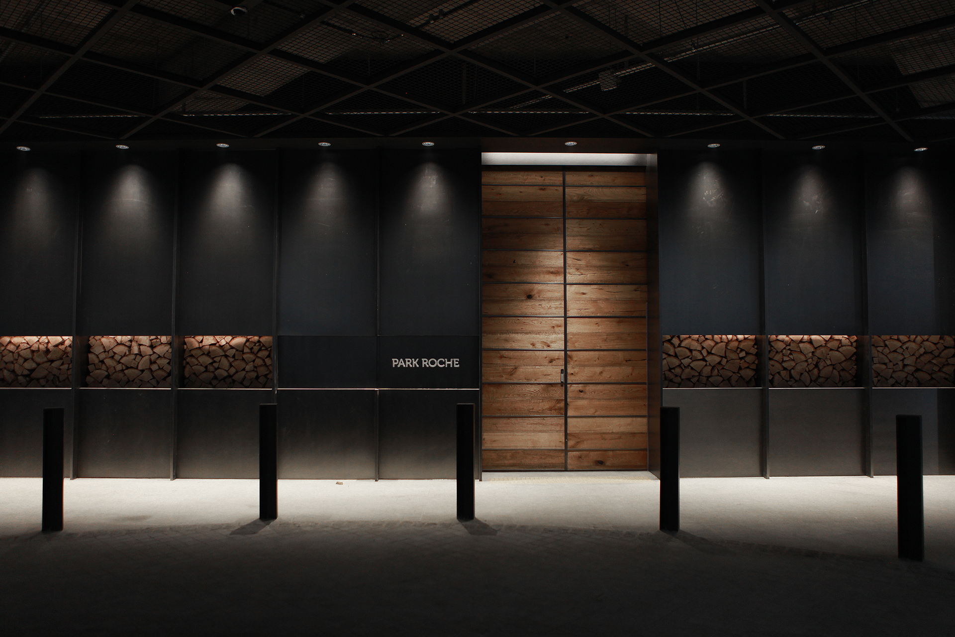
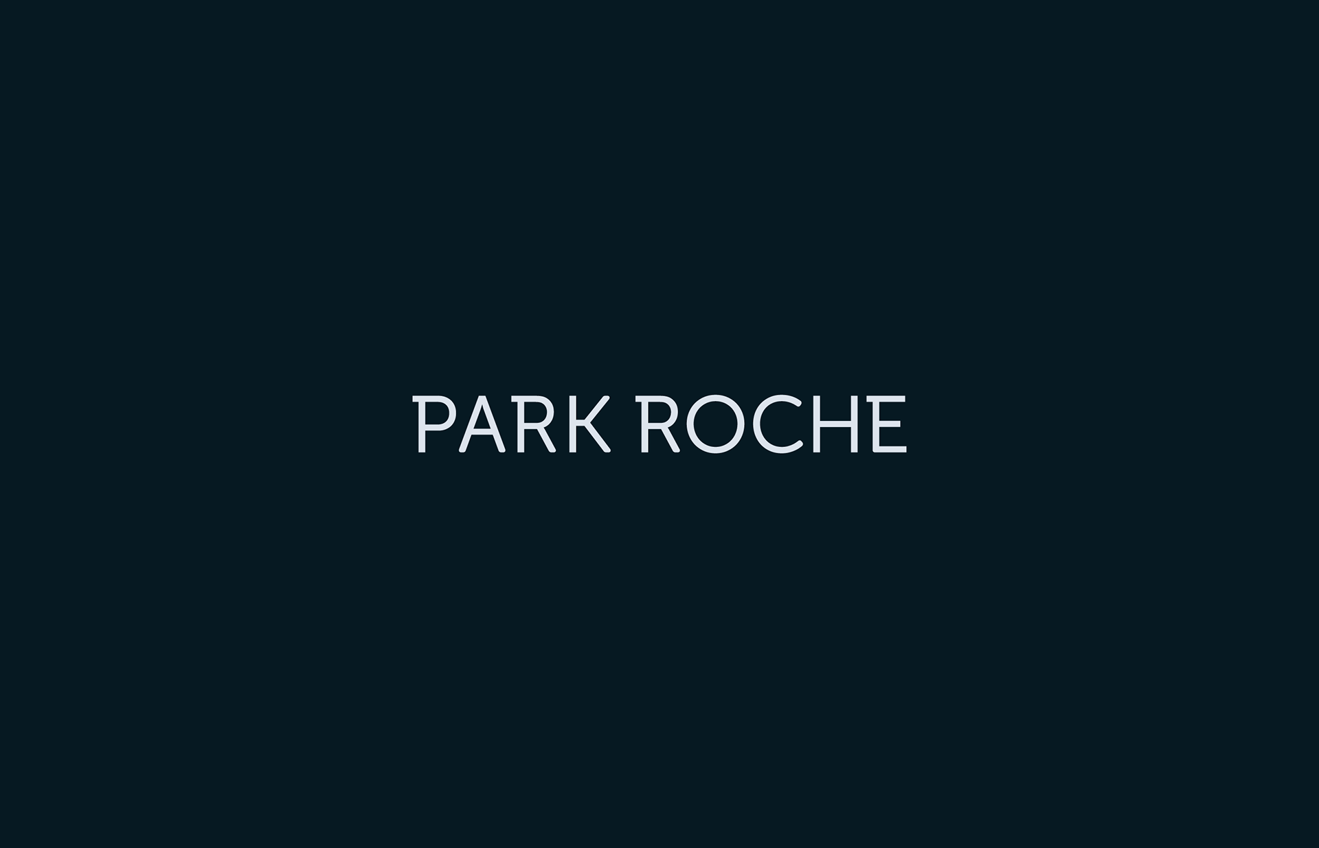
Park Roche, a Space for complete rest
Project Overview
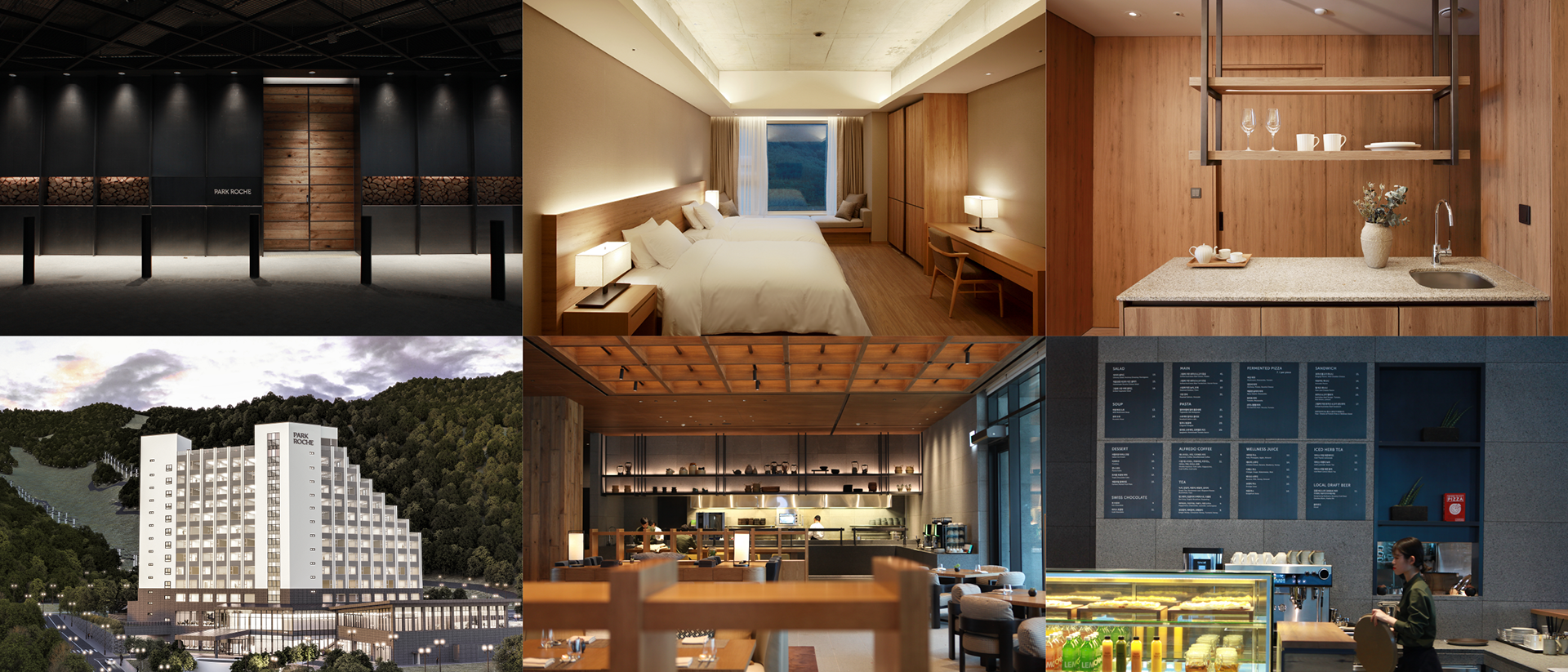
We have developed the identity of the Park Roche resort, located in the serene village, deep in the heart of Jeongseon, Gangwon Province. Park Roche offers a space for complete relaxation, providing moments of contemplation and rejuvenation amidst nature. We contemplated and visualized the identity of this space, dedicated to offering a serene escape from the hustle and bustle of city life, nestled deep in the mountains, far away from the everyday routine.
현대호텔아이파크의 리조트 파크로쉬의 아이덴티티를 개발하였습니다. 파크로쉬는 강원도 정선 깊숙한 곳, 숙암리에 위치한 온전한 쉼을 위한 공간으로 자연 속에서 사색과 재충전의 시간을 제공하는 리조트 입니다. 바쁜 도심, 일상에서 멀리 떨어진 산 깊숙한 곳에서의 오롯한 휴식을 위한 공간의 정체성을 고민하고 시각화 하였습니다.
.
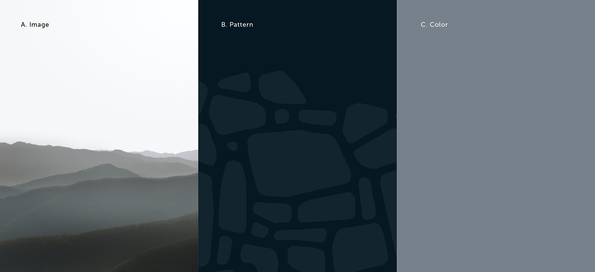
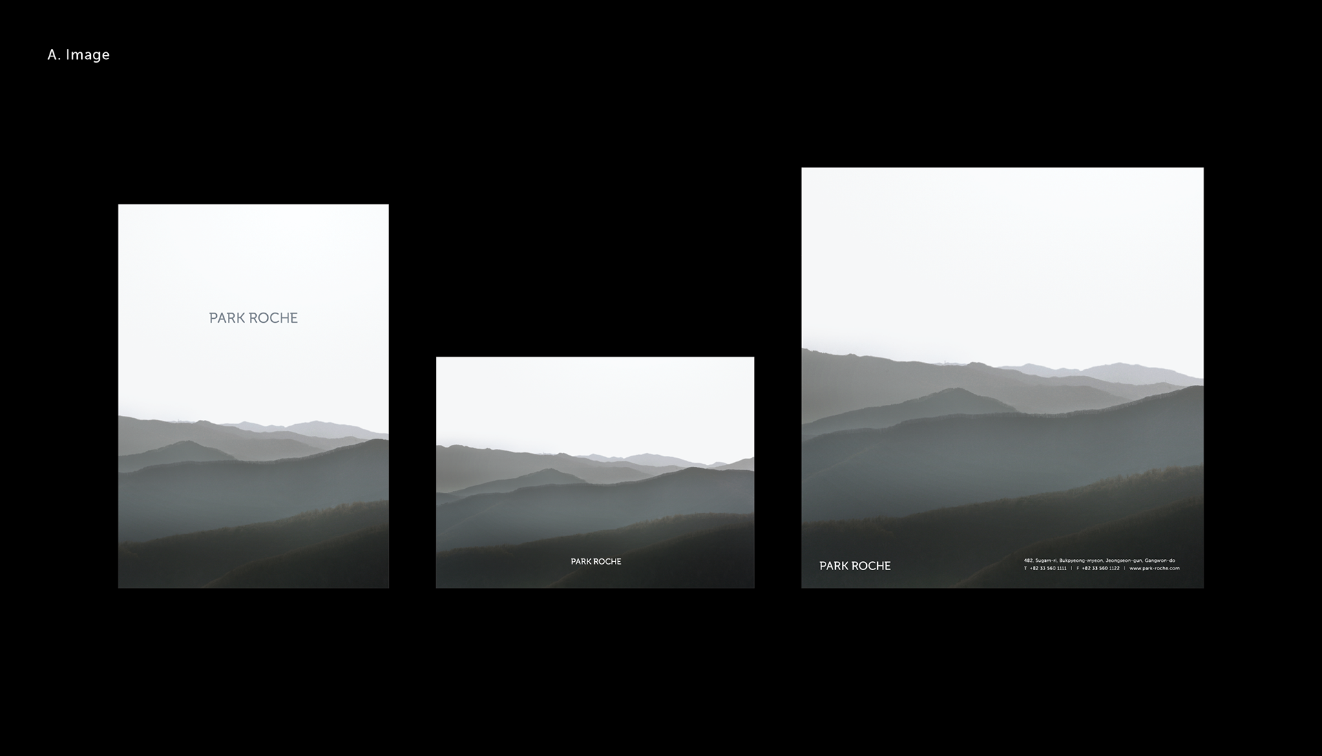
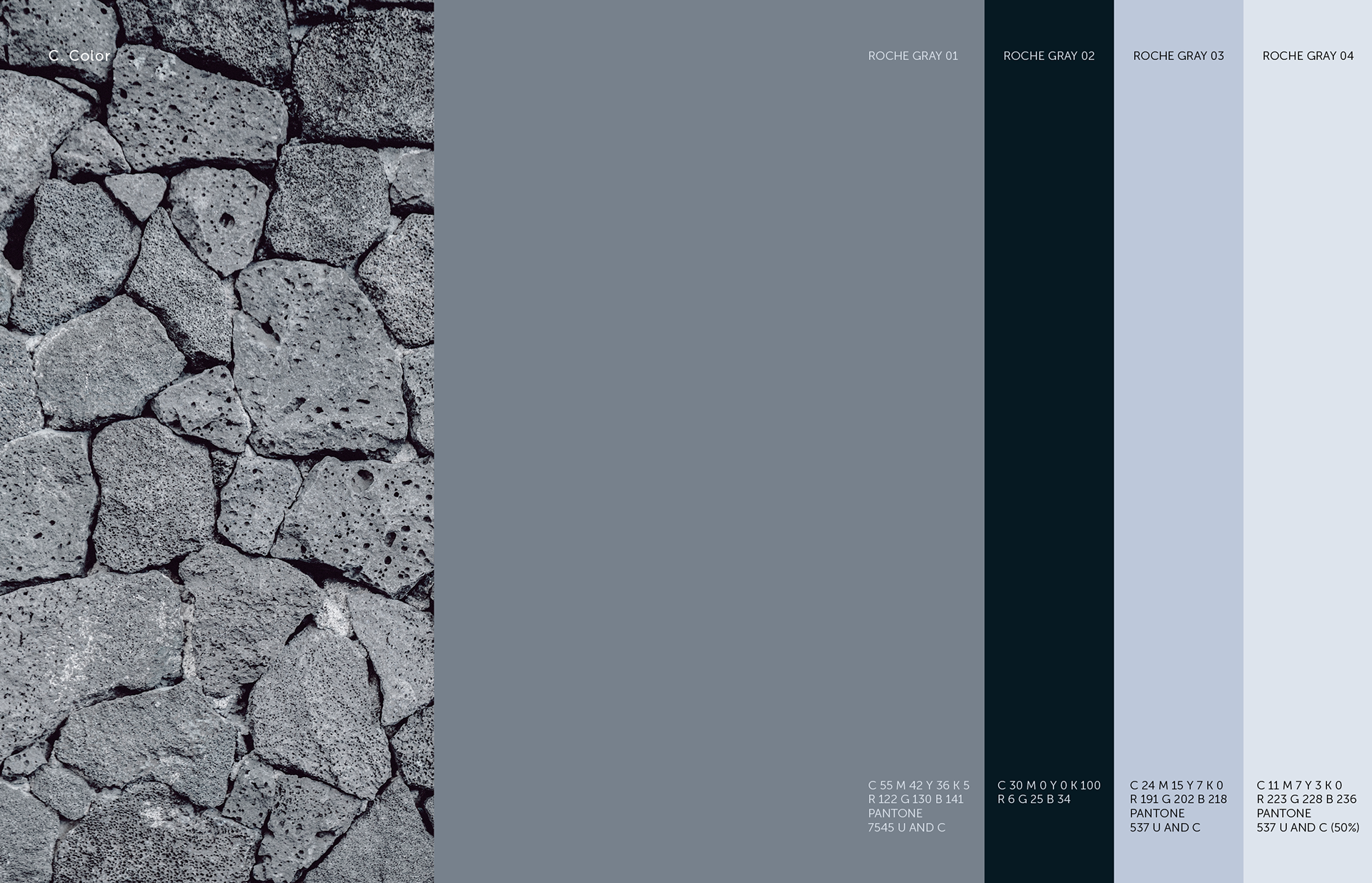
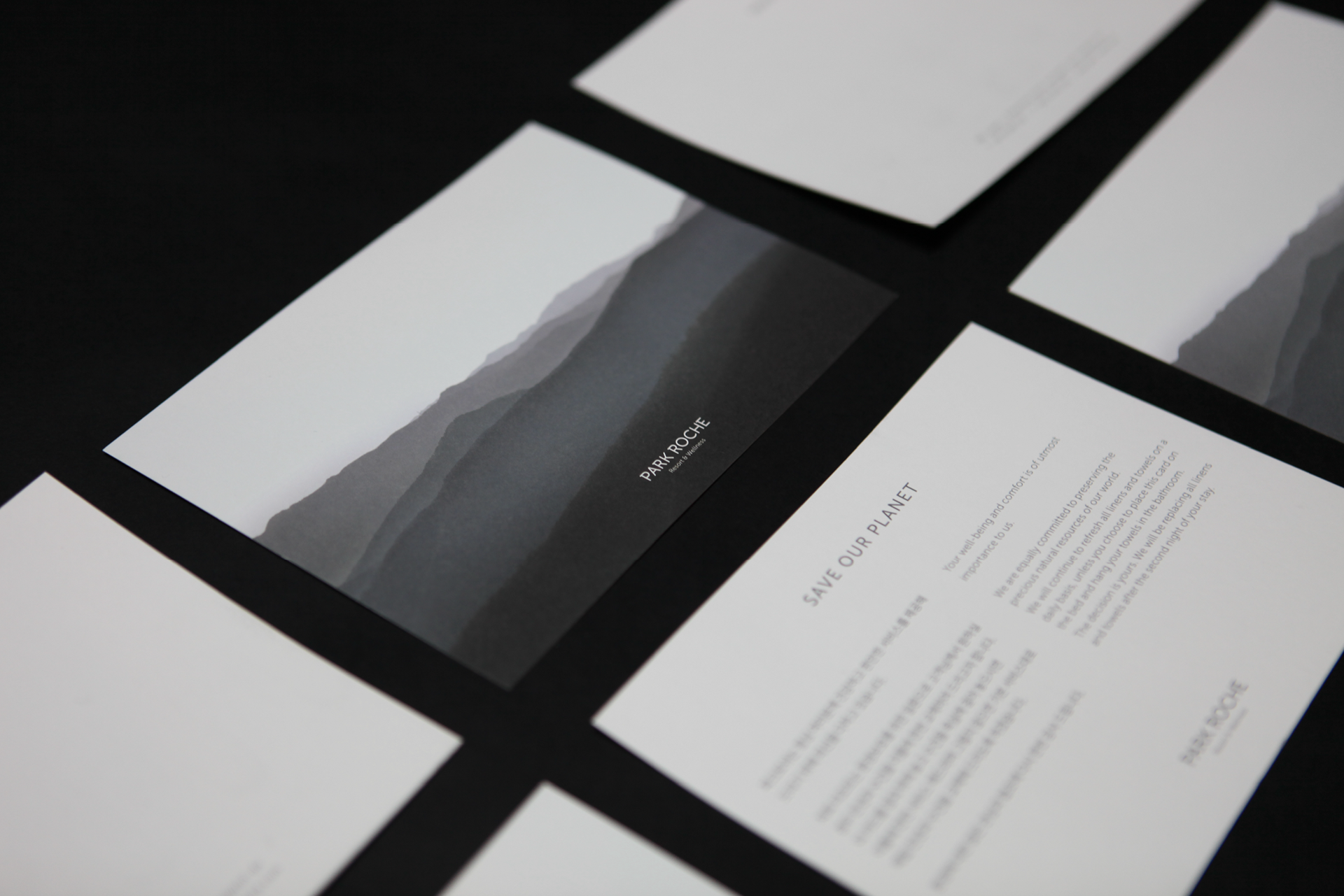
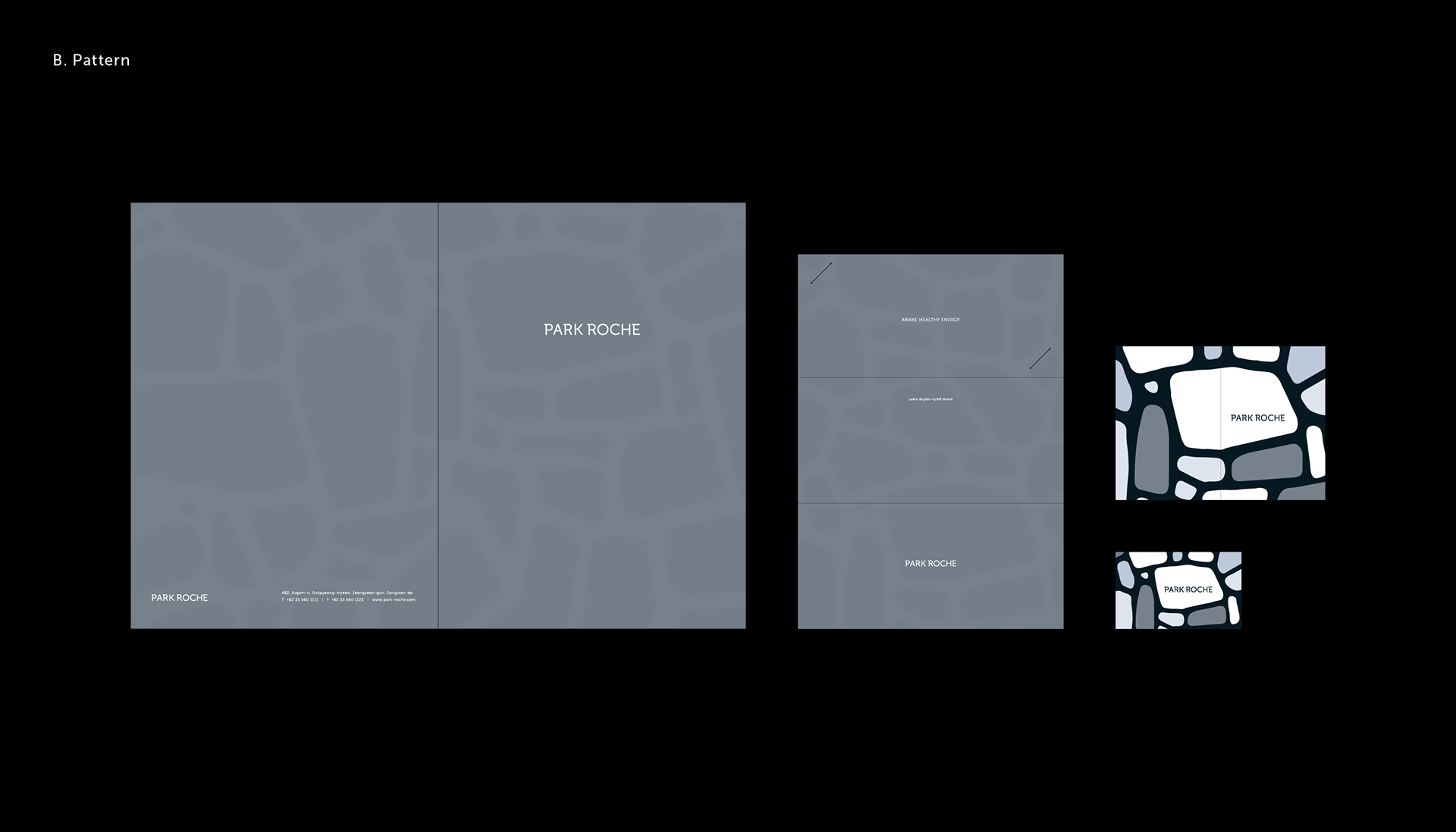
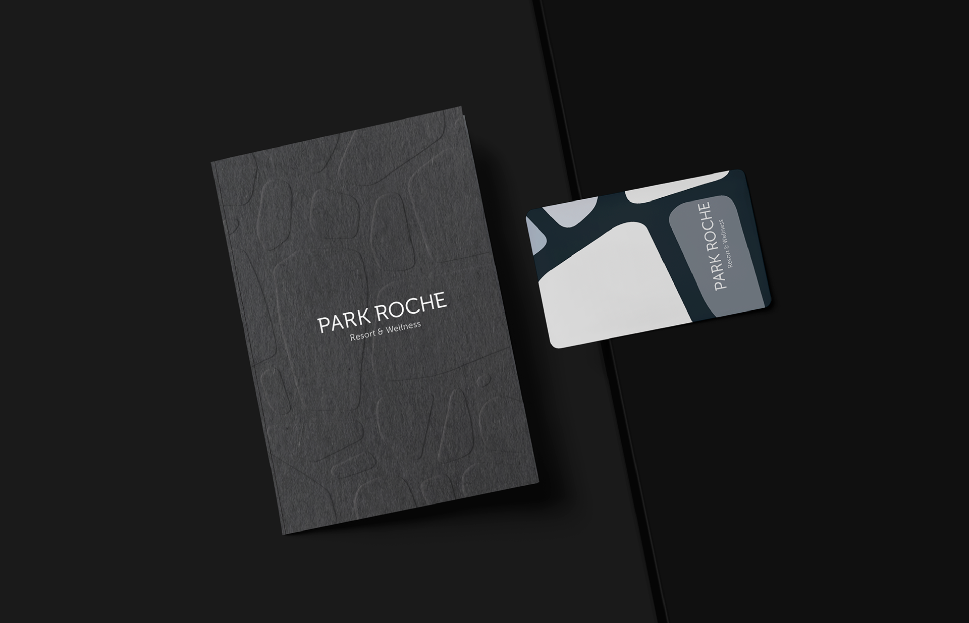
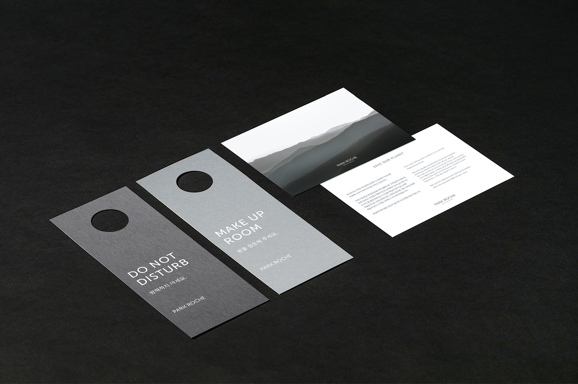
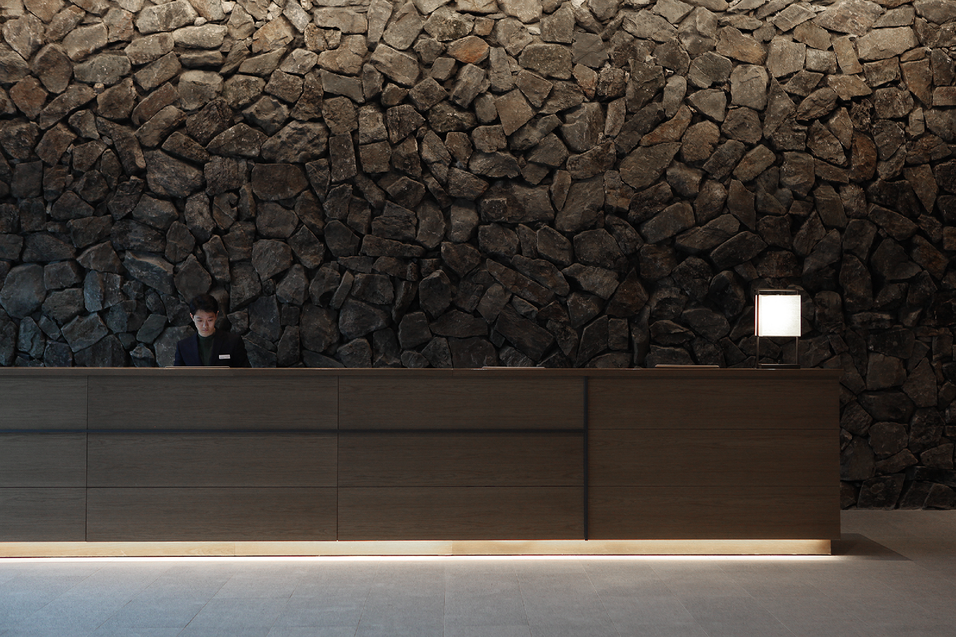
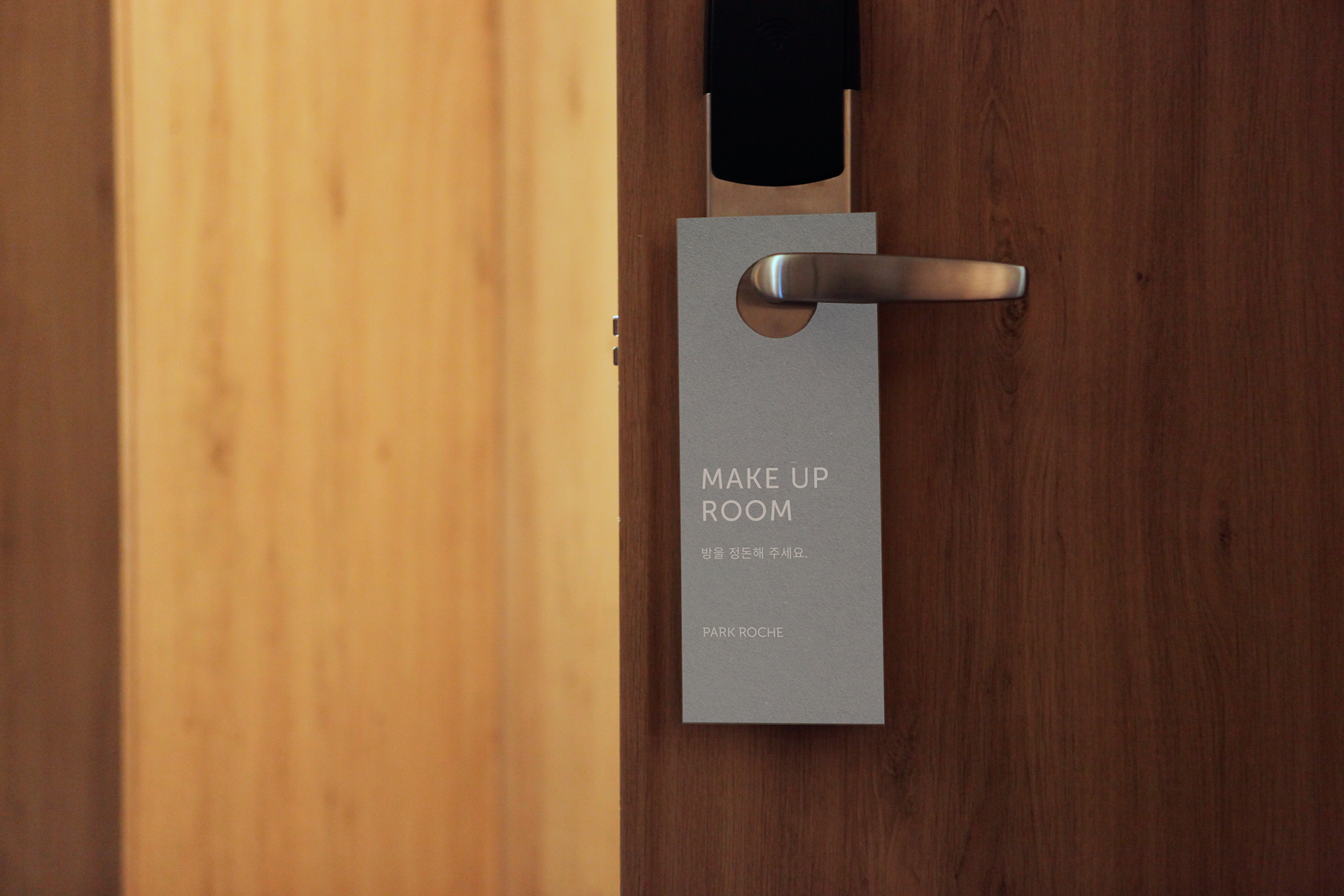
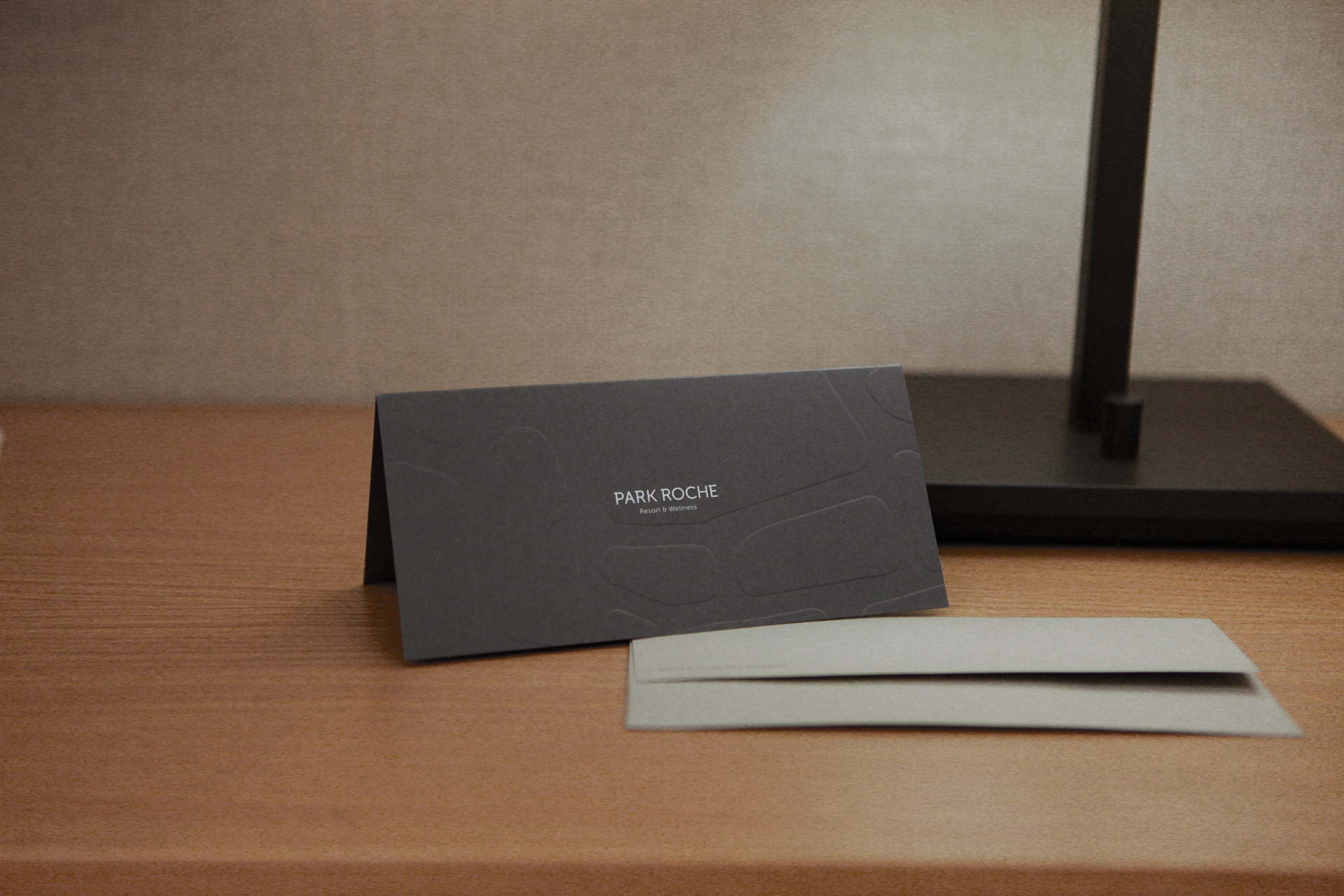
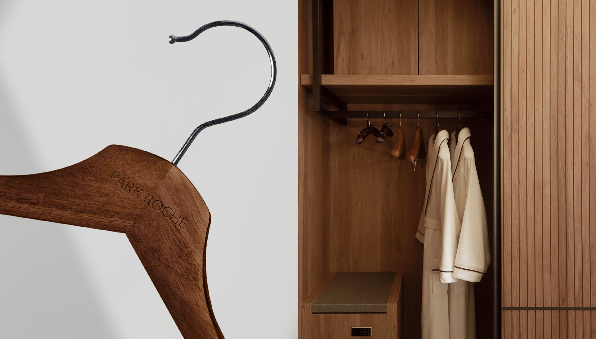
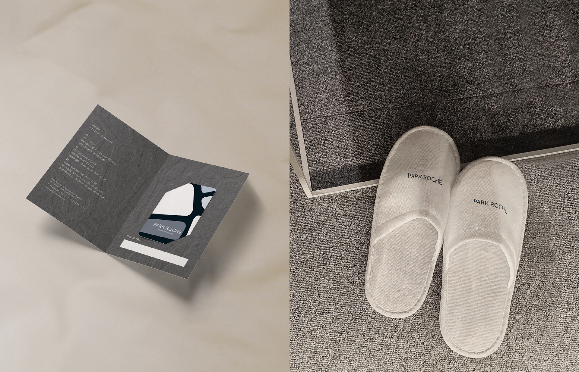
As the name Park Roche is a nod to the resort’s location among rocky mountains (‘roche’ is French for ‘rock’), we created the look and feel of composure and control, drawing from natural rock colors and the patterns created by artist Richard Woods. This Resort collaborated with him to integrate his artwork into the resort's spaces such as the lobby, swimming pool area, and rooftop. We reinterpreted his work into functional patterns, maintaining architectural consistency across the resort's applications. The main color palette, inspired by the village’s rocky surroundings, features various tones of gray. Utilizing rock-shaped patterns reminiscent of village’s natural environment, we made applications with textured paper for a distinctive touch.
파크로쉬는 아티스트 리차드우즈와의 협업을 통해 그의 작품을 리조트의 로비, 수영장과 루프탑에 적용하였습니다. 그의 작품을 사용성 높게 재해석 한 패턴을 개발하고 리조트의 어플리케이션에 적용함으로써 건축물과의 일관성을 소구하였습니다. 메인컬러는 바위산으로 둘러싸인 숙암리의 지역적 특징을 활용한 다양한 톤의 그레이컬러로 지정하였습니다. 또한 숙암리의 고유한 자연을 연상시키는 바위형태의 패턴을 활용하여 형압과 같은 후가공, 텍스쳐가 거친 종이를 사용하여 파크로쉬만의 정체성을 구축하고 이를 적용한 어플리케이션들을 개발하였습니다.
Client HDC Hotel I-Park
Discipline Hotel Identity
Director Jaeyong Jang
Design Hyeyoung Jung, Jeonghoo Lee, Myungjin Kim
Discipline Hotel Identity
Director Jaeyong Jang
Design Hyeyoung Jung, Jeonghoo Lee, Myungjin Kim