
LAYLAY
Strategy, brand verbal & visual system, and product design for LayLay
Brand Strategy / Research & Market Analysis / Verbal Identity (Brand Naming, Slogan, Product Naming Architecture) / Visual Identity / Product Design / Packaging Design / Art Direction
Brand Strategy / Research & Market Analysis / Verbal Identity (Brand Naming, Slogan, Product Naming Architecture) / Visual Identity / Product Design / Packaging Design / Art Direction
Project Overview
LAYLAY is a lifestyle brand designed for single-person households in their 20s and 30s. Recognizing that today’s generation defines life at its own pace and in its own way, VEIG developed a cohesive brand experience spanning naming, strategy, logotype, color system, graphic motifs, packaging, and product design. Moving beyond a mattress market largely driven by functions and product specifications, the project redefined rest as an attitude, building LAYLAY into a sensorial lifestyle brand that resonates with a new generation.
LAYLAY는 20~30대 1인 가구의 라이프스타일 브랜드입니다. 베이그는 오늘날의 세대가 자신만의 속도와 방식으로 삶을 선택한다는 점에 주목해, 네이밍부터 브랜드 전략, 로고타입, 컬러 시스템, 그래픽 모티프, 패키지와 제품 디자인까지 하나의 일관된 경험으로 설계하였습니다. 기능과 제품 스펙 중심으로 설명되던 기존 매트리스 시장에서 벗어나, ‘쉼을 대하는 태도’를 브랜드의 중심 언어로 재정의하여, 새로운 세대가 공감할 수 있는 감각적인 라이프스타일 브랜드로서의 아이덴티티를 구축하였습니다.
LAYLAY는 20~30대 1인 가구의 라이프스타일 브랜드입니다. 베이그는 오늘날의 세대가 자신만의 속도와 방식으로 삶을 선택한다는 점에 주목해, 네이밍부터 브랜드 전략, 로고타입, 컬러 시스템, 그래픽 모티프, 패키지와 제품 디자인까지 하나의 일관된 경험으로 설계하였습니다. 기능과 제품 스펙 중심으로 설명되던 기존 매트리스 시장에서 벗어나, ‘쉼을 대하는 태도’를 브랜드의 중심 언어로 재정의하여, 새로운 세대가 공감할 수 있는 감각적인 라이프스타일 브랜드로서의 아이덴티티를 구축하였습니다.
Verbal Identity
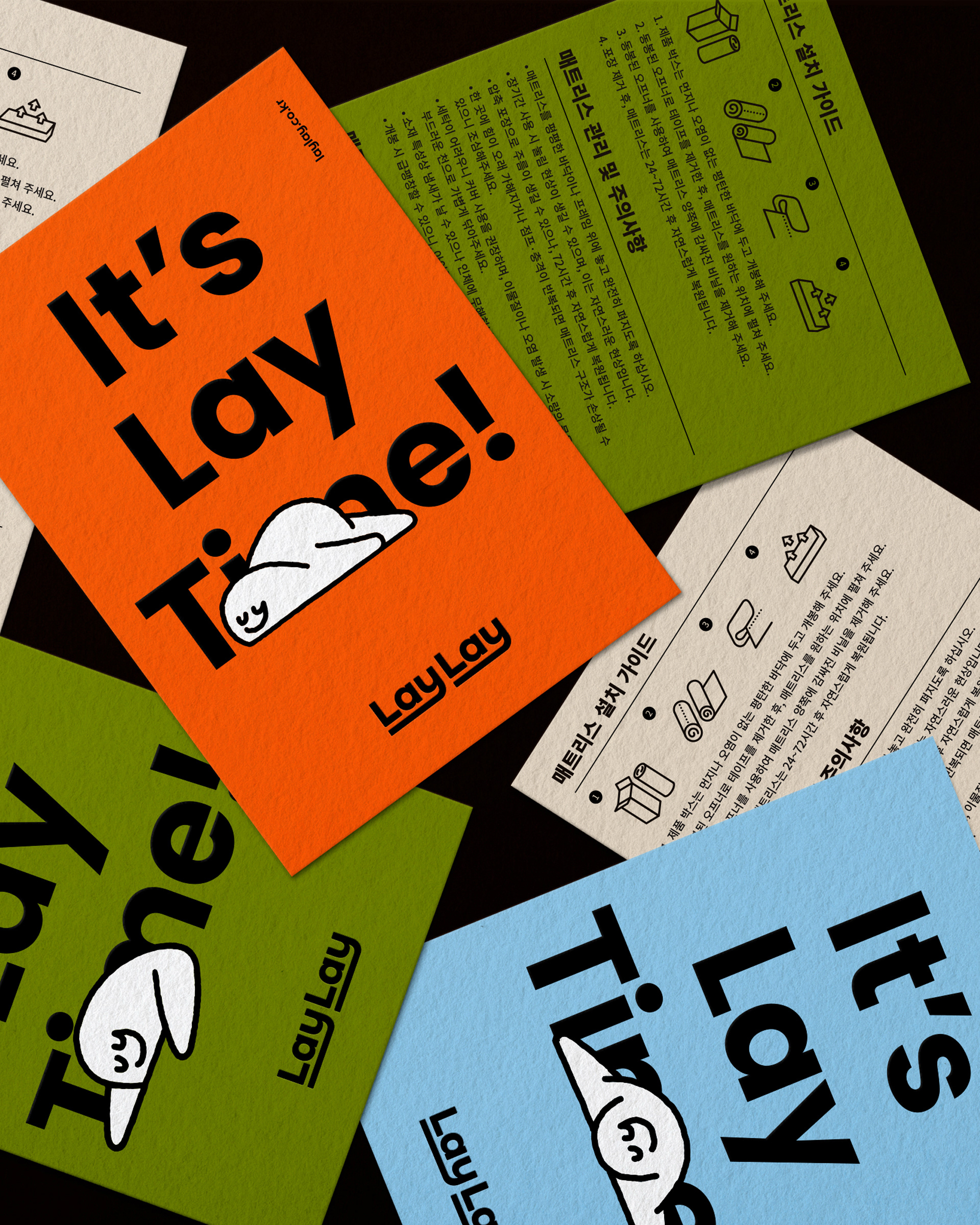
Naming, Slogan LAYLAY begins with the word “lay,” a simple word for lying down, resting, and letting go. Its repeated sound creates a gentle rhythm that is simple, memorable, and naturally connected to the act of lying down. With the slogan “It’s Lay Time,” LAYLAY turns everyday rest into a personal ritual.
Product Naming The product naming system extends this verbal identity through Lay-Z1, Lay-Z2, and Lay-Z3. By adding “Z” to “Lay,” the names are playfully read as “lazy,” reinterpreting the word not as a passive state, but as a relaxed lifestyle choice: choosing to lie down, rest, and stay at one’s own pace. Through this system, LAYLAY connects its brand name, slogan, and product names into one cohesive verbal language, delivering the idea of rest in a more sensorial and approachable way.
LAYLAY의 버벌 아이덴티티는 ‘눕다’라는 의미를 지닌 단어 “lay”에서 출발합니다. 누워 쉬고, 자신만의 방식으로 머무는 감각을 브랜드 언어의 중심에 두었습니다. 반복되는 “Lay”의 사운드는 부드러운 리듬과 오래 남는 인상을 만들며, “It’s Lay Time”이라는 슬로건을 통해 일상 속 쉼을 나를 위한 시간으로 정의하였습니다. 제품 네이밍은 이러한 언어적 맥락을 확장해 Lay-Z1, Lay-Z2, Lay-Z3의 체계로 개발하였습니다. “Lay”에 “Z”를 더해 “lazy”처럼 읽히는 위트를 담고, ‘게으름’이라는 단어를 수동적인 태도가 아닌, 스스로 눕고 쉬기를 선택하는 여유로운 라이프스타일로 재해석하였습니다. 이를 통해 LAYLAY는 브랜드명과 슬로건, 제품 네이밍까지 하나의 일관된 언어 시스템으로 연결하며, 쉼을 보다 감각적이고 친근한 브랜드 경험으로 전달합니다.
LAYLAY의 버벌 아이덴티티는 ‘눕다’라는 의미를 지닌 단어 “lay”에서 출발합니다. 누워 쉬고, 자신만의 방식으로 머무는 감각을 브랜드 언어의 중심에 두었습니다. 반복되는 “Lay”의 사운드는 부드러운 리듬과 오래 남는 인상을 만들며, “It’s Lay Time”이라는 슬로건을 통해 일상 속 쉼을 나를 위한 시간으로 정의하였습니다. 제품 네이밍은 이러한 언어적 맥락을 확장해 Lay-Z1, Lay-Z2, Lay-Z3의 체계로 개발하였습니다. “Lay”에 “Z”를 더해 “lazy”처럼 읽히는 위트를 담고, ‘게으름’이라는 단어를 수동적인 태도가 아닌, 스스로 눕고 쉬기를 선택하는 여유로운 라이프스타일로 재해석하였습니다. 이를 통해 LAYLAY는 브랜드명과 슬로건, 제품 네이밍까지 하나의 일관된 언어 시스템으로 연결하며, 쉼을 보다 감각적이고 친근한 브랜드 경험으로 전달합니다.
Visual Identity
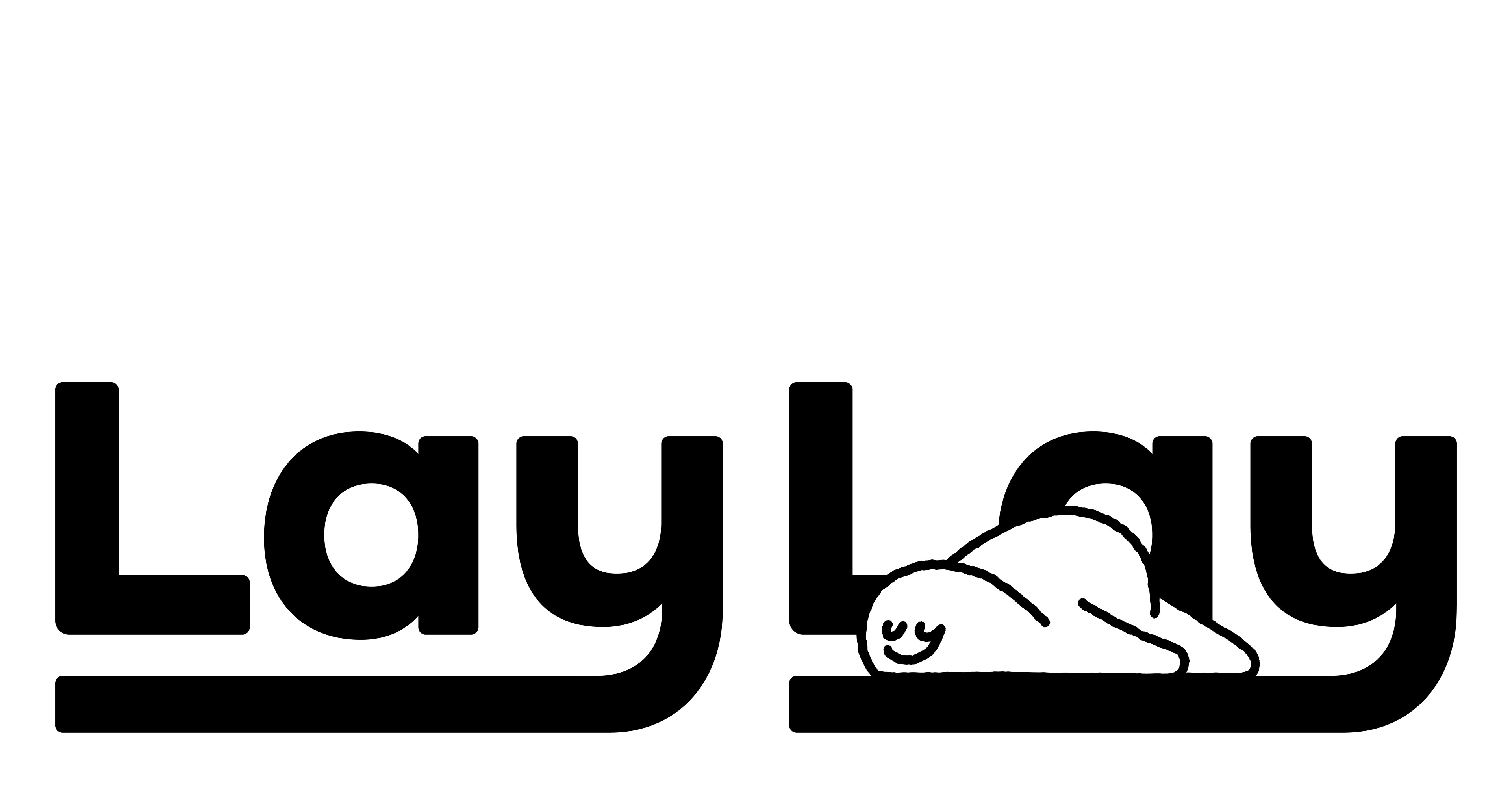
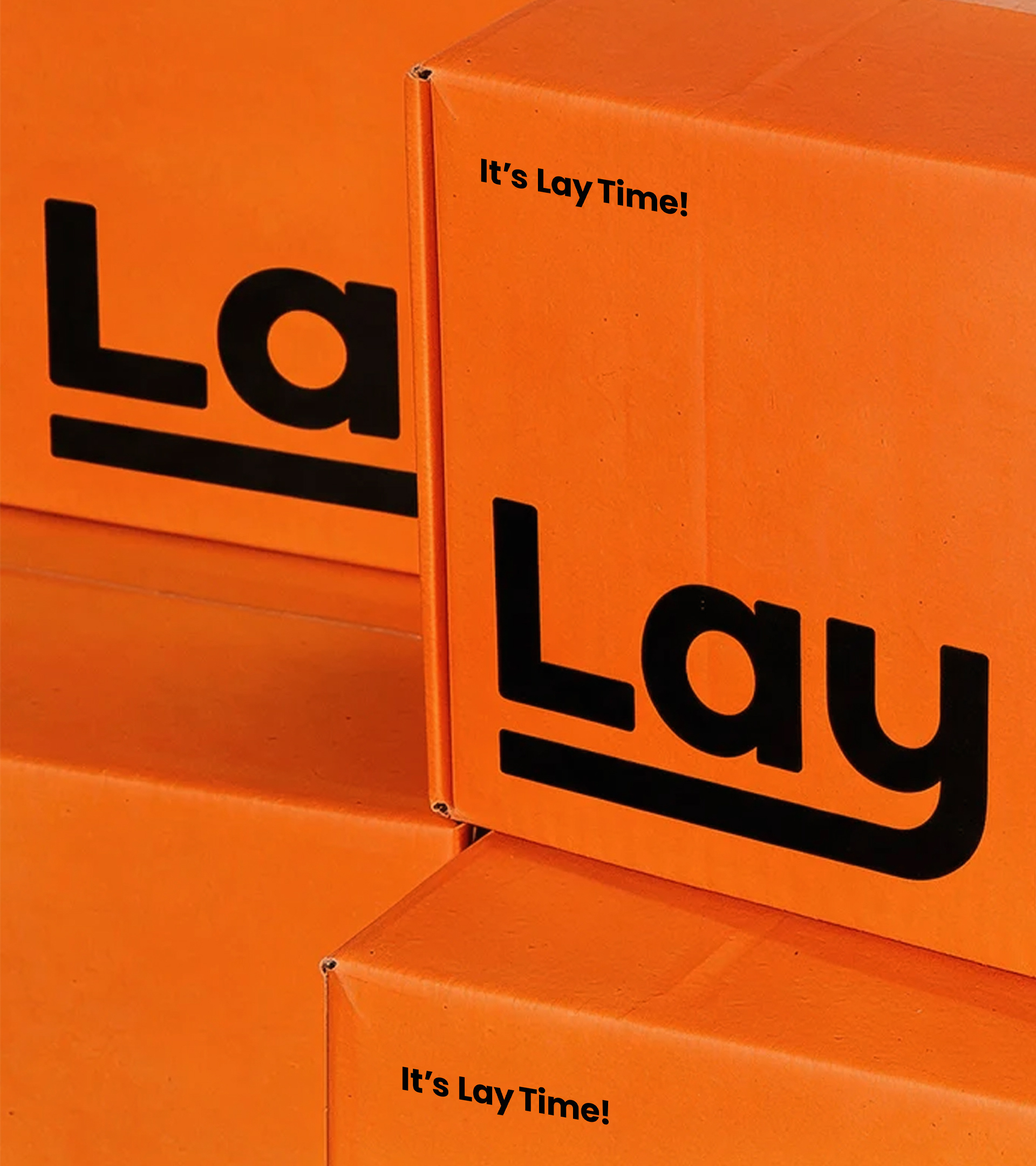
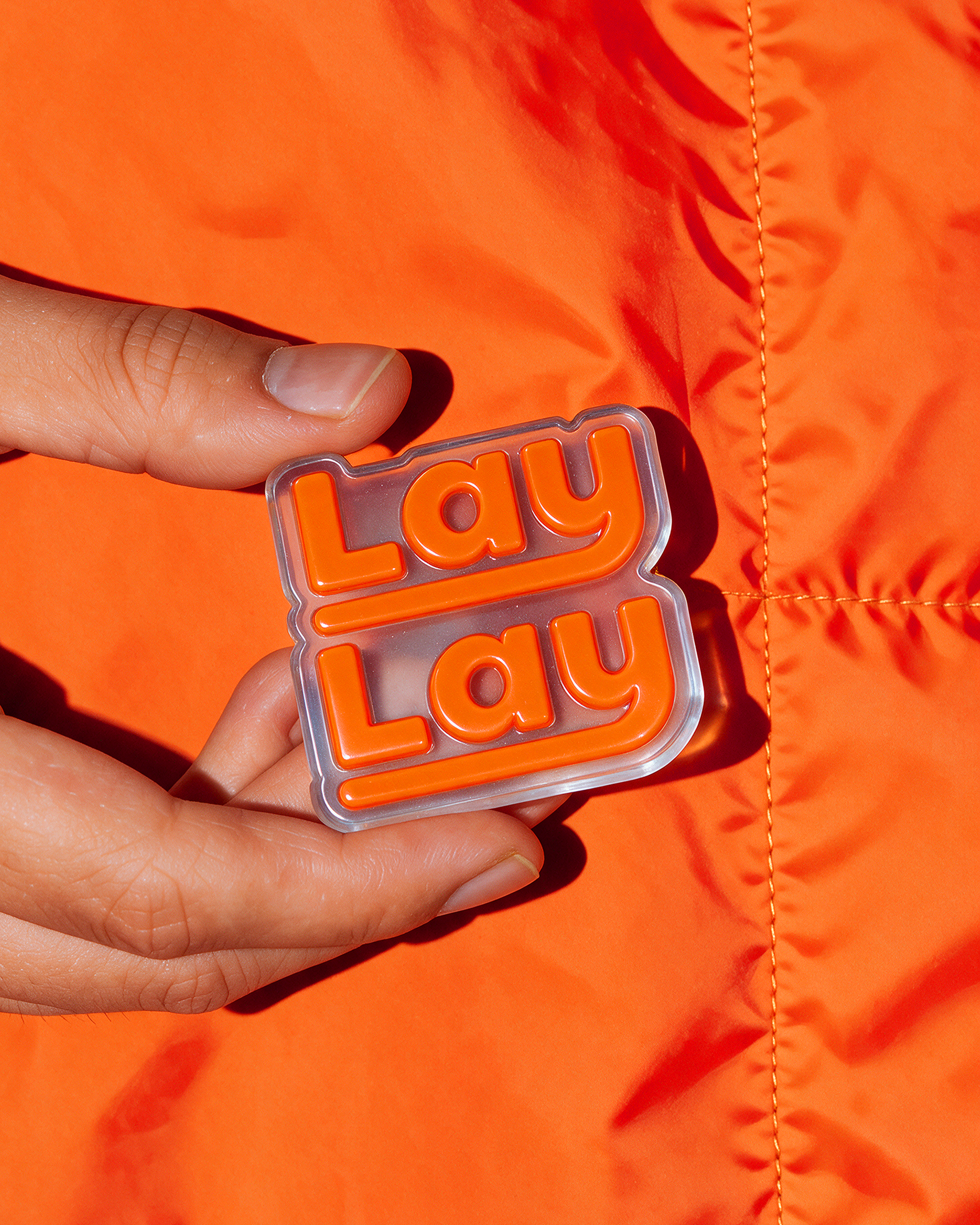
Logotype LAYLAY’s logotype extends the descender of the lowercase “y” to express the brand’s open attitude toward the different ways its target generation rests, lives, and stays in its own rhythm.
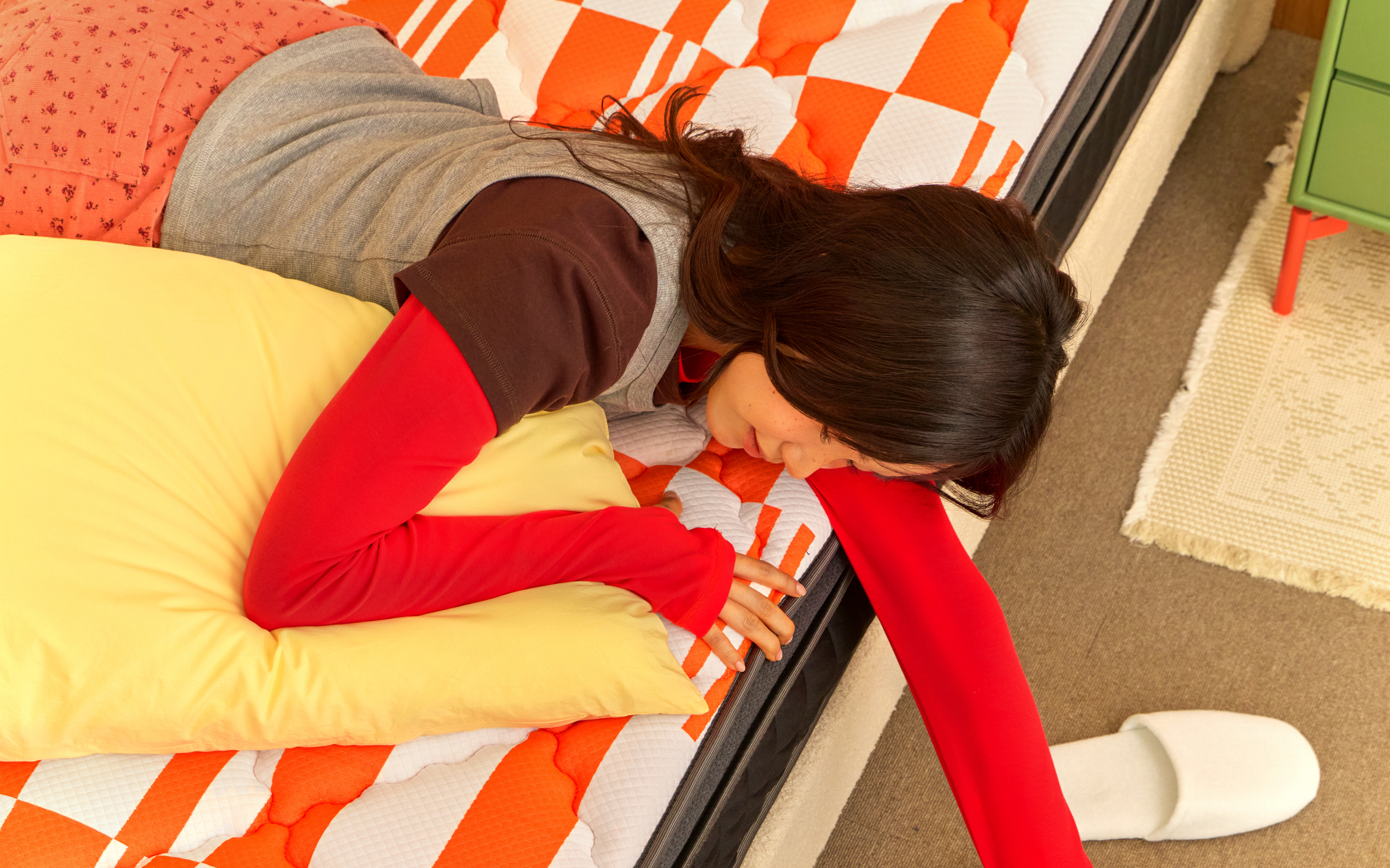
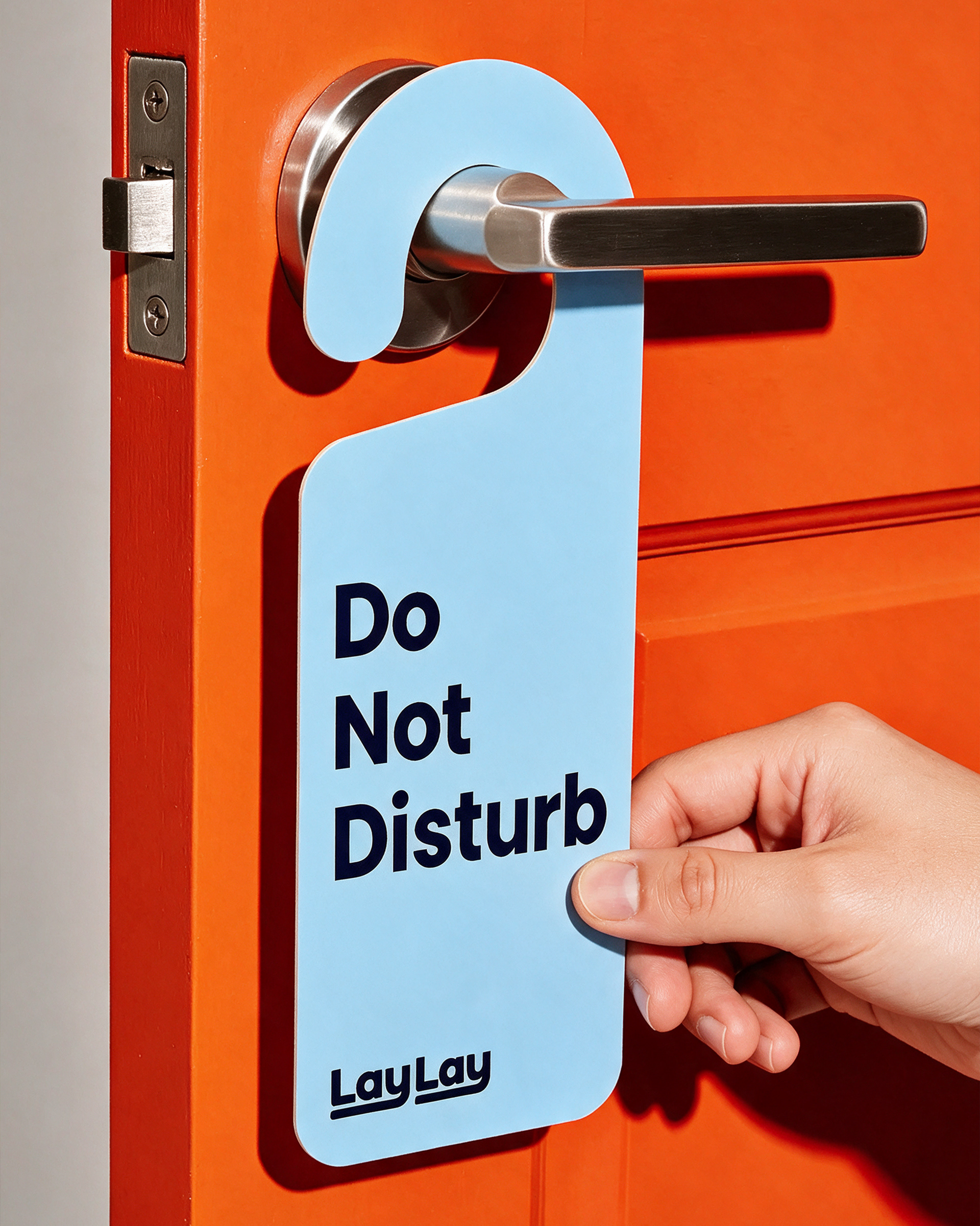
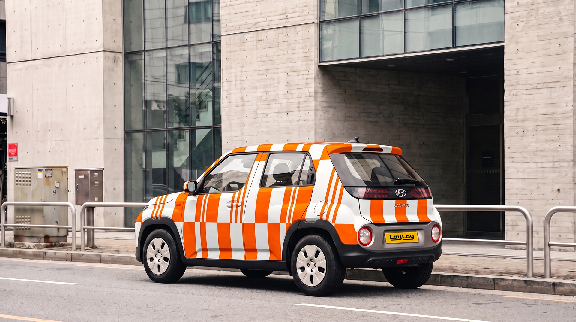
Color System The color system was designed to move away from the functional and technical impression often seen in mattress brands, creating a fresh and sensorial lifestyle mood unique to LAYLAY.
Illustration LAYLAY’s illustrations depict various moments of lying down, resting, and staying on a mattress with a sense of wit. They extend the brand’s relaxed and friendly mood into a consistent visual experience across packaging, advertising, digital content, and other touchpoints.
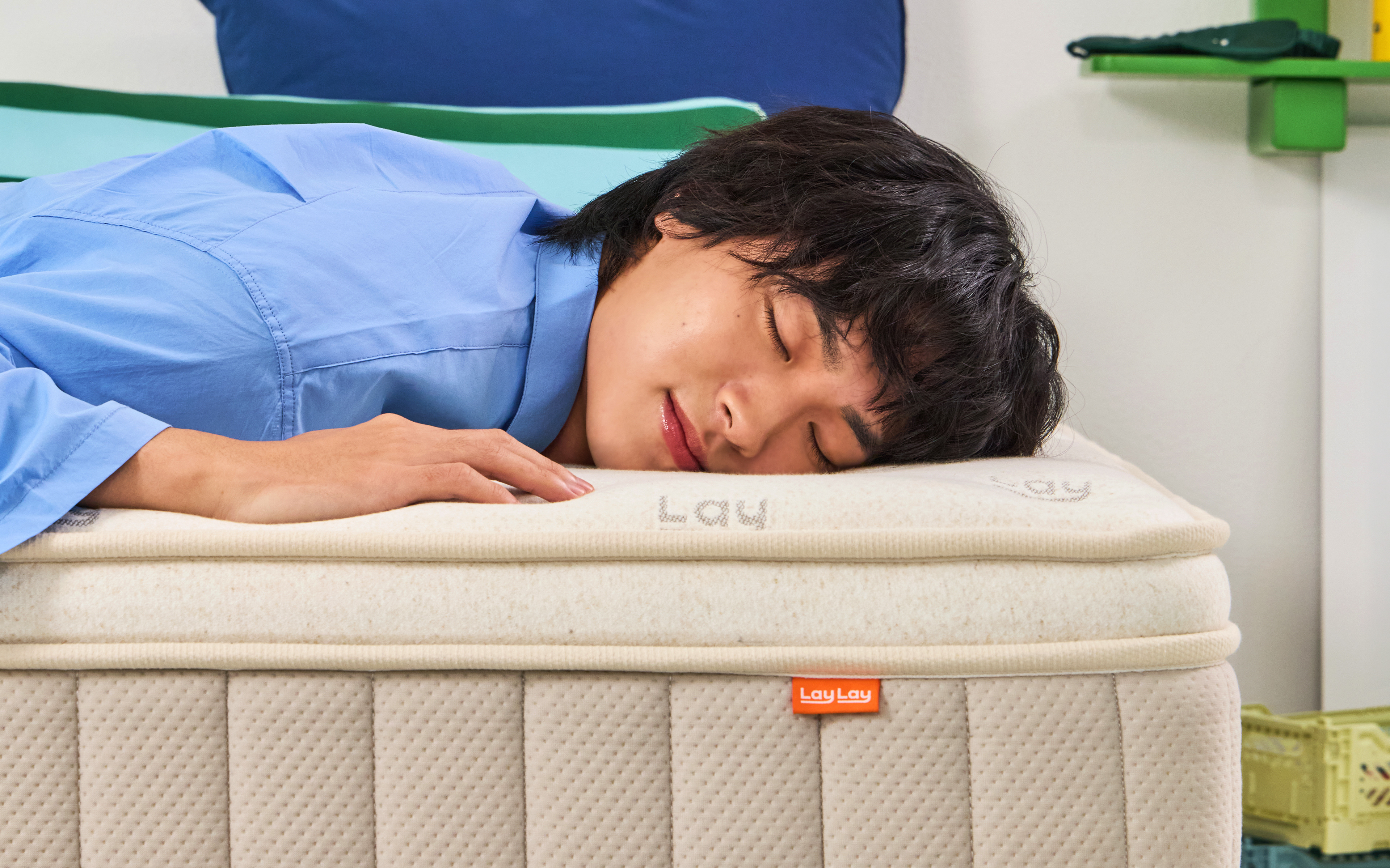
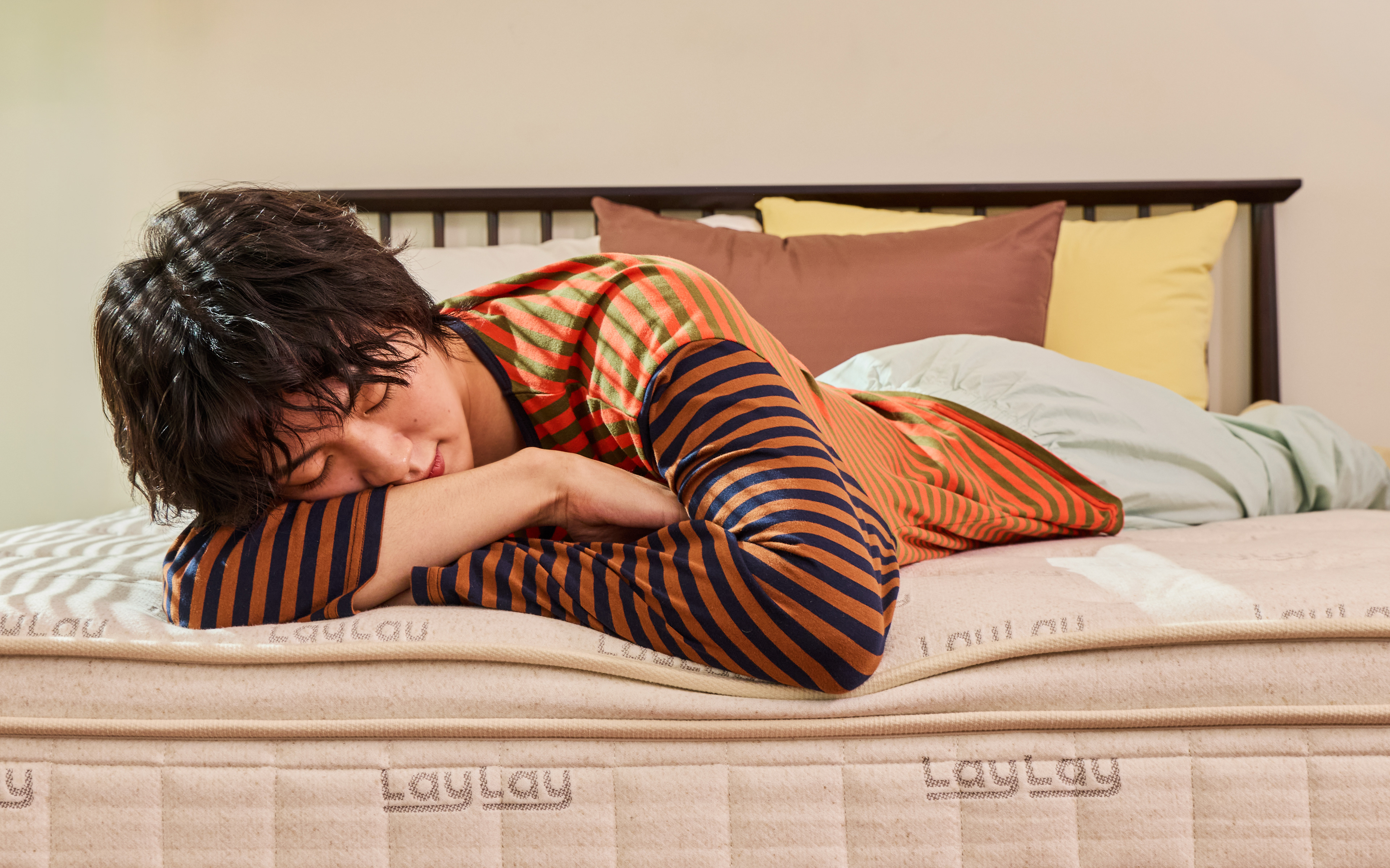
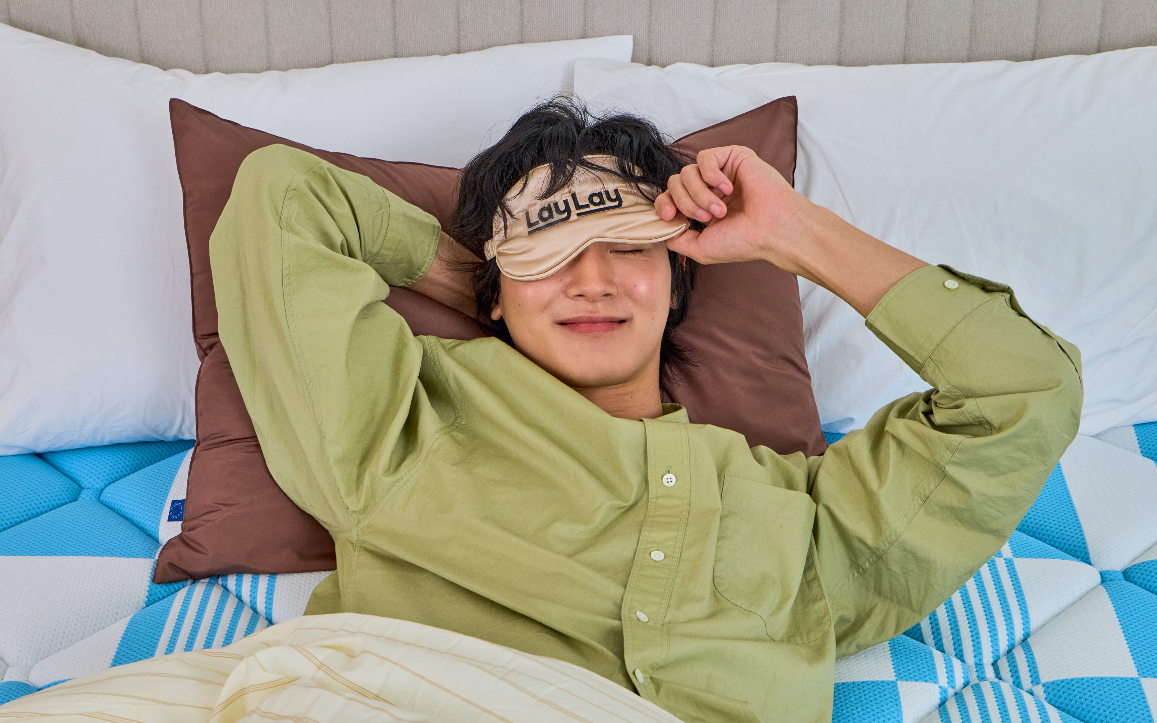
Product Design Graphic elements such as the logotype, patterns, and labels were applied to the product design so that LAYLAY’s identity could naturally continue into the actual user experience. Details such as fabric, embroidery, labels, and finishing methods were also considered to bring the brand’s sensibility into the product itself.
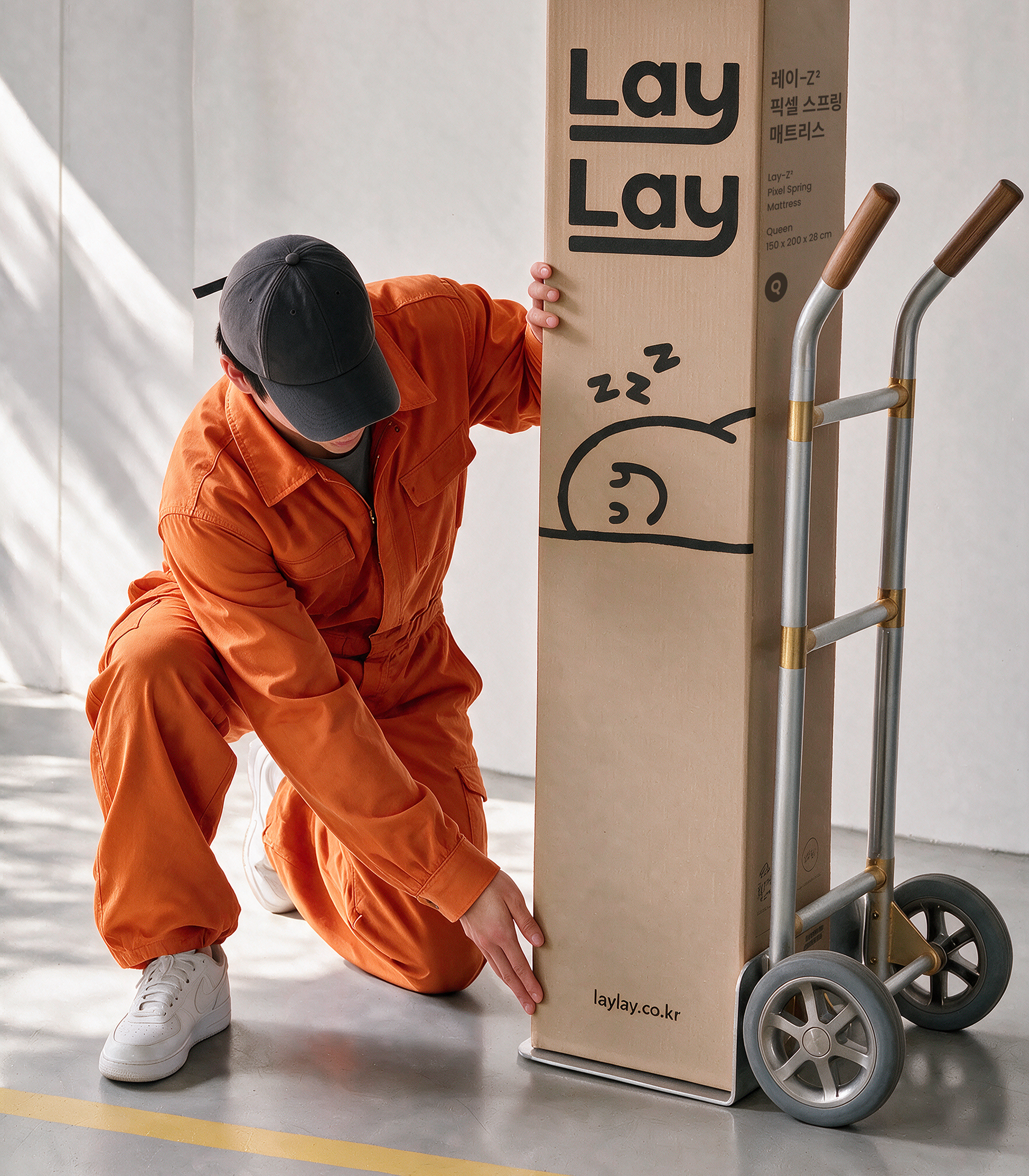
Packaging Design The packaging was developed as a key brand touchpoint that brings together various elements of the visual identity, allowing customers to experience LAYLAY’s sensorial attitude toward rest from the moment they encounter the product.
LAYLAY의 로고타입은 소문자 y의 디센더를 길게 확장한 형태를 통해, 각자의 방식으로 쉬고 머무는 타깃 세대의 다양한 라이프스타일을 포용하는 브랜드의 열린 태도를 표현하였습니다. 컬러 시스템은 기존 매트리스 브랜드의 기능적이고 기술적인 인상에서 벗어나, LAYLAY만의 산뜻하고 감각적인 라이프스타일 무드를 형성하도록 설계하였습니다. 또한 매트리스에서 누워 쉬고 머무는 다양한 장면을 위트 있는 일러스트레이션으로 표현하여, 브랜드가 지향하는 편안하고 친근한 무드를 패키지와 광고, 디지털 콘텐츠 등 다양한 접점에서 일관된 시각 경험으로 확장하였습니다. 제품 디자인에는 로고타입, 패턴, 라벨 등의 그래픽 요소를 적용해 LAYLAY의 아이덴티티가 실제 사용 경험 안에서도 자연스럽게 이어지도록 하였으며, 패브릭, 자수, 라벨, 마감 방식 등 제품을 구성하는 세부 요소까지 함께 설계하여 브랜드의 감각이 제품 디테일에 반영되도록 하였습니다. 패키지는 비주얼 아이덴티티의 다양한 요소를 통합한 주요 브랜드 접점으로 개발하여, 제품을 만나는 순간부터 LAYLAY의 감각적인 쉼의 태도를 경험할 수 있도록 하였습니다.
LAYLAY의 로고타입은 소문자 y의 디센더를 길게 확장한 형태를 통해, 각자의 방식으로 쉬고 머무는 타깃 세대의 다양한 라이프스타일을 포용하는 브랜드의 열린 태도를 표현하였습니다. 컬러 시스템은 기존 매트리스 브랜드의 기능적이고 기술적인 인상에서 벗어나, LAYLAY만의 산뜻하고 감각적인 라이프스타일 무드를 형성하도록 설계하였습니다. 또한 매트리스에서 누워 쉬고 머무는 다양한 장면을 위트 있는 일러스트레이션으로 표현하여, 브랜드가 지향하는 편안하고 친근한 무드를 패키지와 광고, 디지털 콘텐츠 등 다양한 접점에서 일관된 시각 경험으로 확장하였습니다. 제품 디자인에는 로고타입, 패턴, 라벨 등의 그래픽 요소를 적용해 LAYLAY의 아이덴티티가 실제 사용 경험 안에서도 자연스럽게 이어지도록 하였으며, 패브릭, 자수, 라벨, 마감 방식 등 제품을 구성하는 세부 요소까지 함께 설계하여 브랜드의 감각이 제품 디테일에 반영되도록 하였습니다. 패키지는 비주얼 아이덴티티의 다양한 요소를 통합한 주요 브랜드 접점으로 개발하여, 제품을 만나는 순간부터 LAYLAY의 감각적인 쉼의 태도를 경험할 수 있도록 하였습니다.

본 프로젝트의 일부 이미지는 AI(Midjourney)를 활용해 생성되었습니다. Some images in this project were generated using AI (Midjourney).
Client EIBE Inc.
Director Jaeyong Jang
Design Yoona Kim, Jongchan Yoon, Taeyul Kwon, Dohee Ham
Potography / Brand Film Team Pros
Web Development -
Director Jaeyong Jang
Design Yoona Kim, Jongchan Yoon, Taeyul Kwon, Dohee Ham
Potography / Brand Film Team Pros
Web Development -