
Communitas Archive, New York

Overview
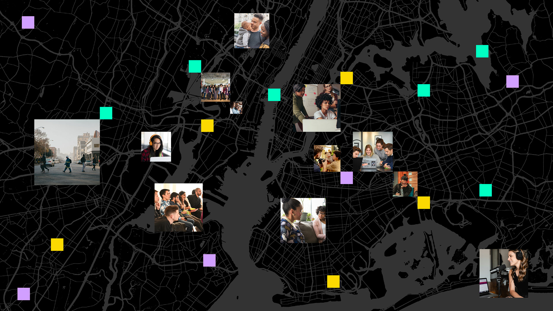
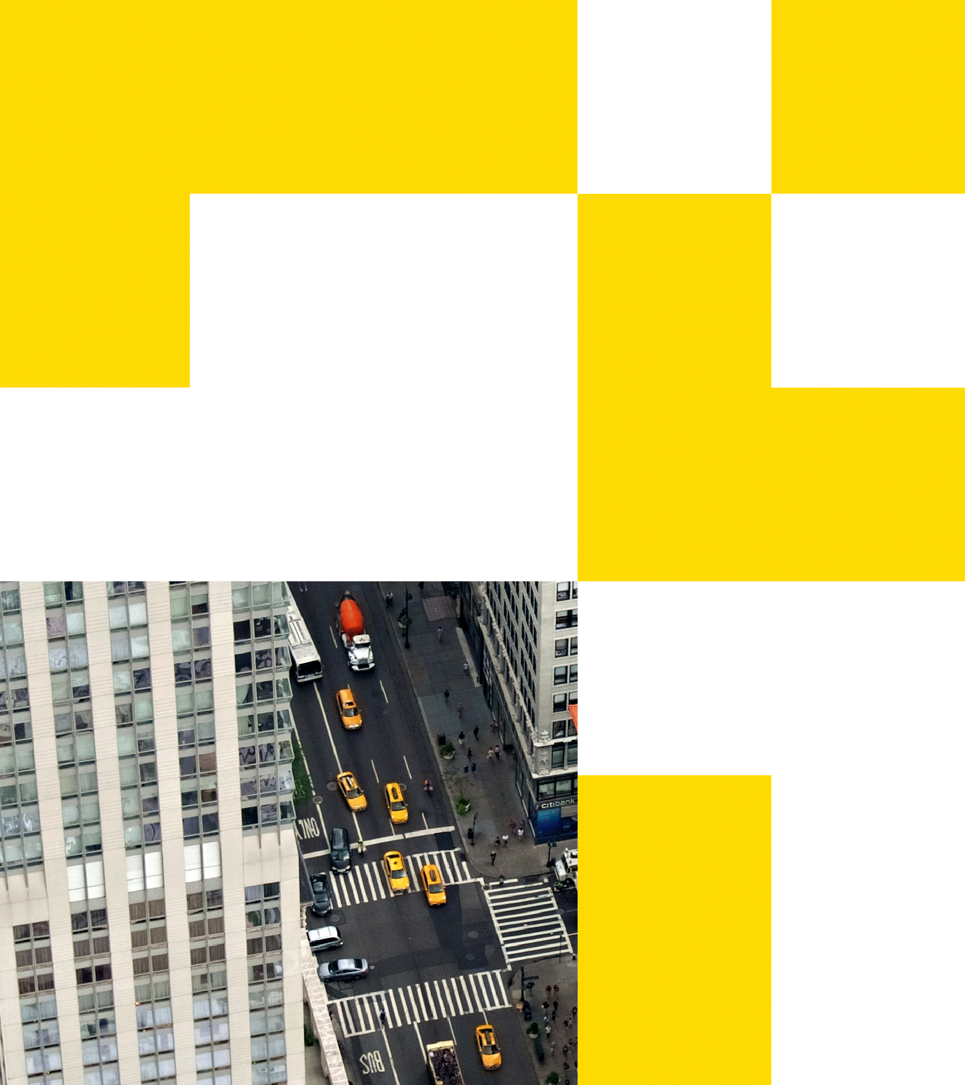
We developed the identity for Communitas Archive, a new nonprofit organization that archives and amplifies the stories of hyperlocal communities. Founded in New York City, Communitas Archive aims to capture and share the deep and diverse stories of communities and individuals around the world. We visualized hyperlocal communities through the metaphor of pixels—fragments and/or hyperlocalities of the city—and developed the brand identity based on this concept.
하이퍼로컬 커뮤니티의 이야기를 아카이브하고 널리 알리는 신규 비영리 단체, 커뮤니타스 아카이브의 아이덴티티를 개발하였습니다. 커뮤니타스 아카이브는 뉴욕시를 기반으로, 전세계 다양한 커뮤니티와 사람들의 깊고 다채로운 이야기를 공유합니다. 베이그는 도시의 작은 조각들을 픽셀로 형상화해 하이퍼로컬 커뮤니티를 시각적으로 표현하고, 이를 기반으로 아이덴티티를 전개 하였습니다.
Communitas Archive
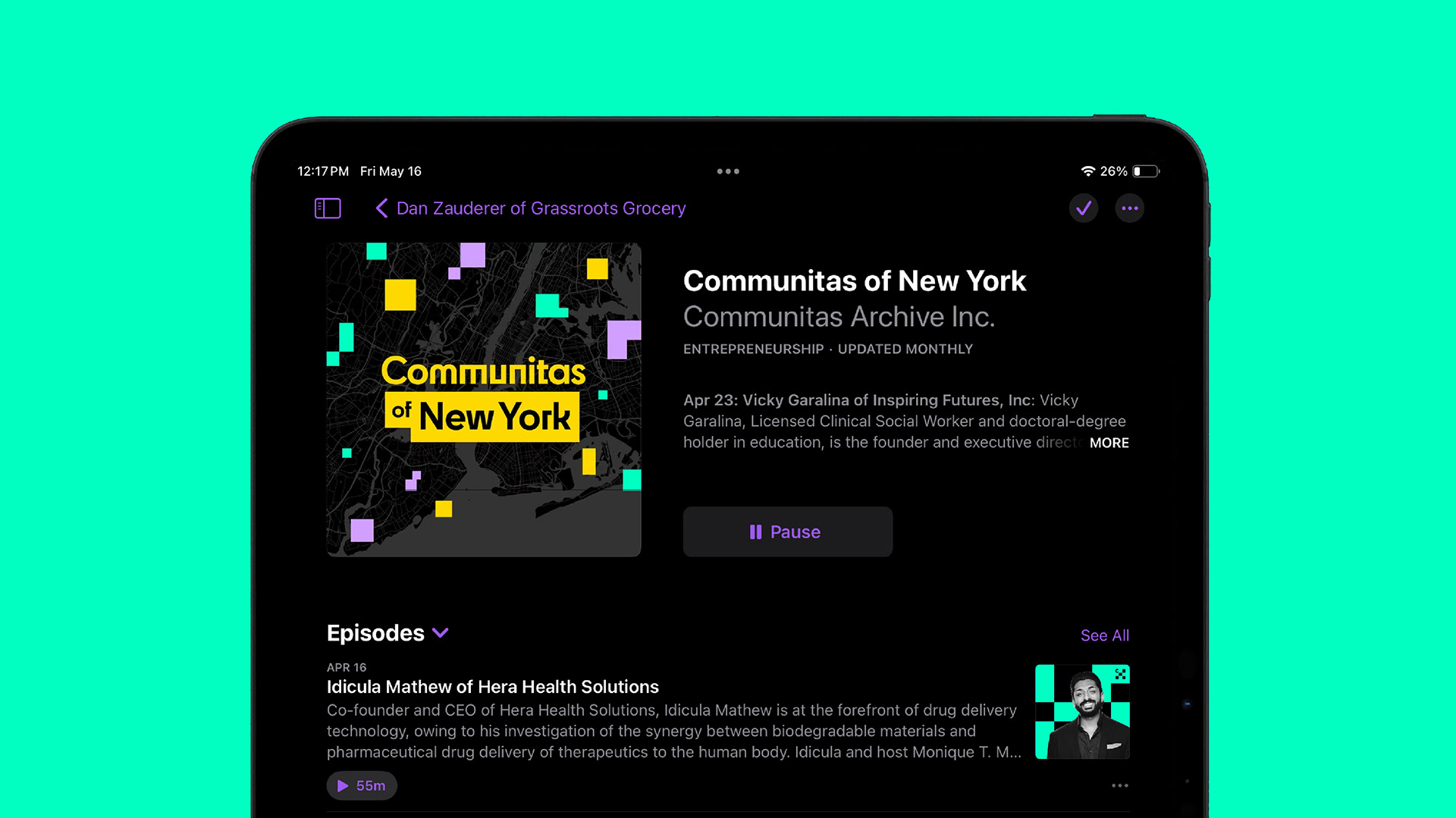
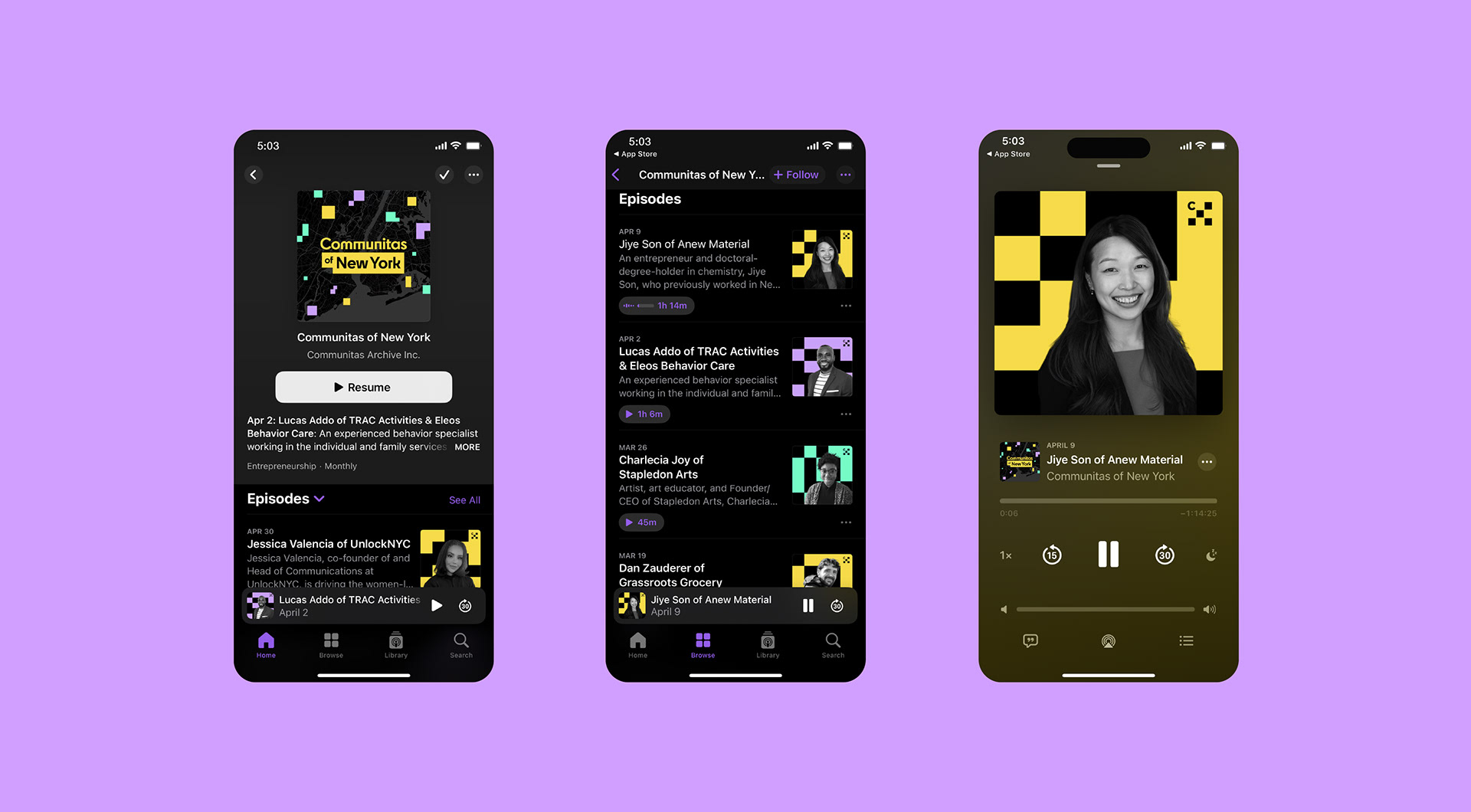
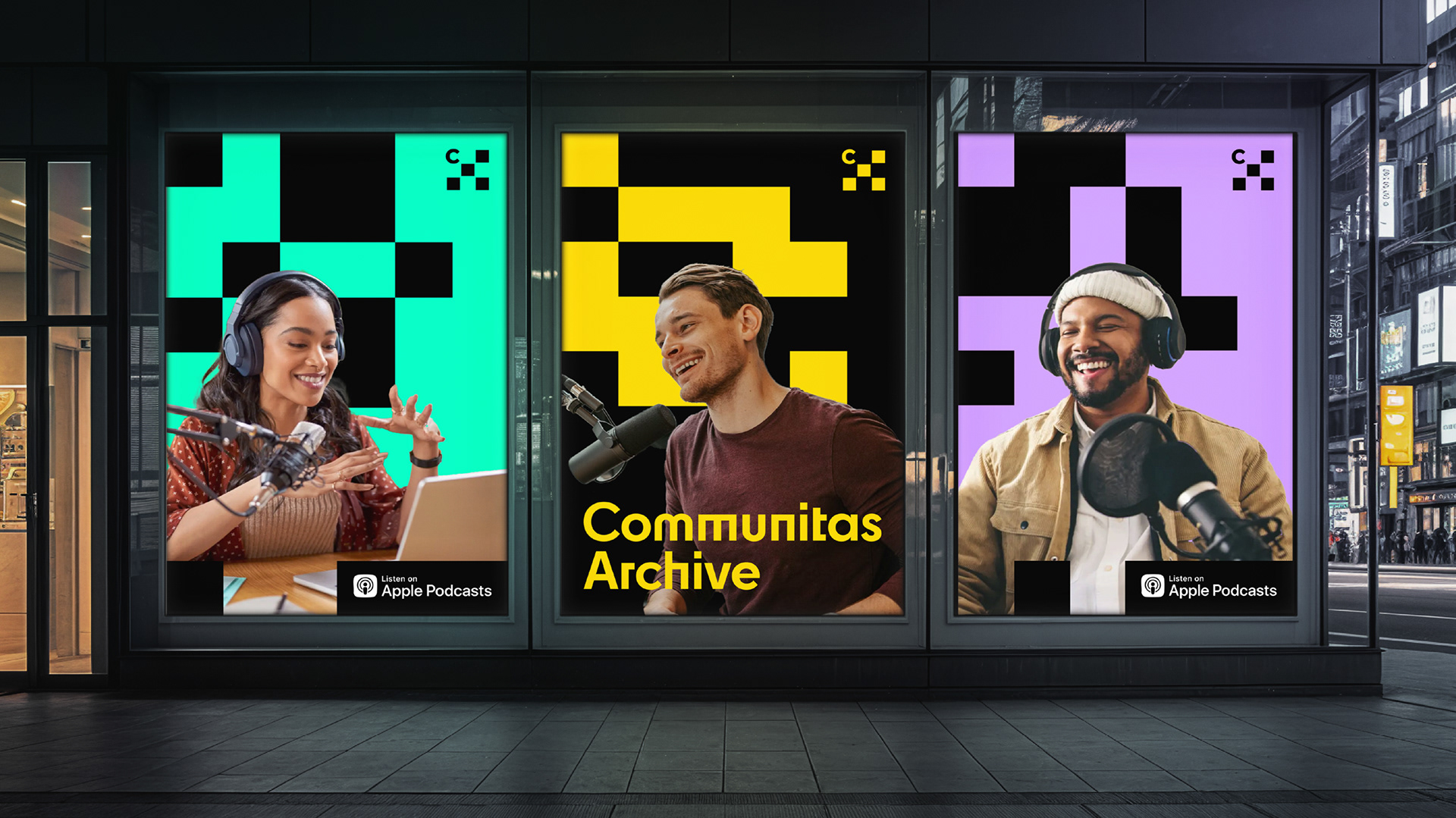
Communitas refers to an “in-between” space that transcends artificial boundaries, a concept introduced by anthropologist Victor Turner in his essay Liminality and Communitas published about 60 years ago. Communitas Archive is a nonprofit organization that witnesses cities and people around the world with love. Through urban research, publications, and exhibitions, it documents urban life and seeks to create connections as an active witness. As its first project, Communitas Archive runs the podcast Communitas of New York, sharing stories of local entrepreneurs and fostering connections with like-minded groups and external collaborators.
커뮤니타스는 인위적인 경계를 넘어선 '사이in-between의 공간'을 뜻하며, 인류학자 빅터 터너가 약 60년 전 발표한 글 Liminality and Communitas에서 사용된 개념입니다. 커뮤니타스 아카이브는 전 세계 도시와 인간을 애정을 담아 관찰하며, 연구, 출판, 전시 등을 통해 도시의 삶을 기록하고 연결을 시도하는 관찰자의 역할을 수행하는 비영리 조직입니다. 커뮤니타스 아카이브는 첫 번째 프로젝트로 팟캐스트 ‘Communitas of New York’를 운영하며, 지역 창업가들의 이야기를 공유하고, 유사한 문제의식을 가진 조직 및 외부 전문가들과의 연결을 모색하고 있습니다.

Typography & Colors
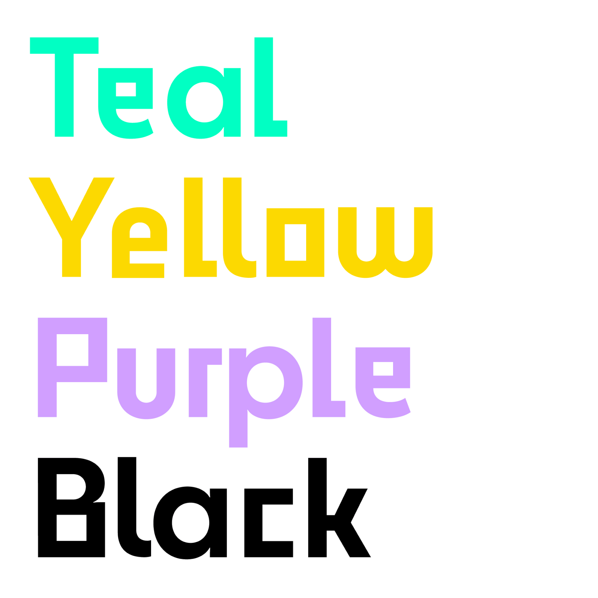
The typeface Cy, for the logo and title, features multiple forms within a single alphabet, symbolizing the diversity that Communitas Archive embraces. The brand colors also reflect this concept of in-betweenness—Teal, a color between blue and green, and Purple, between red and blue, were chosen to visually express the identity of the brand.
커뮤니타스 아카이브의 로고와 타이틀에 사용한 서체 Cy는 하나의 알파벳에 두 가지 이상의 형태를 지닌 글꼴로, 커뮤니타스 아카이브가 포용하는 다양성을 상징합니다. 컬러 또한 이 경계에 대한 의미를 담고 있습니다. 블루와 그린 사이의 Teal, 레드와 블루 사이의 Purple을 주요 색상으로 활용하여 브랜드의 정체성을 시각화하였습니다.
커뮤니타스 아카이브의 로고와 타이틀에 사용한 서체 Cy는 하나의 알파벳에 두 가지 이상의 형태를 지닌 글꼴로, 커뮤니타스 아카이브가 포용하는 다양성을 상징합니다. 컬러 또한 이 경계에 대한 의미를 담고 있습니다. 블루와 그린 사이의 Teal, 레드와 블루 사이의 Purple을 주요 색상으로 활용하여 브랜드의 정체성을 시각화하였습니다.

Symbol
The symbol of Communitas Archive represents the act of archiving hyperlocal communities, encompassing the diverse individuals and organizations within them. It serves as a strong visual identity across various applications—most notably podcast thumbnails and promotional materials—retaining its symbolic impact even at small scales.
커뮤니타스 아카이브의 심볼은 하이퍼로컬 커뮤니티와 그 안의 다양한 인물 및 조직의 이야기를 아카이빙하는 활동을 상징합니다. 이 심볼은 팟캐스트 썸네일을 비롯한 다양한 홍보물 및 콘텐츠에 적용되어, 작은 크기로도 브랜드의 강력한 아이덴티티와 상징성을 효과적으로 전달합니다.


Client Communitas Archive Inc.
Discipline Brand Identity
Director Hyeyoung Jung
Design Hyeyoung Jung, Sangyeon Byun
Discipline Brand Identity
Director Hyeyoung Jung
Design Hyeyoung Jung, Sangyeon Byun