
GoofyFoot
brand verbal & visual system, and product design for Goofy Foot
Brand Strategy / Research & Market Analysis / Verbal Identity (Brand Name, Slogan, Product Name) / Visual Identity / Product Design / Packaging Design
Brand Strategy / Research & Market Analysis / Verbal Identity (Brand Name, Slogan, Product Name) / Visual Identity / Product Design / Packaging Design
Phase 1.
Riding Our Own Way
Riding Our Own Way
룸 스프레이 만들자!
엉뚱하게 들릴지도 모를 이 한마디에서, 우리의 새로운 시도가 시작됐습니다. 디자인 컨설턴시 베이그는 클라이언트 수주 업무에만 머무르지 않고, 우리의 역량과 경험을 확장하는 다양한 프로젝트를 진행하고 있습니다. 그중 하나가 구피풋입니다.
엉뚱하게 들릴지도 모를 이 한마디에서, 우리의 새로운 시도가 시작됐습니다. 디자인 컨설턴시 베이그는 클라이언트 수주 업무에만 머무르지 않고, 우리의 역량과 경험을 확장하는 다양한 프로젝트를 진행하고 있습니다. 그중 하나가 구피풋입니다.
따라하지않고 나답게 이름의 의미
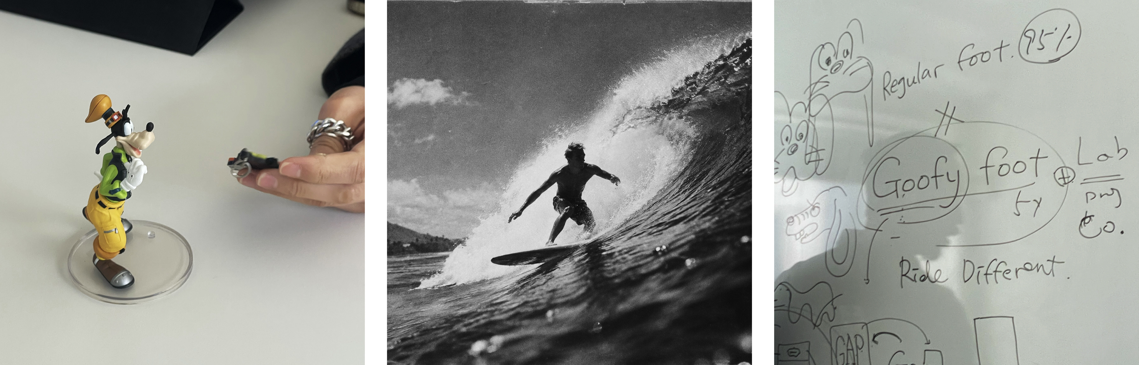
구피풋은 서핑에서 보드에 올라서는 스텝을 가리키는 용어입니다. 왼발을 앞으로 딛는 대부분의 레귤러와 반대로, 오른발을 앞으로 딛고 타는 서퍼를 구피풋이라고 부릅니다. 다수를 따르지 않고 자기만의 방식으로 파도를 타는 사람이죠. 브랜드의 이름을 구피풋으로 정한 것은 넘쳐나는 디지털 콘텐츠 속 간접 경험을 벗어나 직접 경험을 추구하기를 바라는 마음에서 시작합니다. 모두가 따라가기 급급한 시류를 비평할 수 있는 고유한 시각을 가지고, 낭만을 좇고, 약간의 반항적 기질을 가진 우리를 닮은 사람들을 위한 브랜드가 되기를 바랍니다. 그리고 디자인 에이전시의 정형에서 벗어나 베이그만의 고유성을 구축하기 위한 모든 시도를 의미합니다.
구피풋은 서핑에서 보드에 올라서는 스텝을 가리키는 용어입니다. 왼발을 앞으로 딛는 대부분의 레귤러와 반대로, 오른발을 앞으로 딛고 타는 서퍼를 구피풋이라고 부릅니다. 다수를 따르지 않고 자기만의 방식으로 파도를 타는 사람이죠. 브랜드의 이름을 구피풋으로 정한 것은 넘쳐나는 디지털 콘텐츠 속 간접 경험을 벗어나 직접 경험을 추구하기를 바라는 마음에서 시작합니다. 모두가 따라가기 급급한 시류를 비평할 수 있는 고유한 시각을 가지고, 낭만을 좇고, 약간의 반항적 기질을 가진 우리를 닮은 사람들을 위한 브랜드가 되기를 바랍니다. 그리고 디자인 에이전시의 정형에서 벗어나 베이그만의 고유성을 구축하기 위한 모든 시도를 의미합니다.
Ride Different 무엇을 만들 것인가
구피풋은 처음부터 향을 목표로 기획된 것은 아니었습니다. 우리가 스튜디오에서 루틴하게 사용하는, 일상을 함께할 수 있는 제품의 카테고리에서 시작했습니다. 구피풋은 룸 스프레이가 아닐 수도 있었습니다. 구피풋의 다음 아이템은 향이 아닐 수 있습니다. 우리는 다양한 아이템 중에서 향을 처음으로 선택합니다. 그리고 향을 만들기보다 무드를 만든다는 생각으로 접근합니다. 브랜드를 전개하는 모든 과정에서 브랜드 철학 Ride Different를 상기하며 한 발 한 발 내디뎠습니다.
구피풋은 처음부터 향을 목표로 기획된 것은 아니었습니다. 우리가 스튜디오에서 루틴하게 사용하는, 일상을 함께할 수 있는 제품의 카테고리에서 시작했습니다. 구피풋은 룸 스프레이가 아닐 수도 있었습니다. 구피풋의 다음 아이템은 향이 아닐 수 있습니다. 우리는 다양한 아이템 중에서 향을 처음으로 선택합니다. 그리고 향을 만들기보다 무드를 만든다는 생각으로 접근합니다. 브랜드를 전개하는 모든 과정에서 브랜드 철학 Ride Different를 상기하며 한 발 한 발 내디뎠습니다.
Let's make our fragrance!
It began with one line that sounds like a joke. VEIG doesn't stay inside client commissions alone — we run projects that stretch what we know how to do. Goofy Foot is one of them.
It began with one line that sounds like a joke. VEIG doesn't stay inside client commissions alone — we run projects that stretch what we know how to do. Goofy Foot is one of them.
Our own way what the name means
In surfing, "goofy foot" describes a stance. Where most surfers ride regular, left foot forward, a goofy footer leads with the right. Someone who takes the wave their own way instead of the way most people do. We chose the name hoping for direct experience, over the secondhand kind that fills our screens. A brand for people like us — people with a point of view on the trend everyone else is chasing, people who follow romance, people with a little defiance in them. And a name for every attempt to step outside the standard shape of a design agency and build something that is ours.
In surfing, "goofy foot" describes a stance. Where most surfers ride regular, left foot forward, a goofy footer leads with the right. Someone who takes the wave their own way instead of the way most people do. We chose the name hoping for direct experience, over the secondhand kind that fills our screens. A brand for people like us — people with a point of view on the trend everyone else is chasing, people who follow romance, people with a little defiance in them. And a name for every attempt to step outside the standard shape of a design agency and build something that is ours.
Ride Different what to make
Goofy Foot was not planned around fragrance. It began with a category: something we use in the studio every day, something that lives alongside us. It might not have been a room spray. The next one might not be a scent at all. Of the options, we chose scent first. And we approached it as making a mood rather than making a fragrance. At every step of building the brand, we came back to Ride Different.
Goofy Foot was not planned around fragrance. It began with a category: something we use in the studio every day, something that lives alongside us. It might not have been a room spray. The next one might not be a scent at all. Of the options, we chose scent first. And we approached it as making a mood rather than making a fragrance. At every step of building the brand, we came back to Ride Different.
Phase 2.
The Work Outside Design
The Work Outside Design
바닷바람을 맞고 자란 소나무 어떤 향을 개발할 것인가
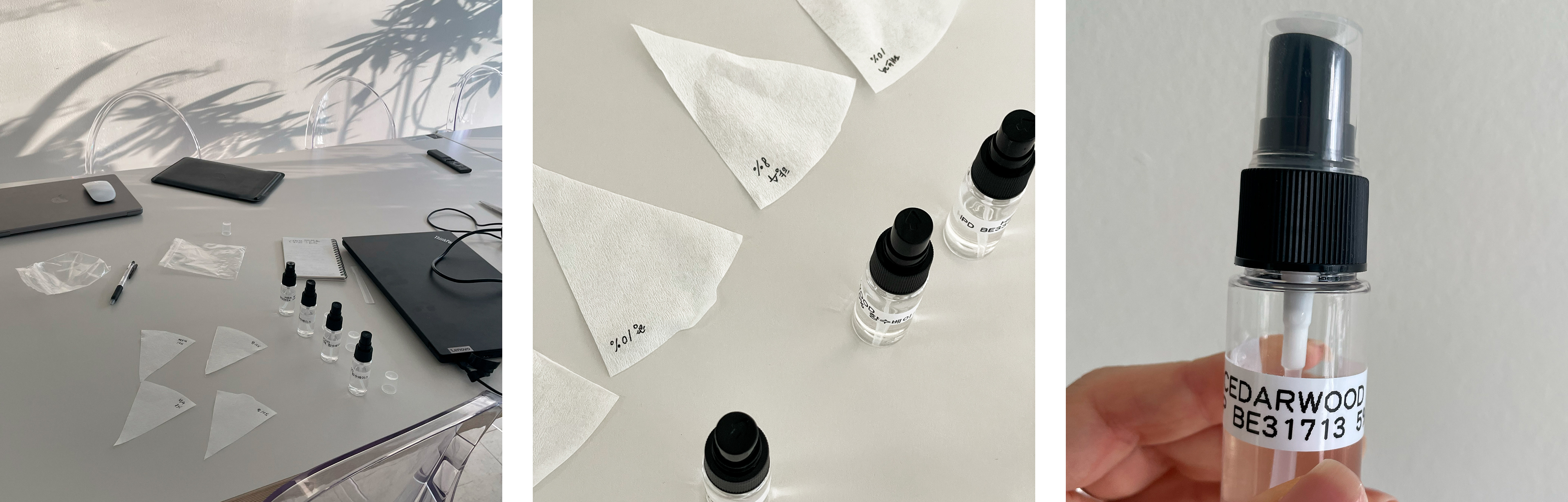
향을 개발하기로 한 후 우리가 정한 방향은 두 가지였습니다. 매일 머무는 도심 속 사무 공간을 자연의 무드로 전환할 수 있는 향일 것. 그리고 독창적이기 위해 우리나라의 고유성이 담긴 한국적인 향일 것. 그래서 우리는 동해의 바닷바람을 머금은 소나무를 생각했습니다. 팀원들 모두 처음 시도해보는 조향이었습니다. 정답을 알고 시작한 것이 아니었기에 방법은 하나뿐이었습니다. 수없이 많은 샘플을 만들고, 향을 확인하고, 다시 조율하는 것. 기준은 분명했습니다. 익숙한 향이어도 안 되고, 너무 강하거나 부담스러워도 안 된다. 그 기준으로 수없이 의심하며 조율해 온 결과물에는 정말로 흔한 히노키와는 다른, 알싸한 한국 소나무의 향이 담겨 있습니다.
향을 개발하기로 한 후 우리가 정한 방향은 두 가지였습니다. 매일 머무는 도심 속 사무 공간을 자연의 무드로 전환할 수 있는 향일 것. 그리고 독창적이기 위해 우리나라의 고유성이 담긴 한국적인 향일 것. 그래서 우리는 동해의 바닷바람을 머금은 소나무를 생각했습니다. 팀원들 모두 처음 시도해보는 조향이었습니다. 정답을 알고 시작한 것이 아니었기에 방법은 하나뿐이었습니다. 수없이 많은 샘플을 만들고, 향을 확인하고, 다시 조율하는 것. 기준은 분명했습니다. 익숙한 향이어도 안 되고, 너무 강하거나 부담스러워도 안 된다. 그 기준으로 수없이 의심하며 조율해 온 결과물에는 정말로 흔한 히노키와는 다른, 알싸한 한국 소나무의 향이 담겨 있습니다.
Pine raised on sea wind what scent to build
We set two directions. A scent that turns a city office into something closer to nature. And, to be original, a scent carrying something distinctly Korean. So we thought of pine holding the wind of the East Sea. None of us had made a fragrance before. We hadn't started with the answer, so there was only one way through: build sample after sample, smell, adjust, repeat. The criteria were clear. It could not smell familiar, and it could not be heavy or overbearing. What came out of all that doubting and adjusting is the sharp, resinous scent of Korean pine — nothing like the hinoki you find everywhere.
We set two directions. A scent that turns a city office into something closer to nature. And, to be original, a scent carrying something distinctly Korean. So we thought of pine holding the wind of the East Sea. None of us had made a fragrance before. We hadn't started with the answer, so there was only one way through: build sample after sample, smell, adjust, repeat. The criteria were clear. It could not smell familiar, and it could not be heavy or overbearing. What came out of all that doubting and adjusting is the sharp, resinous scent of Korean pine — nothing like the hinoki you find everywhere.
나무가 아닌 매미 무엇을 시각화 할 것인가
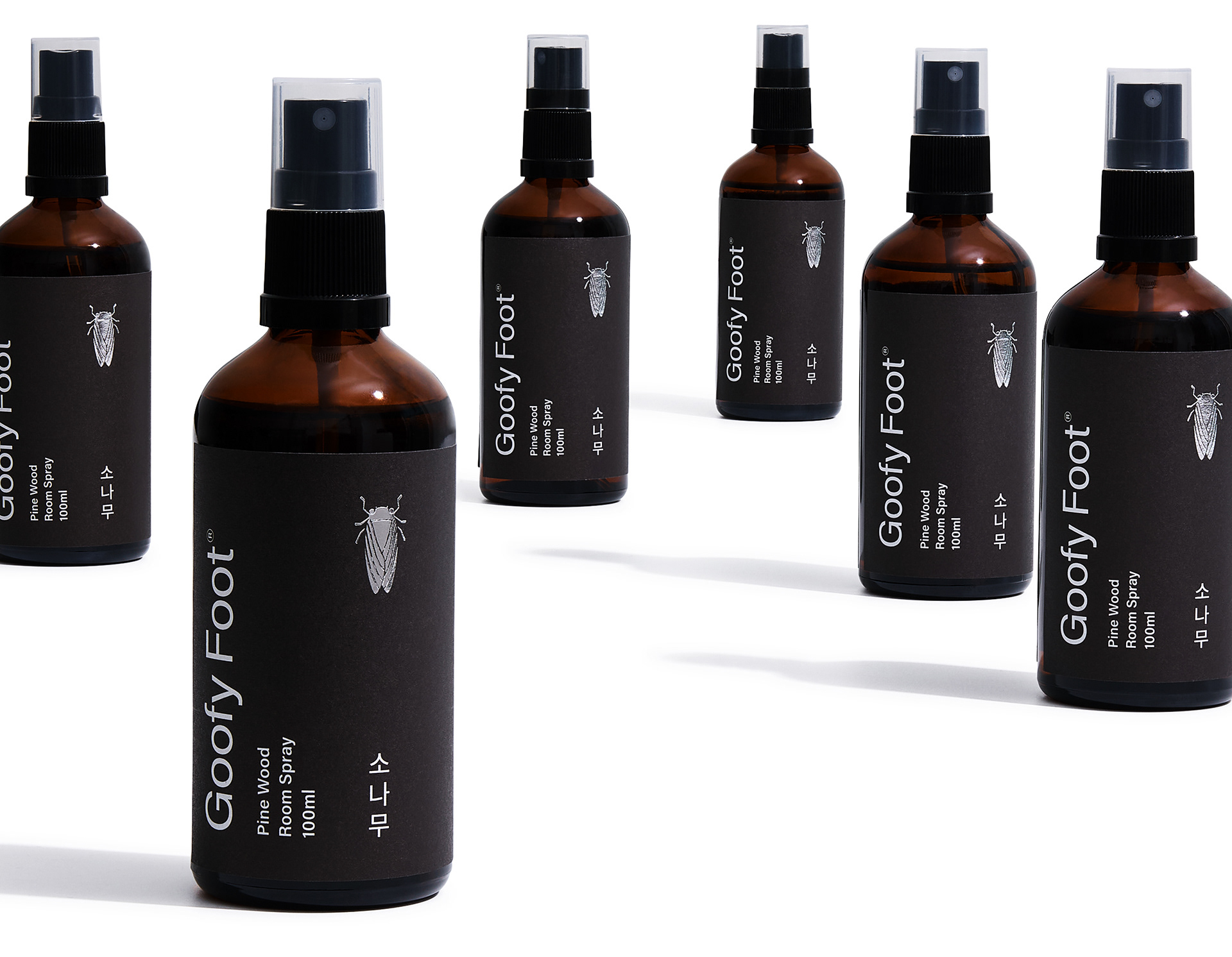
구피풋의 첫 아이템인 소나무 룸 스프레이를 시각화하는 것은 예상대로 쉽지 않았습니다. 브랜드의 얼굴을 시각화하는 게 우리의 일이었으니까요. 이번에는 방향을 정해주는 브리프도, 판단을 맡길 클라이언트도 없었습니다. 기준을 세우는 일부터 검증하는 일까지 전부 우리 몫이었고, 그래서 가능한 모든 길을 다 열어본 뒤에야 답에 도착했습니다. 나무의 향을 담은 향 제품들은 으레 나무의 그래픽 패턴, 나무 소재, 나무의 컬러를 활용합니다. 우리는 그 정형을 벗어나기 위해 수많은 테스트를 했고, 우리가 이른 결론은 나무가 아닌 매미, 그리고 깔끔하고 기본적인 형태의 유리병이었습니다. 매미는 나무의 진액을 빨아내고 한여름을 가득 채워 울어댑니다. 나무의 후각과 퍼져나가는 청각, 그 공감각을 한 번에 담아내는 더할 나위 없는 상징물이었죠. 이렇게 구피풋의 매미는 정형적이지도 과하지도 않게, 일상 환경 속 어디에 두어도 좋은 룸 스프레이 패키징 한쪽에 큰 뜻을 담고 조용히 자리 잡았습니다.
구피풋의 첫 아이템인 소나무 룸 스프레이를 시각화하는 것은 예상대로 쉽지 않았습니다. 브랜드의 얼굴을 시각화하는 게 우리의 일이었으니까요. 이번에는 방향을 정해주는 브리프도, 판단을 맡길 클라이언트도 없었습니다. 기준을 세우는 일부터 검증하는 일까지 전부 우리 몫이었고, 그래서 가능한 모든 길을 다 열어본 뒤에야 답에 도착했습니다. 나무의 향을 담은 향 제품들은 으레 나무의 그래픽 패턴, 나무 소재, 나무의 컬러를 활용합니다. 우리는 그 정형을 벗어나기 위해 수많은 테스트를 했고, 우리가 이른 결론은 나무가 아닌 매미, 그리고 깔끔하고 기본적인 형태의 유리병이었습니다. 매미는 나무의 진액을 빨아내고 한여름을 가득 채워 울어댑니다. 나무의 후각과 퍼져나가는 청각, 그 공감각을 한 번에 담아내는 더할 나위 없는 상징물이었죠. 이렇게 구피풋의 매미는 정형적이지도 과하지도 않게, 일상 환경 속 어디에 두어도 좋은 룸 스프레이 패키징 한쪽에 큰 뜻을 담고 조용히 자리 잡았습니다.
A cicada, not a tree what to visualize
Giving the pine room spray a face was every bit as hard as we expected. Visualizing brands is what we do for a living. But this time there was no brief pointing the way, and no client to hand the judgment to. Setting the criteria and validating them were both ours, so we opened every possible route before we arrived at an answer. Wood-scented products reach for wood: wood patterns, wood materials, wood colors. We ran test after test to get out of that shape, and what we arrived at was a cicada — and a plain glass bottle. Cicadas draw sap from trees and fill the whole of summer with sound. The scent of a tree and the sound spreading from it, held in a single symbol. So the cicada sits quietly on one side of the packaging, neither conventional nor loud, at home anywhere you put it.
Giving the pine room spray a face was every bit as hard as we expected. Visualizing brands is what we do for a living. But this time there was no brief pointing the way, and no client to hand the judgment to. Setting the criteria and validating them were both ours, so we opened every possible route before we arrived at an answer. Wood-scented products reach for wood: wood patterns, wood materials, wood colors. We ran test after test to get out of that shape, and what we arrived at was a cicada — and a plain glass bottle. Cicadas draw sap from trees and fill the whole of summer with sound. The scent of a tree and the sound spreading from it, held in a single symbol. So the cicada sits quietly on one side of the packaging, neither conventional nor loud, at home anywhere you put it.
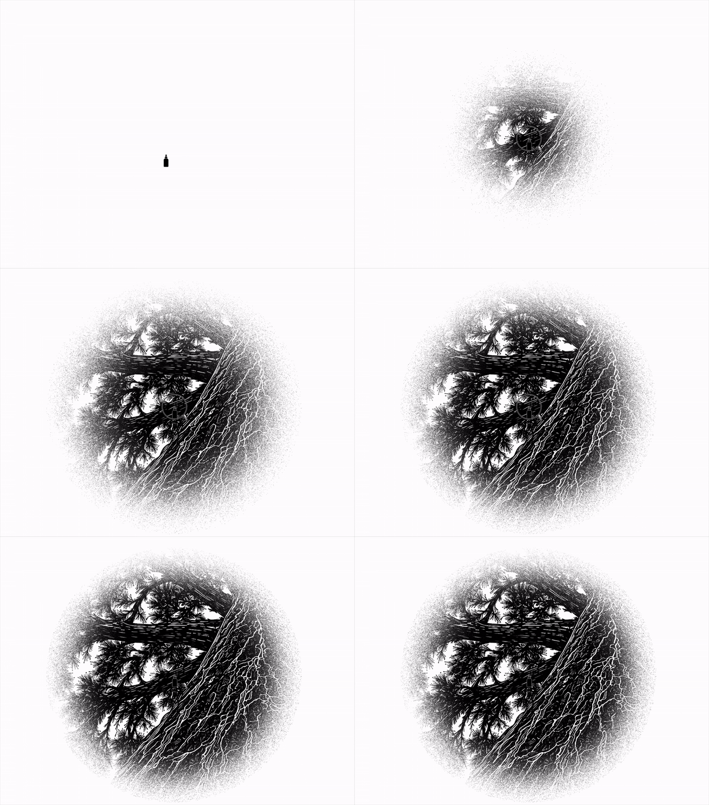
스크린에 분사하는 스프레이 어떤 첫 인상, 어떤 경험을 줄 것인가
향이 제작되는 기간 동안 우리는 사람들이 구피풋을 처음 마주하게 될 매체를 정했습니다. 가장 사람이 많이 몰리는 인스타그램을 피하고, 브랜드 사이트를 개발했습니다. 오프라인 매장 없이 시작한 룸 스프레이 브랜드를 새롭게 각인시키려면 기억에 남는 인터랙션이 필요했습니다. 매미 소리가 가득한 백색의 랜딩 페이지에서 화면을 클릭하면 스프레이가 분사되며 소나무가 나타납니다. 직접 향이 담긴 병을 들고 공간에 뿌려서 소나무를 감각하는 경험을, 그대로 스크린에 구현했습니다. 향을 분사하는 경험을 시각화한 구피풋의 웹사이트, 한 번쯤 방문해서 직접 경험해보시기 바랍니다.
향이 제작되는 기간 동안 우리는 사람들이 구피풋을 처음 마주하게 될 매체를 정했습니다. 가장 사람이 많이 몰리는 인스타그램을 피하고, 브랜드 사이트를 개발했습니다. 오프라인 매장 없이 시작한 룸 스프레이 브랜드를 새롭게 각인시키려면 기억에 남는 인터랙션이 필요했습니다. 매미 소리가 가득한 백색의 랜딩 페이지에서 화면을 클릭하면 스프레이가 분사되며 소나무가 나타납니다. 직접 향이 담긴 병을 들고 공간에 뿌려서 소나무를 감각하는 경험을, 그대로 스크린에 구현했습니다. 향을 분사하는 경험을 시각화한 구피풋의 웹사이트, 한 번쯤 방문해서 직접 경험해보시기 바랍니다.
도전의 기록
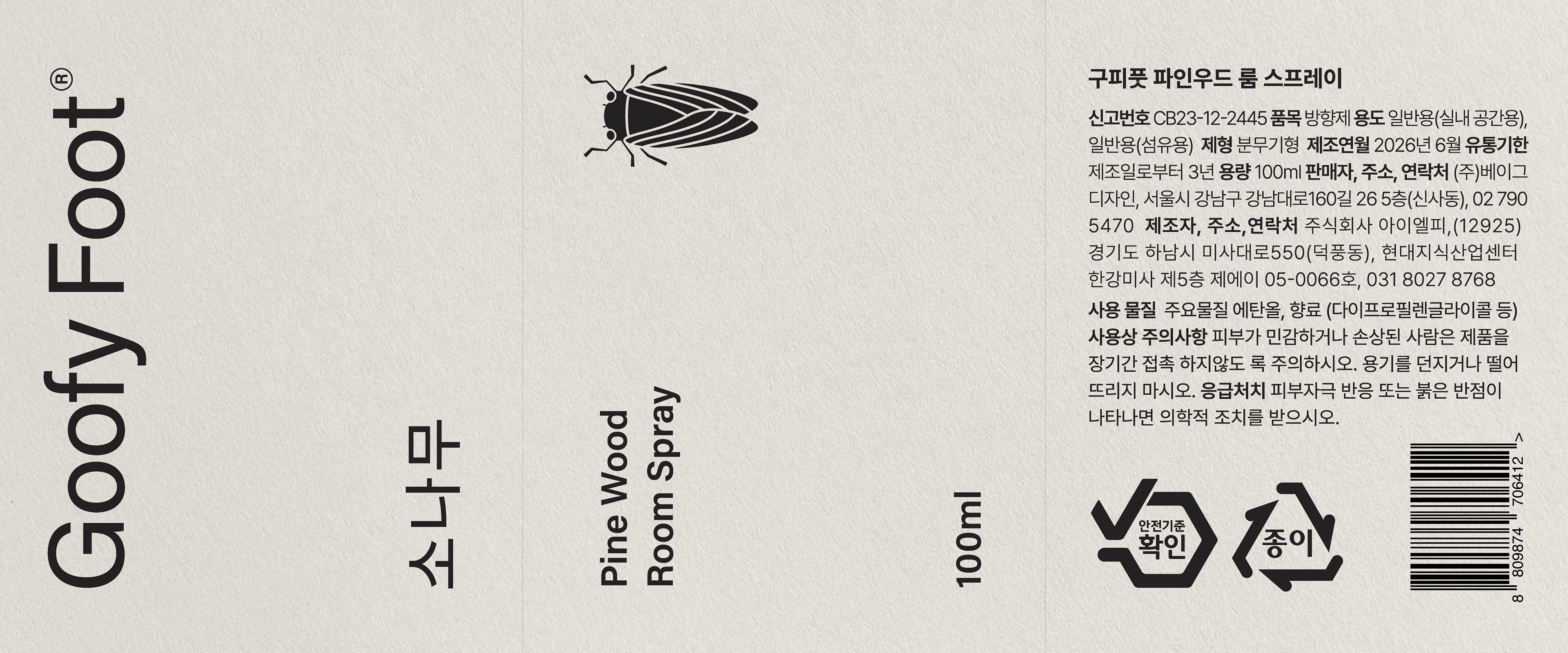
긴 여정의 끝에 완성된 룸 스프레이 제품을 받아 들고 생각했습니다. 그리고 실제 판매를 위한 모든 절차를 마쳤지만 결국 우리는 구피풋을 판매하지 않기로 합니다. 구피풋의 첫 제품은 판매되기보다 이 이야기를 나눌 수 있는 매체가 되면 좋겠다고 생각했기 때문입니다. 이름을 짓고, 향을 만들고, 병을 고르고, 사이트를 열기까지. 클라이언트에게 제안해 온 모든 단계를 이번에는 우리가 직접 검수했습니다. 그리고 그 길에서 마주한 것들은 대부분 디자인 바깥에 있었습니다. 향을 몇 번이고 다시 맡으며 기준을 지켜내는 시간, 제품에 반드시 들어가야 하는 표기 규정, 만들고 난 뒤에야 비로소 시작되는 판매의 문제까지. 디자인이 전체 과정의 일부라는 사실은 알고 있었습니다. 다만 그 일부가 어디에 놓이고 앞뒤의 어떤 조건과 맞물릴 때 비로소 작동하는지는, 직접 통과해본 뒤에야 체감할 수 있었습니다.
긴 여정의 끝에 완성된 룸 스프레이 제품을 받아 들고 생각했습니다. 그리고 실제 판매를 위한 모든 절차를 마쳤지만 결국 우리는 구피풋을 판매하지 않기로 합니다. 구피풋의 첫 제품은 판매되기보다 이 이야기를 나눌 수 있는 매체가 되면 좋겠다고 생각했기 때문입니다. 이름을 짓고, 향을 만들고, 병을 고르고, 사이트를 열기까지. 클라이언트에게 제안해 온 모든 단계를 이번에는 우리가 직접 검수했습니다. 그리고 그 길에서 마주한 것들은 대부분 디자인 바깥에 있었습니다. 향을 몇 번이고 다시 맡으며 기준을 지켜내는 시간, 제품에 반드시 들어가야 하는 표기 규정, 만들고 난 뒤에야 비로소 시작되는 판매의 문제까지. 디자인이 전체 과정의 일부라는 사실은 알고 있었습니다. 다만 그 일부가 어디에 놓이고 앞뒤의 어떤 조건과 맞물릴 때 비로소 작동하는지는, 직접 통과해본 뒤에야 체감할 수 있었습니다.
그래서 우리는 이제 클라이언트의 자리에서 한 번 더 생각합니다. 이 결정이 내려지면 그다음에 무엇이 따라오는지, 어떤 조건이 이 결정을 가로막을 수 있는지, 무엇을 미리 준비해두어야 이 디자인이 끝까지 살아남는지. 좋은 디자인을 제안하는 일과 그 디자인이 실제로 작동하게 만드는 일은 다르다는 것을, 우리 손으로 직접 통과하며 확인했습니다. 구피풋은 그 확인의 기록입니다.
A record of the attempt
We held the finished product and thought about it. Every step required to sell it was complete. And we decided not to sell Goofy Foot. We wanted the first product to be a medium for this story rather than a thing on a shelf. Naming it, building the scent, choosing the bottle, opening the site — every stage we have proposed to clients, we ran and inspected ourselves this time. And most of what we met along the way sat outside design. The hours of returning to the scent to hold our own standard. The labeling requirements a product has to carry. The problem of selling, which only begins once the thing exists. We knew design was one part of the process. What we could only feel by going through it is where that part sits, and which conditions in front of it and behind it have to line up before it works at all.
We held the finished product and thought about it. Every step required to sell it was complete. And we decided not to sell Goofy Foot. We wanted the first product to be a medium for this story rather than a thing on a shelf. Naming it, building the scent, choosing the bottle, opening the site — every stage we have proposed to clients, we ran and inspected ourselves this time. And most of what we met along the way sat outside design. The hours of returning to the scent to hold our own standard. The labeling requirements a product has to carry. The problem of selling, which only begins once the thing exists. We knew design was one part of the process. What we could only feel by going through it is where that part sits, and which conditions in front of it and behind it have to line up before it works at all.
So now we think once more from the client's side. What follows once this decision is made. What conditions could block it. What has to be prepared in advance for this design to survive to the end. Proposing good design and making that design work are two different jobs — and we confirmed it with our own hands. Goofy Foot is the record of that.

Director Jaeyong Jang
Identity Design Hyeyoung Jung, Yoona Kim, Sol Kim
Packaging Design Hyeyoung Jung, Sol Kim, Jongchan Yoon, Taeyul Kwon
Website/Motion/3D Design Jongchan Yoon, Taeyul Kwon
Identity Design Hyeyoung Jung, Yoona Kim, Sol Kim
Packaging Design Hyeyoung Jung, Sol Kim, Jongchan Yoon, Taeyul Kwon
Website/Motion/3D Design Jongchan Yoon, Taeyul Kwon