
HiMSEN, Creating a powerful new identity
Challenge Faced
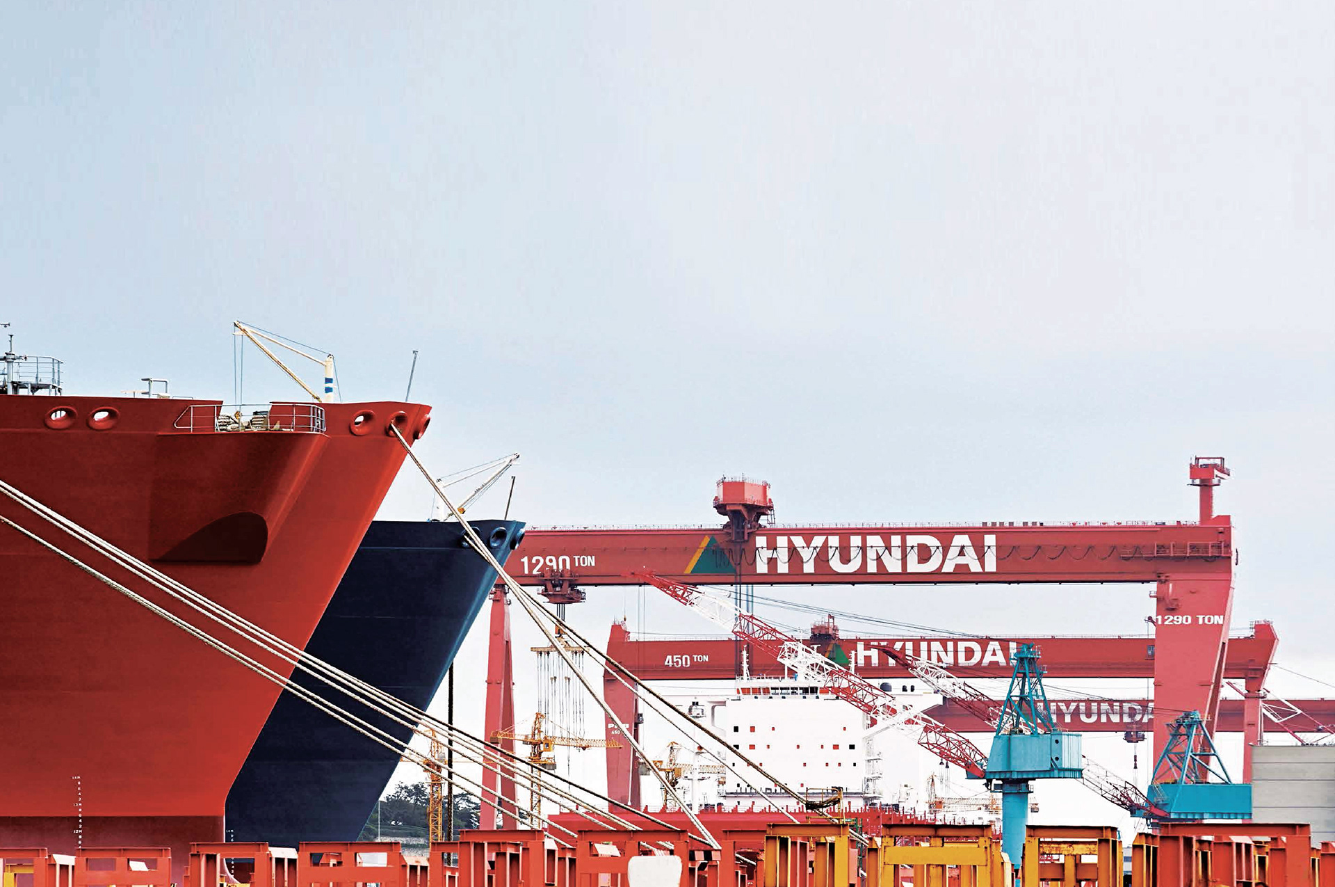
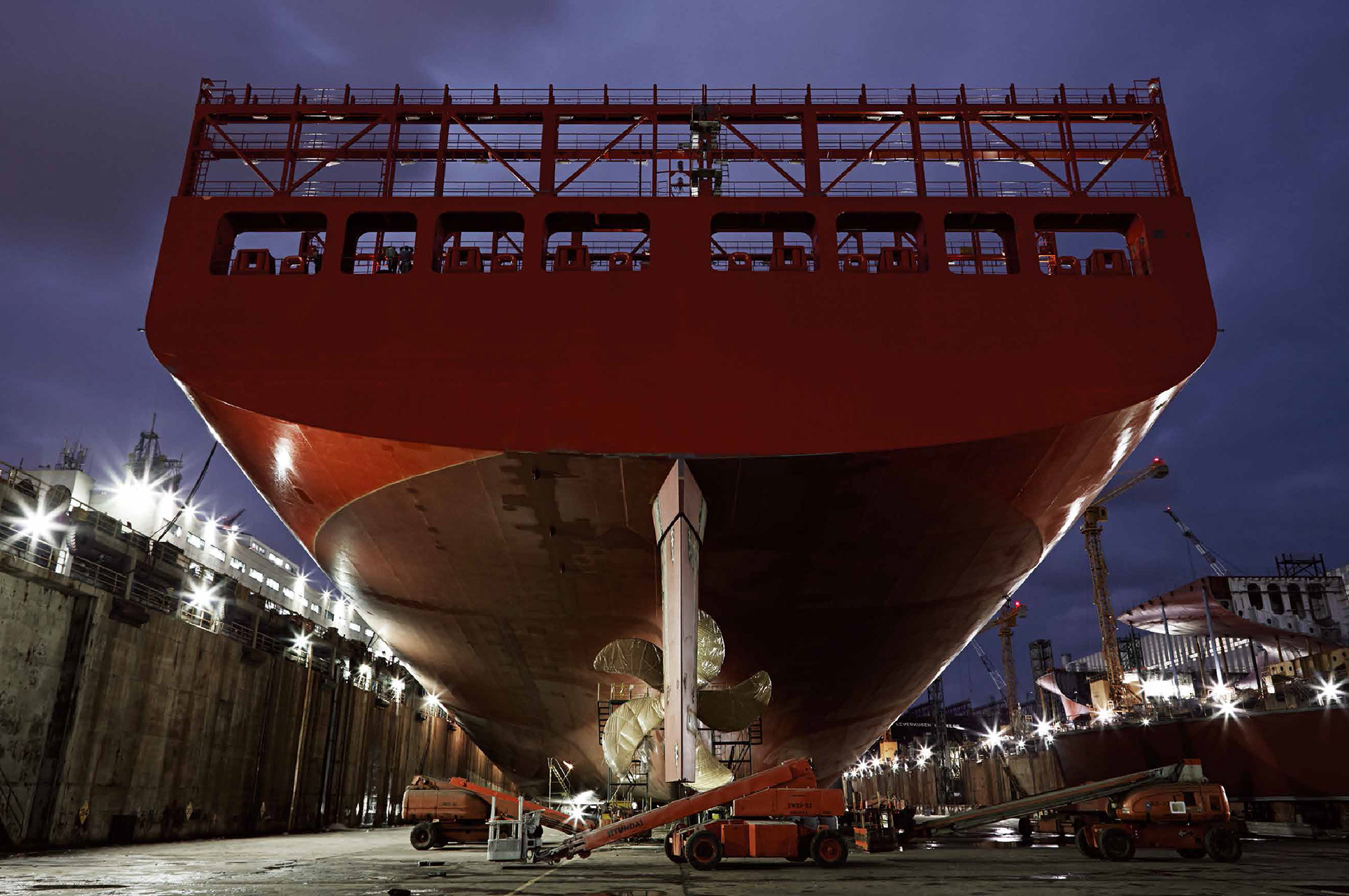
As a world-famous engine brand that takes up 35% of the world’s market share in diesel engines for marine and stationary purposes, it was necessary for Hyundai Heavy Industries-Engine & Machinery Division to have its own branding system. It should meet the visions of Hyundai Heavy Industries-Engine & Machinery Division that covers Propulsion System, Marine Eco Machinery & Packaged Power Stations, Stationary Engine Power Plants globally.
현대중공업 엔진기계사업본부는 세계 대형엔진시장의 약 35%를 점유하고 있는 세계 최대의 엔진제작사입니다. 추진시스템을 비롯하여 박용 친환경 제품 및 이동식 발전 설비, 육상 엔진발전 설비를 국내외 시장에 공급하여 미래 성장 동력 산업을 위한 기반을 준비하는 현대중공업 엔진기계사업본부의 비전에 부합하는 새로운 브랜드 이미지와 아이덴티티 운용을 위한 시스템, 가이드가 필요했습니다.
현대중공업 엔진기계사업본부는 세계 대형엔진시장의 약 35%를 점유하고 있는 세계 최대의 엔진제작사입니다. 추진시스템을 비롯하여 박용 친환경 제품 및 이동식 발전 설비, 육상 엔진발전 설비를 국내외 시장에 공급하여 미래 성장 동력 산업을 위한 기반을 준비하는 현대중공업 엔진기계사업본부의 비전에 부합하는 새로운 브랜드 이미지와 아이덴티티 운용을 위한 시스템, 가이드가 필요했습니다.

Unique Design
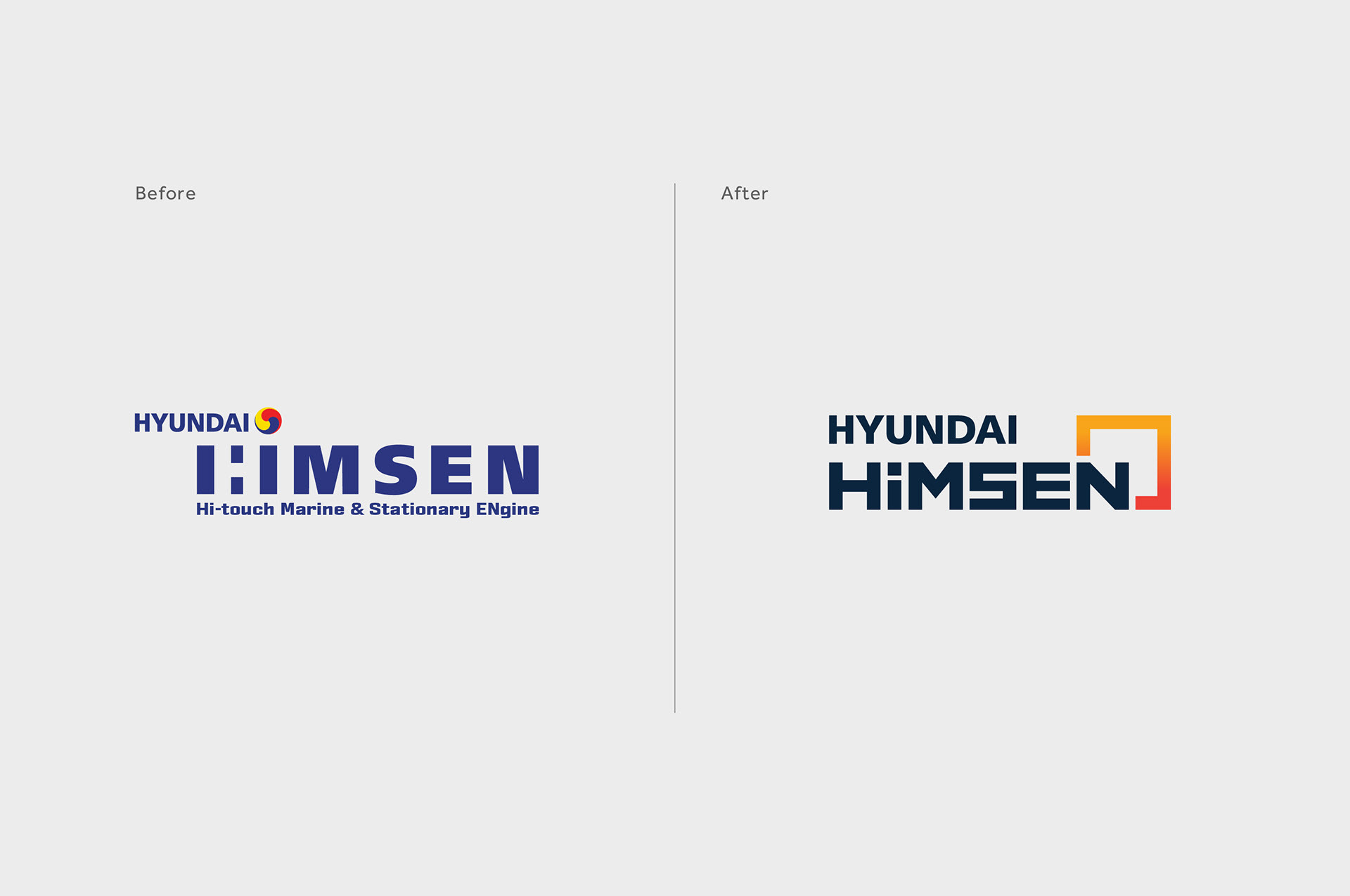
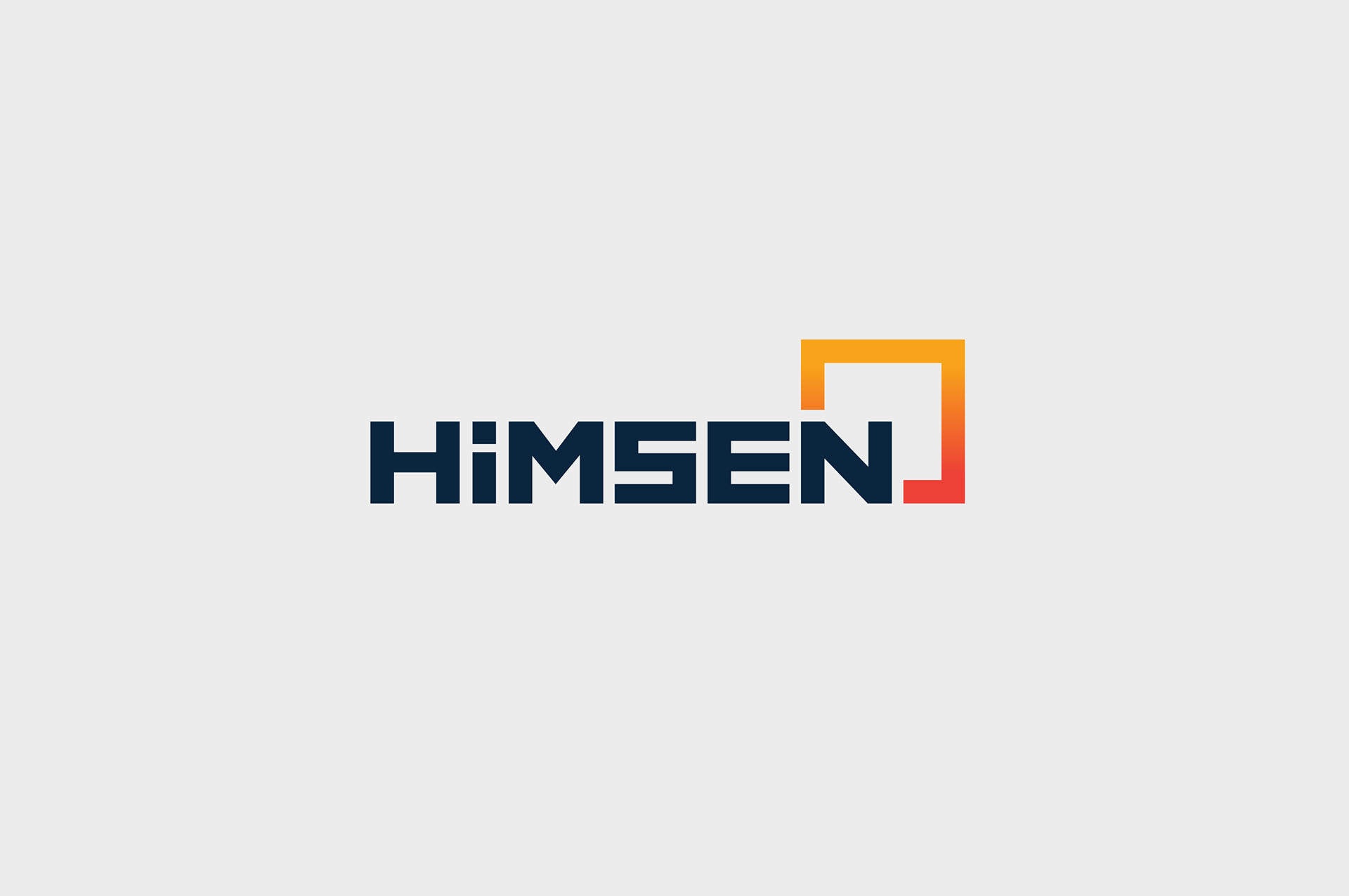
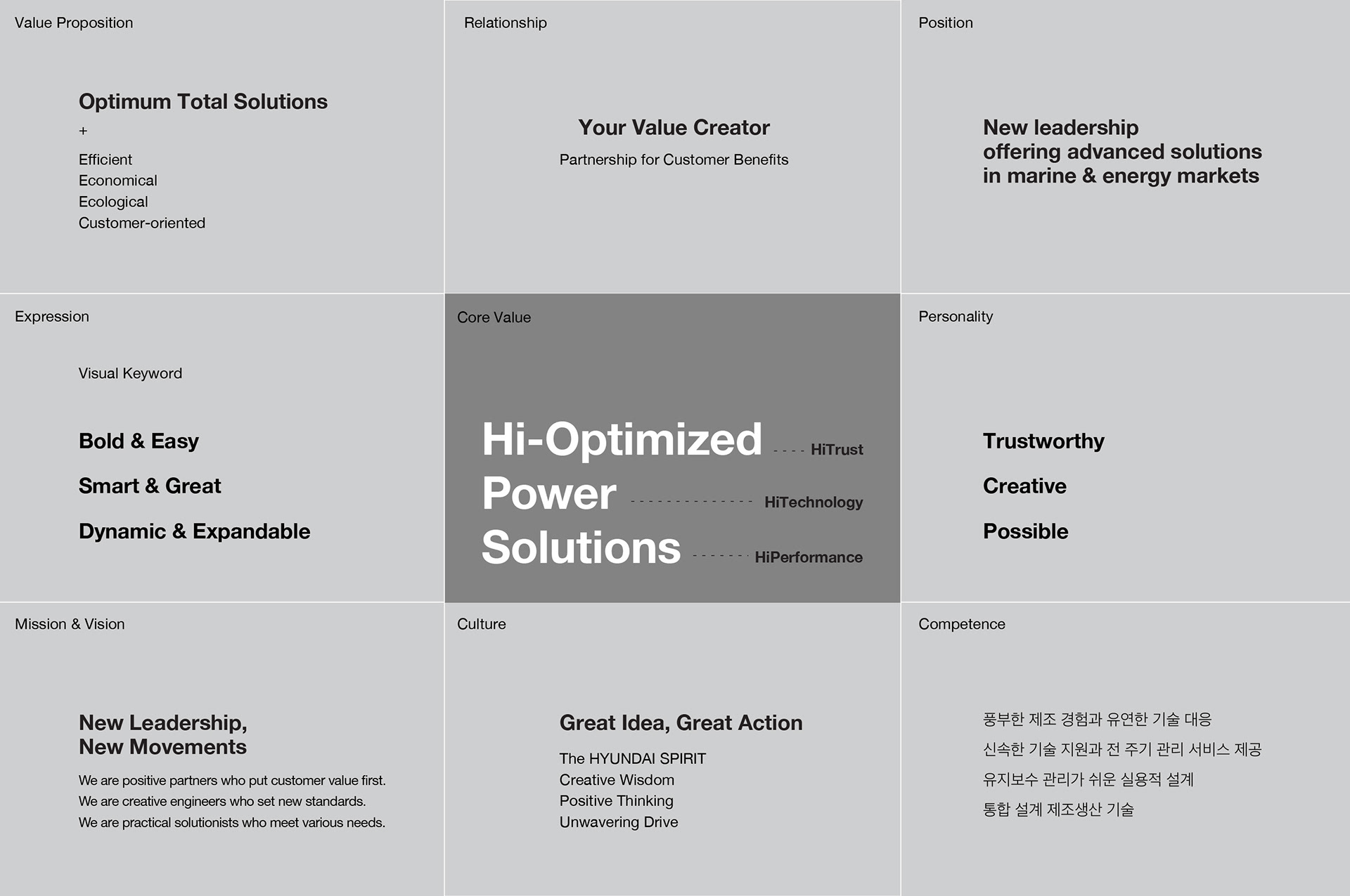
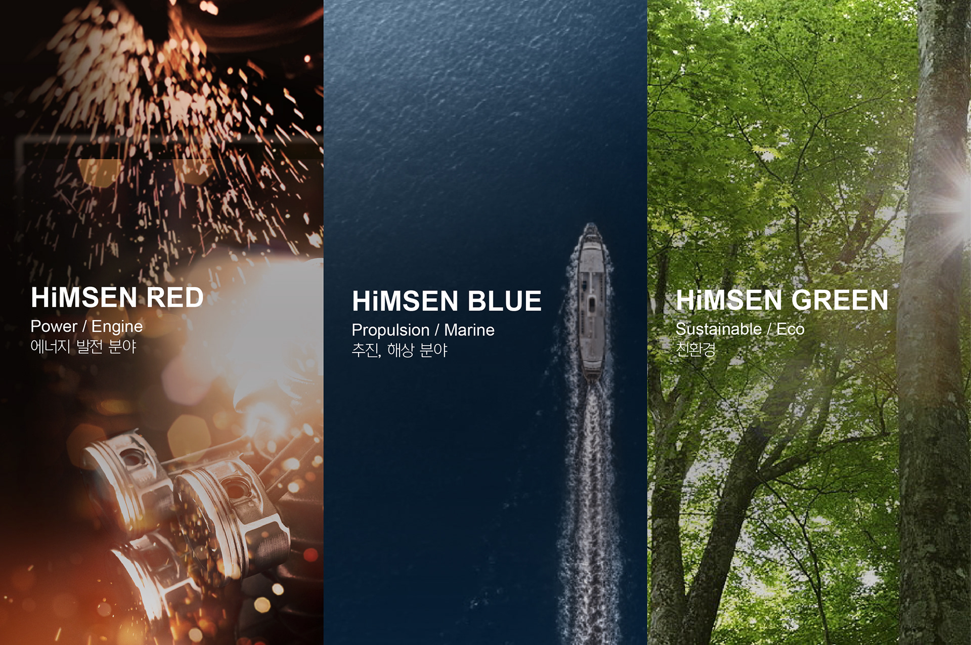
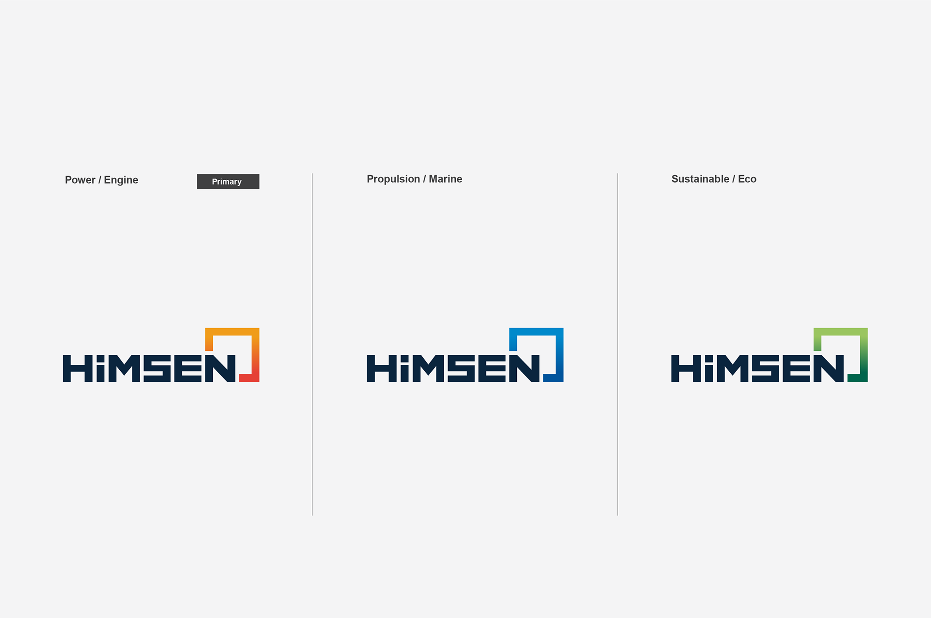
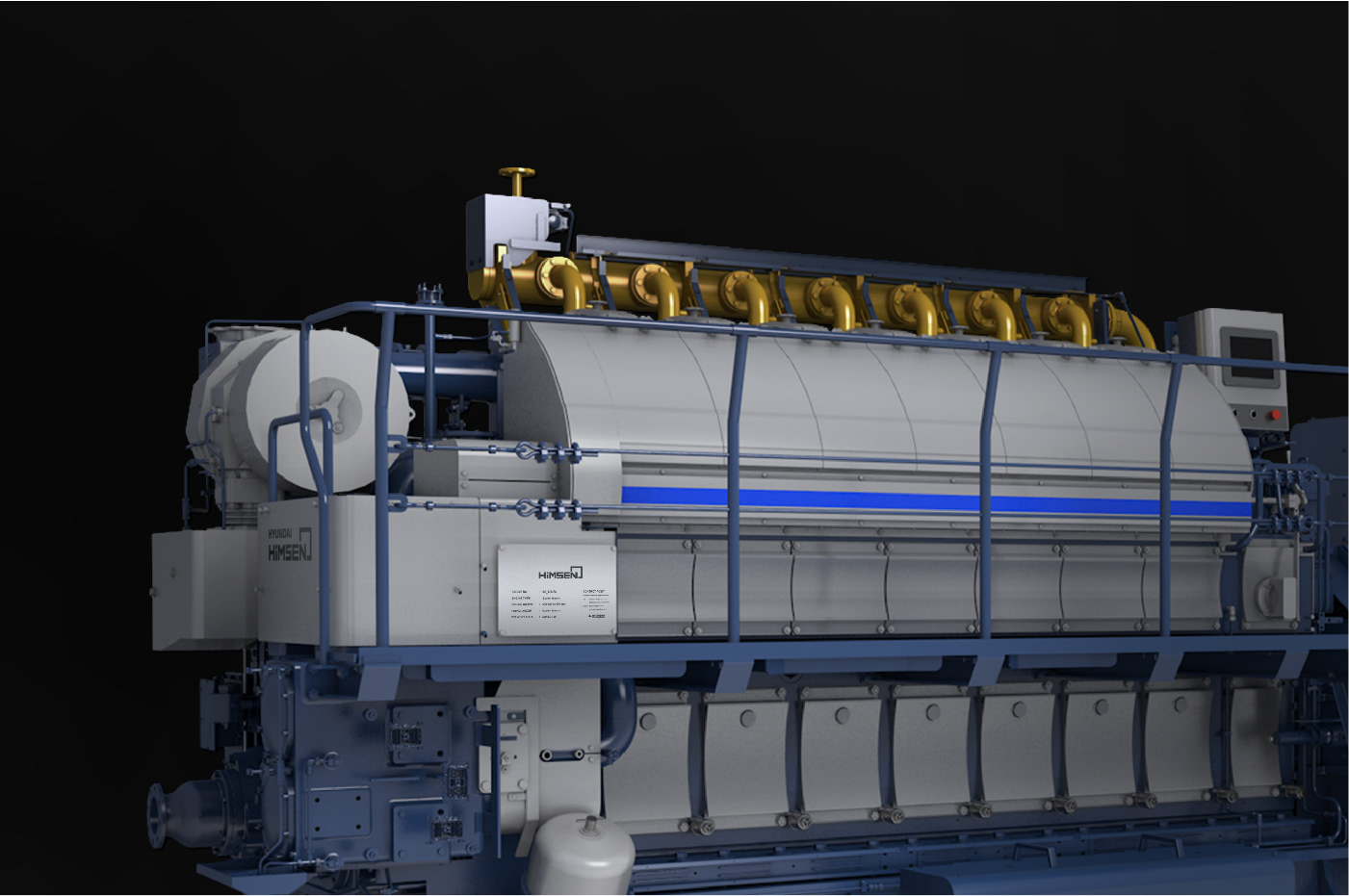
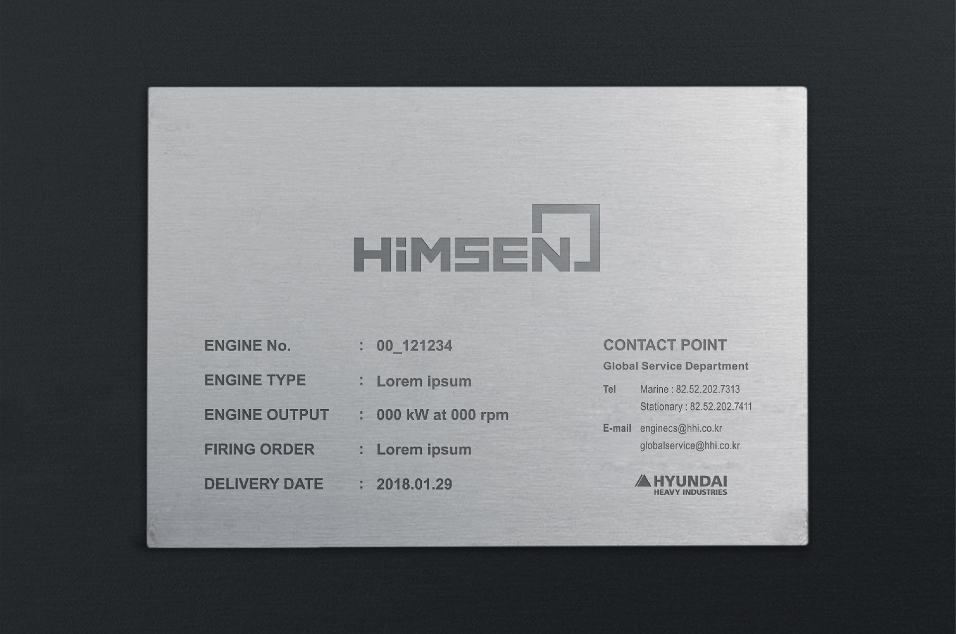
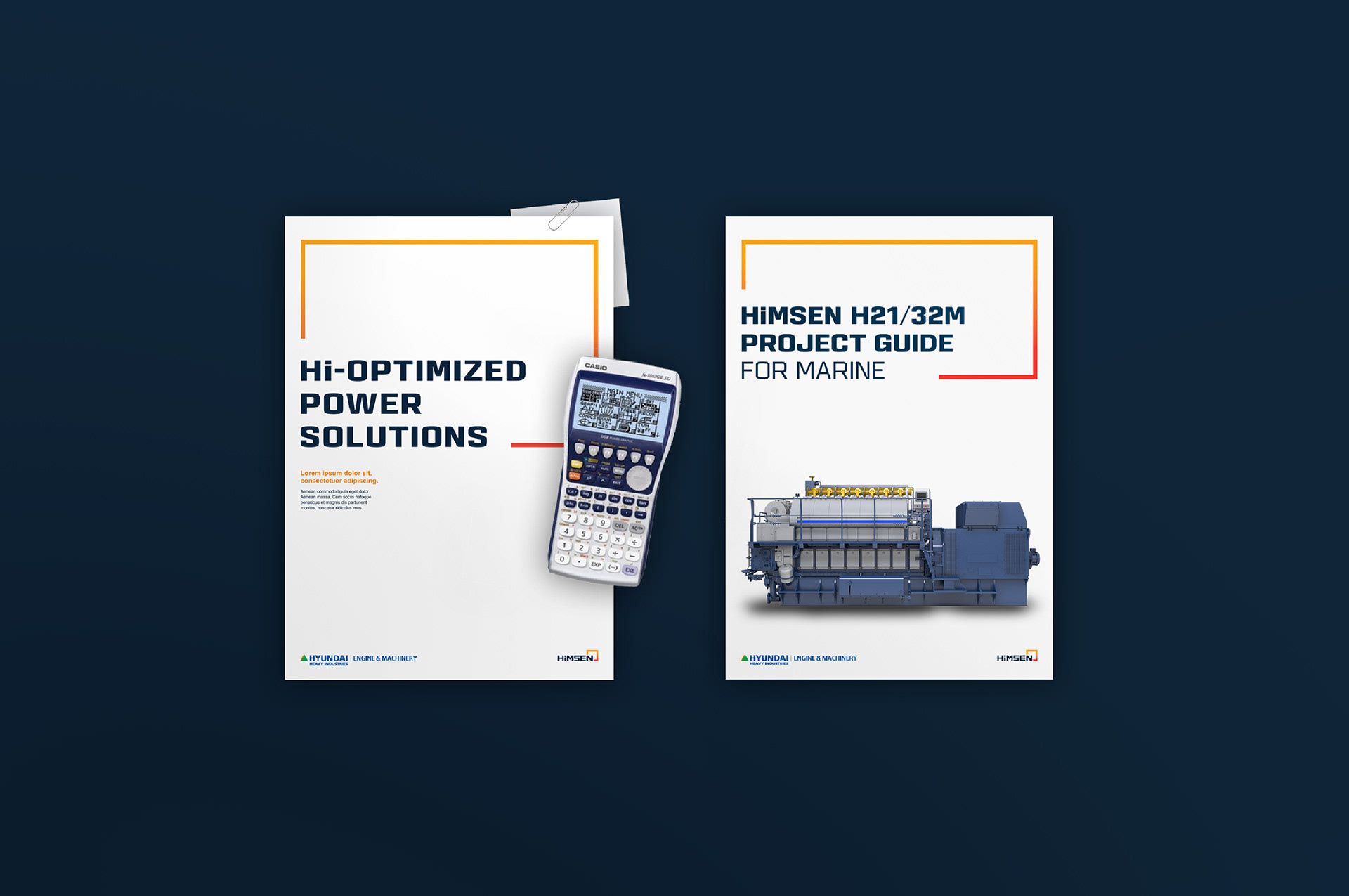
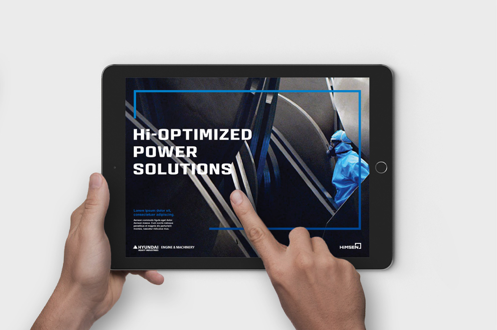
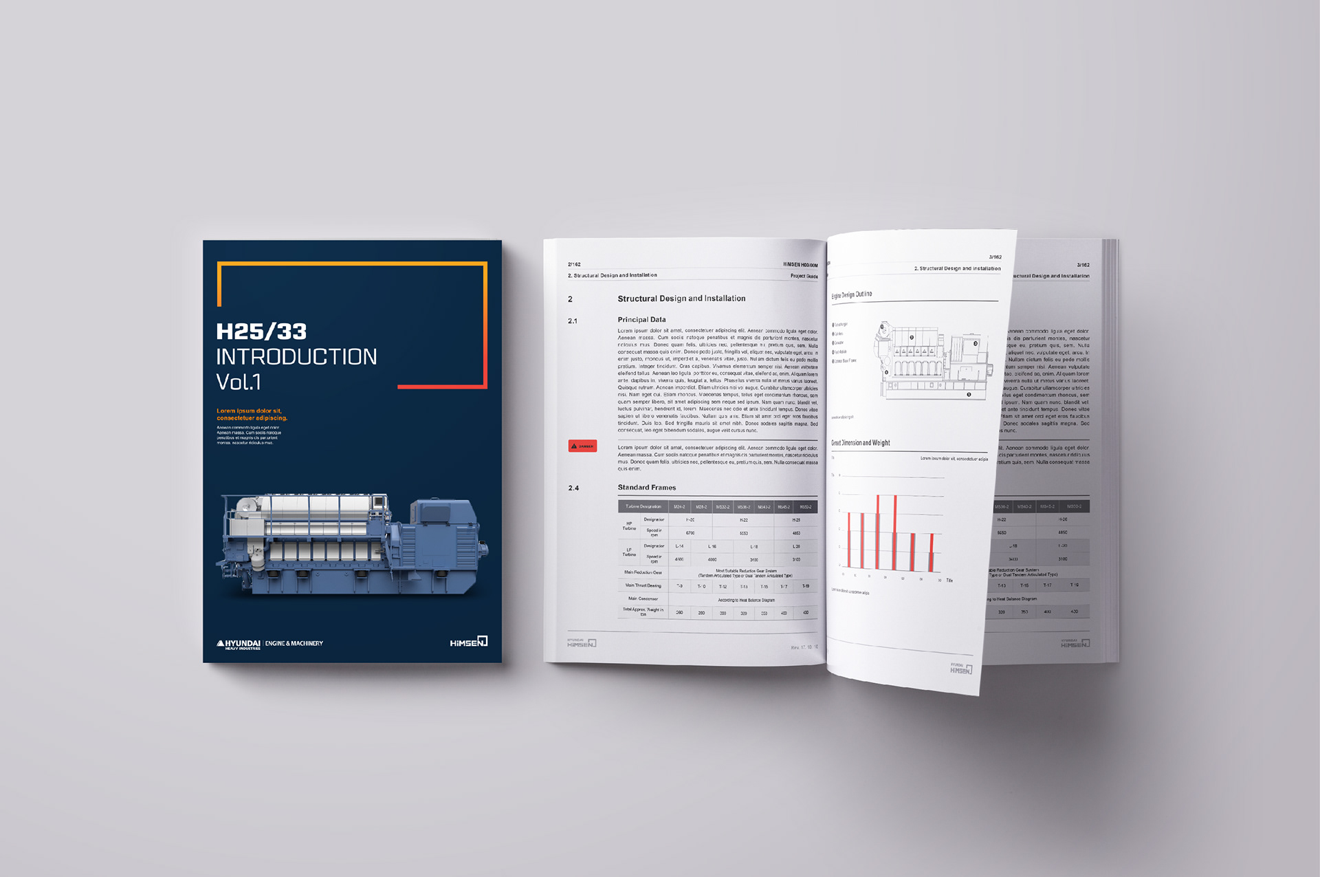
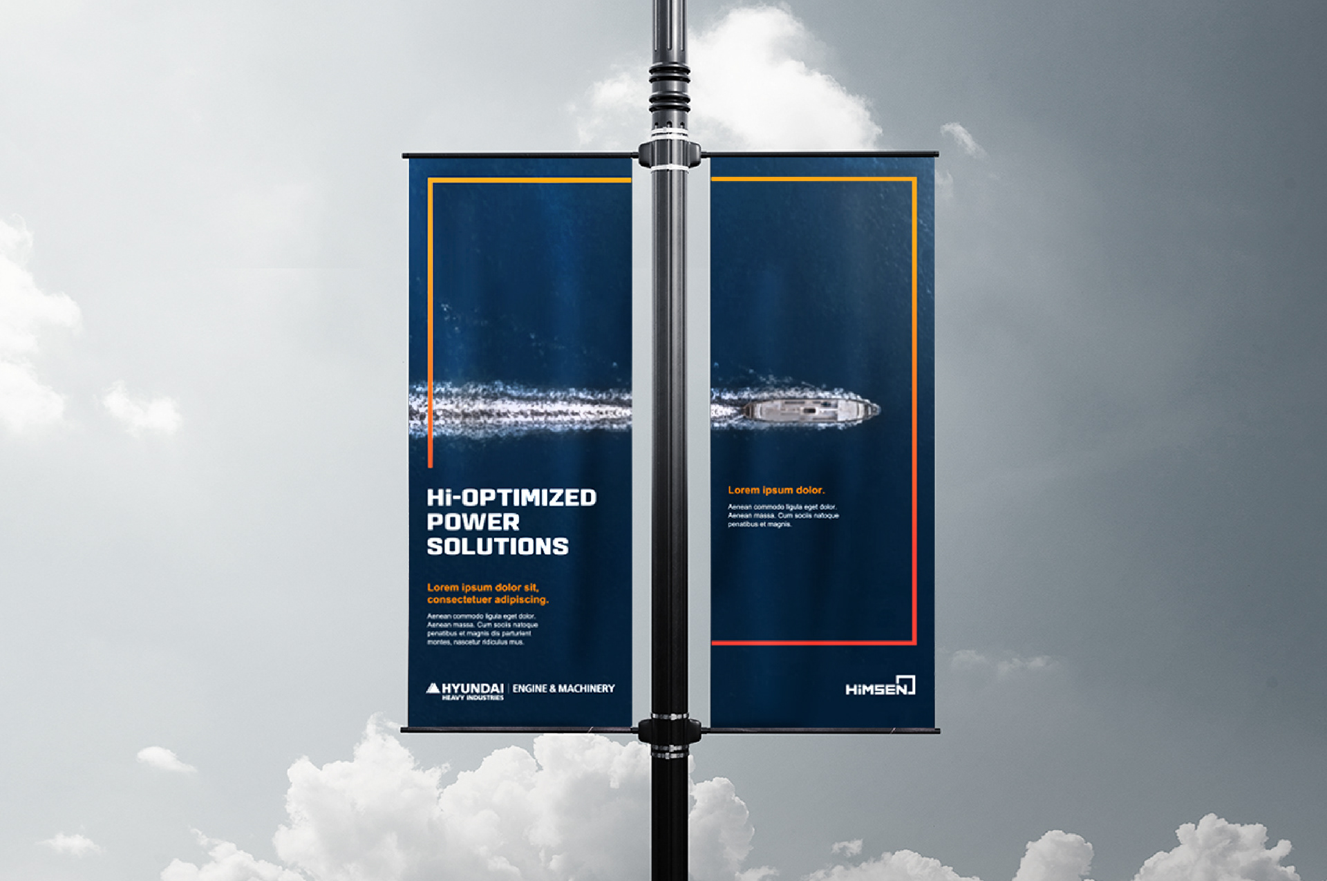
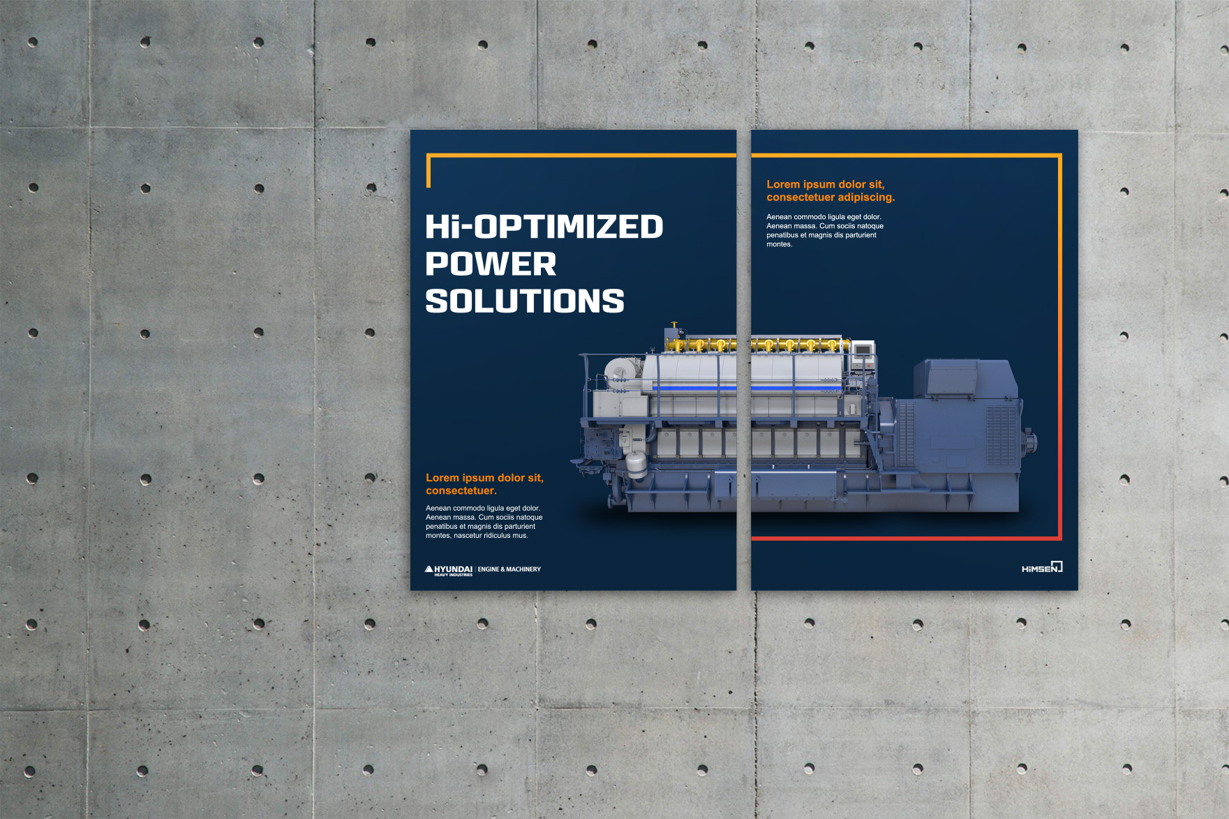
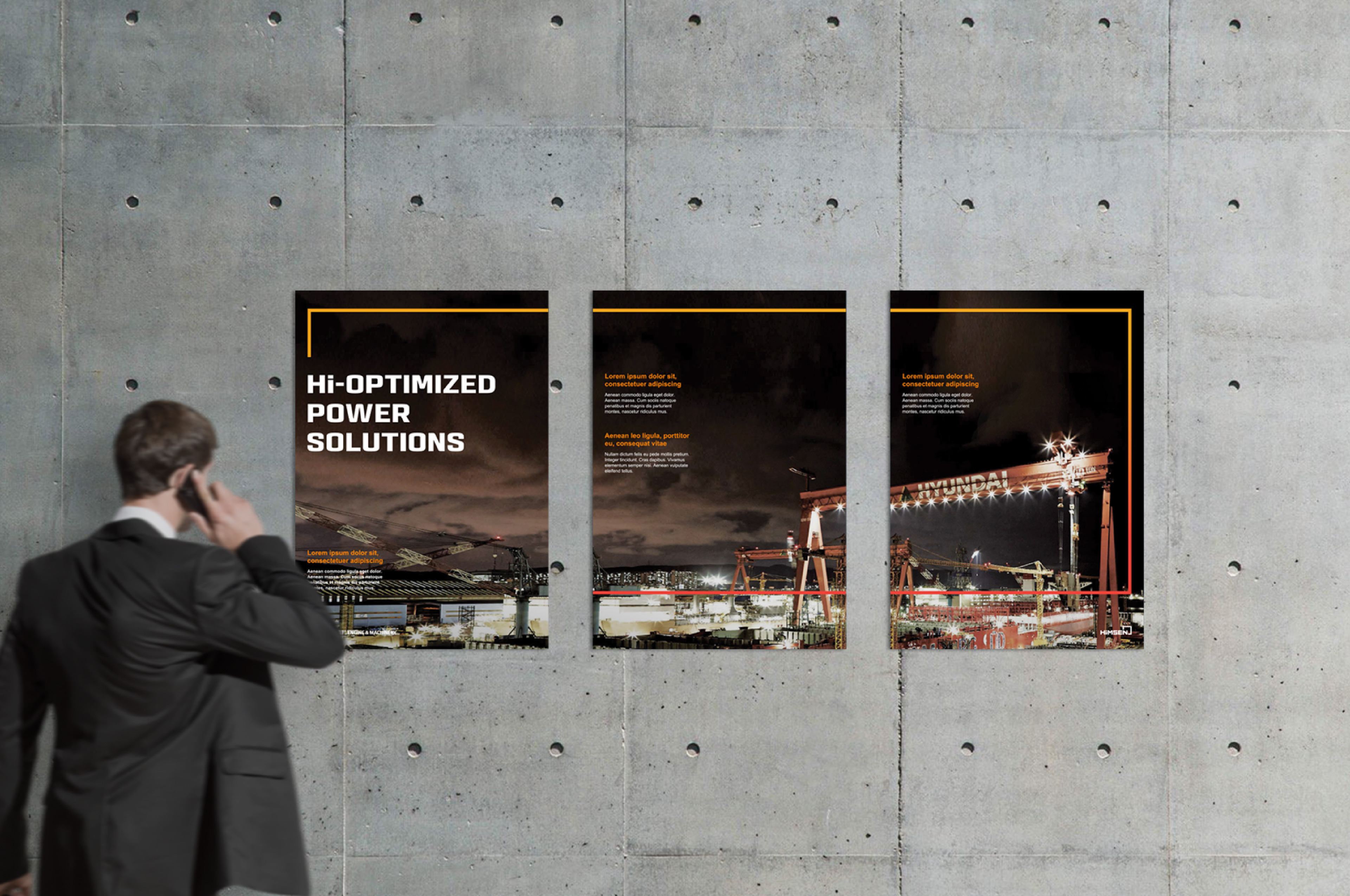
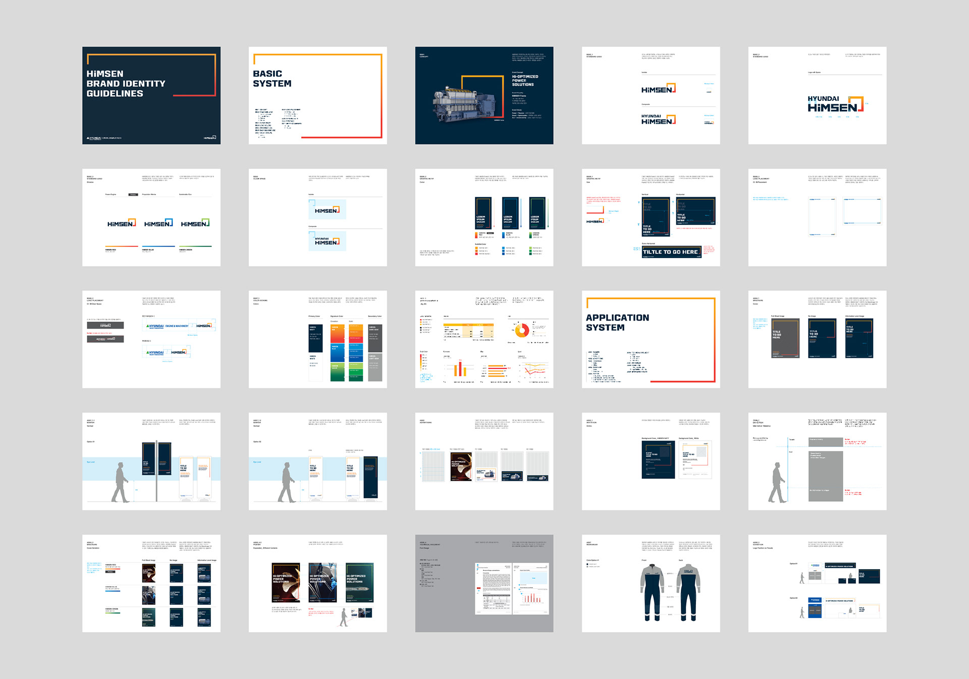
With those in our minds, we assess the competitive advantage of the brand’s status and developed the new face, brand platform, logotype, color, graphic motif and various application items of Hyundai HiMSEN. It is certainly believed to establish and strengthen the brand power in the large engine industry and related customers. Hyundai HiMSEN in Korean has dual meanings of being powerful and representing its unique engine system. So we tried to align with what it could mean both and build the visual communication system by 1) highlighting the Hyundai HiMSEN frame in emphasizing the power and the quality of brand and 2) distinguishing the colors between each business for red in Power / Engine, blue in Propulsion / Marine and green in Sustainable / Eco. Hyundai HiMSEN frame is the center of visual communication system based on its brand platform. It symbolizes the Hyundai HiMSEN engine itself and the circulating energy created from the engine powerfully and strongly.
리서치 전문기관과의 협업을 통해 동종 업계 및 자체 서비스 현황을 진단하고 대형 엔진 사업의 본질과 비전, 과거와 현재를 바탕으로 하여 새로운 HiMSEN 브랜드의 플랫폼을 정립하였습니다. 브랜드 플랫폼을 기초한 비쥬얼 커뮤니케이션 시스템의 중심인 HiMSEN 프레임은 HiMSEN 엔진과 그로부터 발생하고 순환하는 에너지를 상징합니다. HiMSEN 프레임을 하이라이트 요소로 활용하여 브랜드의 중요 가치와 제품력을 강조하고 세부 사업 분야마다 특색을 반영한 (레드:엔진발전분야 / 블루:해양추진분야 / 그린:친환경분야) 컬러를 적용, 사업분야 별 구분이 가능한 비쥬얼 커뮤니케이션 시스템을 구축하였습니다.
리서치 전문기관과의 협업을 통해 동종 업계 및 자체 서비스 현황을 진단하고 대형 엔진 사업의 본질과 비전, 과거와 현재를 바탕으로 하여 새로운 HiMSEN 브랜드의 플랫폼을 정립하였습니다. 브랜드 플랫폼을 기초한 비쥬얼 커뮤니케이션 시스템의 중심인 HiMSEN 프레임은 HiMSEN 엔진과 그로부터 발생하고 순환하는 에너지를 상징합니다. HiMSEN 프레임을 하이라이트 요소로 활용하여 브랜드의 중요 가치와 제품력을 강조하고 세부 사업 분야마다 특색을 반영한 (레드:엔진발전분야 / 블루:해양추진분야 / 그린:친환경분야) 컬러를 적용, 사업분야 별 구분이 가능한 비쥬얼 커뮤니케이션 시스템을 구축하였습니다.
Benefit to Client
With the new brand identity and visual communication system, the client Hyundai Heavy Industries-Engine & Machinery Division can further its image to be ready for the integrated technology and solution brand. The renewed brand identity indeed considers the Hyundai HiMSEN engine development philosophy, the customer values and the competitive edges. It makes Hyundai HiMSEN engine brand possible to strongly deliver its proactive and consistent communication message to the stakeholders internally and externally.
새로운 아이덴티티와 체계적인 시스템을 통해 현대중공업 엔진기계 사업부는 통합 기술 및 솔루션 브랜드에 대한 이미지를 강화하였습니다. 리뉴얼된 브랜드 아이덴티티는 현대 힘센 엔진 개발 철학, 고객 가치 및 경쟁 우위의 의미를 담아 내외부적으로 적극적이고 일관된 커뮤니케이션 메시지를 강력하게 전달합니다.
새로운 아이덴티티와 체계적인 시스템을 통해 현대중공업 엔진기계 사업부는 통합 기술 및 솔루션 브랜드에 대한 이미지를 강화하였습니다. 리뉴얼된 브랜드 아이덴티티는 현대 힘센 엔진 개발 철학, 고객 가치 및 경쟁 우위의 의미를 담아 내외부적으로 적극적이고 일관된 커뮤니케이션 메시지를 강력하게 전달합니다.
Client Hyundai Heavy Industries
Discipline Brand Identity Renewal
Director Jaeyong Jang
Design Hyeyoung Jung, Myungjin Kim, Jeonghoo Lee
Discipline Brand Identity Renewal
Director Jaeyong Jang
Design Hyeyoung Jung, Myungjin Kim, Jeonghoo Lee