
GoofyFoot®
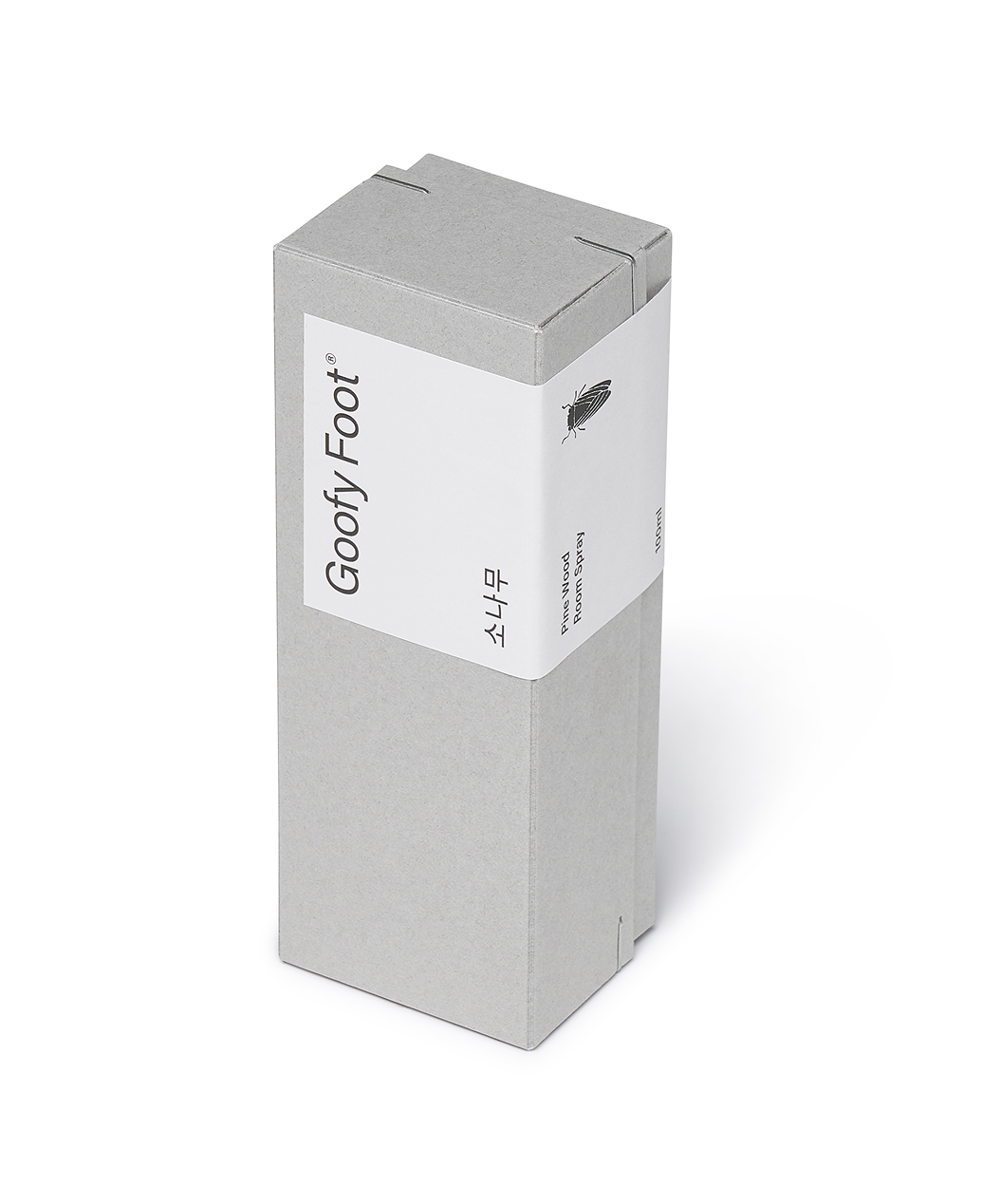
Brand verbal, visual, olfactory system & product design for GoofyFoot
Planning / Verbal Identity (Brand Name, Slogan, Product Name) / Visual Identity / Olfactory Identity (Scent Direction) / Product Design / Packaging Design
Planning / Verbal Identity (Brand Name, Slogan, Product Name) / Visual Identity / Olfactory Identity (Scent Direction) / Product Design / Packaging Design

Start Different
VEIG develops projects that expand our capabilities and experience. GoofyFoot is one of them, alongside OUTTAKES, our ongoing platform for exploring Asian design. GoofyFoot refers to a surfer who rides with an unconventional stance, finding their own way to ride the waves. For its first project, we wanted to create something that could bring an interesting shift to everyday life. We chose a room spray. We set two directions for the scent: to transform an urban workspace into a natural atmosphere, and to create a distinctly Korean scent with a character of its own. We imagined pine trees carrying the sea breeze of Korea’s East Coast. After countless samples, doubts, and adjustments,
we arrived at a sharp and vivid Korean pine scent—distinct from the familiar hinoki.
베이그는 우리의 역량과 경험을 확장하는 다양한 프로젝트를 진행합니다. 그 활동의 일환으로 아시아 디자인 담론을 만들어가고 있는 OUTTAKES 전시와 브랜드 GoofyFoot이 있습니다. 구피풋(GoofyFoot)은 스탠스를 거꾸로 하여 자기만의 방식으로 파도를 타는 서퍼를 가리킵니다. 우리는 구피풋의 첫 번째 프로젝트로 일상에 흥미로운 전환을 만들어줄 아이템을 고민했고, 그 결과 룸 스프레이를 선택했습니다. 향을 개발하며 우리가 정한 방향은 두 가지였습니다. 매일 머무는 도심의 사무 공간을 자연의 무드로 전환할 수 있는 향일 것. 그리고 독창성을 위해 우리만의 고유성이 담긴, 한국적인 향일 것. 그렇게 우리는 동해의 바닷바람을 머금은 소나무를 떠올렸습니다. 수없이 많은 샘플을 만들고, 또 의심하고, 다시 조율하는 과정을 거쳐 완성한 향에는 흔히 접하는 히노키와는 다른, 알싸하고 선명한 한국 소나무의 향이 담겨 있습니다.
we arrived at a sharp and vivid Korean pine scent—distinct from the familiar hinoki.
베이그는 우리의 역량과 경험을 확장하는 다양한 프로젝트를 진행합니다. 그 활동의 일환으로 아시아 디자인 담론을 만들어가고 있는 OUTTAKES 전시와 브랜드 GoofyFoot이 있습니다. 구피풋(GoofyFoot)은 스탠스를 거꾸로 하여 자기만의 방식으로 파도를 타는 서퍼를 가리킵니다. 우리는 구피풋의 첫 번째 프로젝트로 일상에 흥미로운 전환을 만들어줄 아이템을 고민했고, 그 결과 룸 스프레이를 선택했습니다. 향을 개발하며 우리가 정한 방향은 두 가지였습니다. 매일 머무는 도심의 사무 공간을 자연의 무드로 전환할 수 있는 향일 것. 그리고 독창성을 위해 우리만의 고유성이 담긴, 한국적인 향일 것. 그렇게 우리는 동해의 바닷바람을 머금은 소나무를 떠올렸습니다. 수없이 많은 샘플을 만들고, 또 의심하고, 다시 조율하는 과정을 거쳐 완성한 향에는 흔히 접하는 히노키와는 다른, 알싸하고 선명한 한국 소나무의 향이 담겨 있습니다.

Think Different
Wood-scented products often rely on wood patterns, natural materials, or earthy colors. We wanted to move beyond this familiar visual language. Instead of the tree itself, we chose a cicada and a simple glass bottle. Cicadas feed on tree sap and fill the summer air with their sound. The scent of the tree and the sound spreading through the air became the perfect symbol for connecting two senses. Without a physical store, we needed a memorable way to introduce the brand. On a white landing page filled with cicada sounds, a click triggers the spray, and a pine tree appears. We translated the physical act of spraying the scent into a digital interaction—making an invisible experience visible on screen. Visit the GoofyFoot website and experience it for yourself.
나무의 향을 담은 제품들은 으레 나무의 그래픽 패턴이나 소재, 나무를 연상시키는 색을 활용합니다. 우리는 이러한 정형에서 벗어나기 위해 수많은 테스트를 거쳤고, 결국 나무가 아닌 매미와 깔끔하고 기본적인 형태의 유리병을 선택했습니다. 매미는 나무의 진액을 먹고, 한여름을 가득 채우며 울어댑니다. 나무의 향과 사방으로 퍼져나가는 매미의 소리. 서로 다른 감각을 연결하는 이 공감각적 상징은 우리가 만들고자 했던 경험을 표현하기에 더할 나위 없이 적합했습니다. 오프라인 매장 없이 시작한 룸 스프레이 브랜드를 사람들에게 새롭게 각인시키기 위해서는 기억에 남는 인터랙션이 필요했습니다. 매미 소리로 가득한 새하얀 랜딩 페이지. 화면을 클릭하면 스프레이가 분사되고, 그 순간 소나무가 나타납니다. 실제로 향이 담긴 병을 들고 공간에 스프레이를 뿌려 소나무의 향을 감각하는 경험을, 그대로 스크린 위에 구현했습니다. 향을 분사하는 행위를 시각적인 경험으로 확장한 구피풋의 웹사이트를 한 번 방문해보세요. 간결하지만 분명한 맥락과 인터랙션을 통해, 구피풋이 말하고자 하는 경험을 직접 느낄 수 있습니다.
나무의 향을 담은 제품들은 으레 나무의 그래픽 패턴이나 소재, 나무를 연상시키는 색을 활용합니다. 우리는 이러한 정형에서 벗어나기 위해 수많은 테스트를 거쳤고, 결국 나무가 아닌 매미와 깔끔하고 기본적인 형태의 유리병을 선택했습니다. 매미는 나무의 진액을 먹고, 한여름을 가득 채우며 울어댑니다. 나무의 향과 사방으로 퍼져나가는 매미의 소리. 서로 다른 감각을 연결하는 이 공감각적 상징은 우리가 만들고자 했던 경험을 표현하기에 더할 나위 없이 적합했습니다. 오프라인 매장 없이 시작한 룸 스프레이 브랜드를 사람들에게 새롭게 각인시키기 위해서는 기억에 남는 인터랙션이 필요했습니다. 매미 소리로 가득한 새하얀 랜딩 페이지. 화면을 클릭하면 스프레이가 분사되고, 그 순간 소나무가 나타납니다. 실제로 향이 담긴 병을 들고 공간에 스프레이를 뿌려 소나무의 향을 감각하는 경험을, 그대로 스크린 위에 구현했습니다. 향을 분사하는 행위를 시각적인 경험으로 확장한 구피풋의 웹사이트를 한 번 방문해보세요. 간결하지만 분명한 맥락과 인터랙션을 통해, 구피풋이 말하고자 하는 경험을 직접 느낄 수 있습니다.


Director Jaeyong Jang
Identity Design Hyeyoung Jung, Yoona Kim, Sol Kim
Packaging Design Hyeyoung Jung, Sol Kim, Jongchan Yoon, Taeyul Kwon, Dohee Ham, Sangyeon Byun
Website/Motion/3D Design Jongchan Yoon, Taeyul Kwon
Fragrance Production ILP
Packaging Production Cornervery
Identity Design Hyeyoung Jung, Yoona Kim, Sol Kim
Packaging Design Hyeyoung Jung, Sol Kim, Jongchan Yoon, Taeyul Kwon, Dohee Ham, Sangyeon Byun
Website/Motion/3D Design Jongchan Yoon, Taeyul Kwon
Fragrance Production ILP
Packaging Production Cornervery