
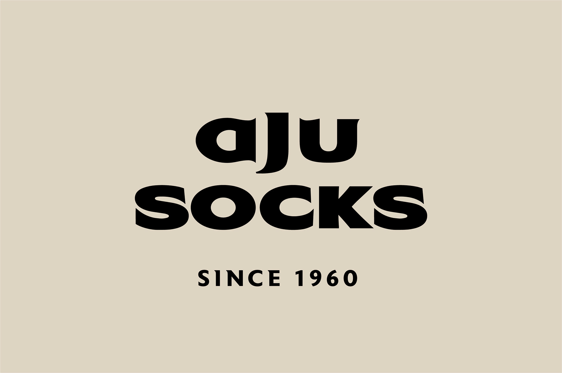
AJU Socks, History of the socks
Project Overview
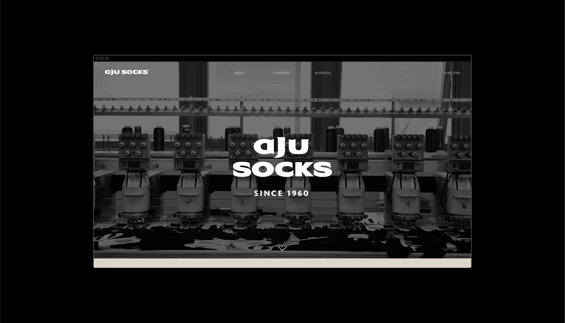
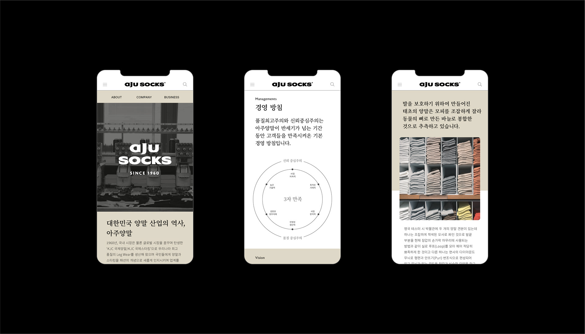
Corporate identity design for AJU Socks. Starting as KUKJE Nylon in 1960, AJU Socks is a representative company that has been leading the Korean socks manufacturing industry and has continued the family business from generation to generation for over 60 years. AJU Socks, a legwear company that has protected the people's feet with the highest quality and sincerity, has established a vision to renew its CI and move forward as a 100-year company to mark its 60th anniversary. We set the history of AJU Socks, which has been devoted to socks production for over 60 years, as the biggest core value that differentiates it from its competitors, and developed the slogan called 'History of the Socks' and renewed its CI with the goal of visualizing the slogan.
1960년 국제 나일론으로 시작한 아주양말은 60여 년 대대로 가업을 이어 온 대한민국 양말 생산업계를 선도해온 대표 기업입니다. 최고의 품질과 정성으로 세계인의 발을 지켜 온 Legwear 기업, 아주양말은 60주년을 맞이하여 CI를 재정비하고 100년 기업으로 나아가고자 비전을 수립했습니다. 60여 년을 양말 생산에 전념해 온 아주양말의 역사를 경쟁사들과 차별화되는 가장 큰 핵심 가치로 설정하고 ‘History of the Socks’라는 슬로건을 개발, 이를 시각화하는 것을 목표로 리뉴얼을 진행하였습니다.
1960년 국제 나일론으로 시작한 아주양말은 60여 년 대대로 가업을 이어 온 대한민국 양말 생산업계를 선도해온 대표 기업입니다. 최고의 품질과 정성으로 세계인의 발을 지켜 온 Legwear 기업, 아주양말은 60주년을 맞이하여 CI를 재정비하고 100년 기업으로 나아가고자 비전을 수립했습니다. 60여 년을 양말 생산에 전념해 온 아주양말의 역사를 경쟁사들과 차별화되는 가장 큰 핵심 가치로 설정하고 ‘History of the Socks’라는 슬로건을 개발, 이를 시각화하는 것을 목표로 리뉴얼을 진행하였습니다.
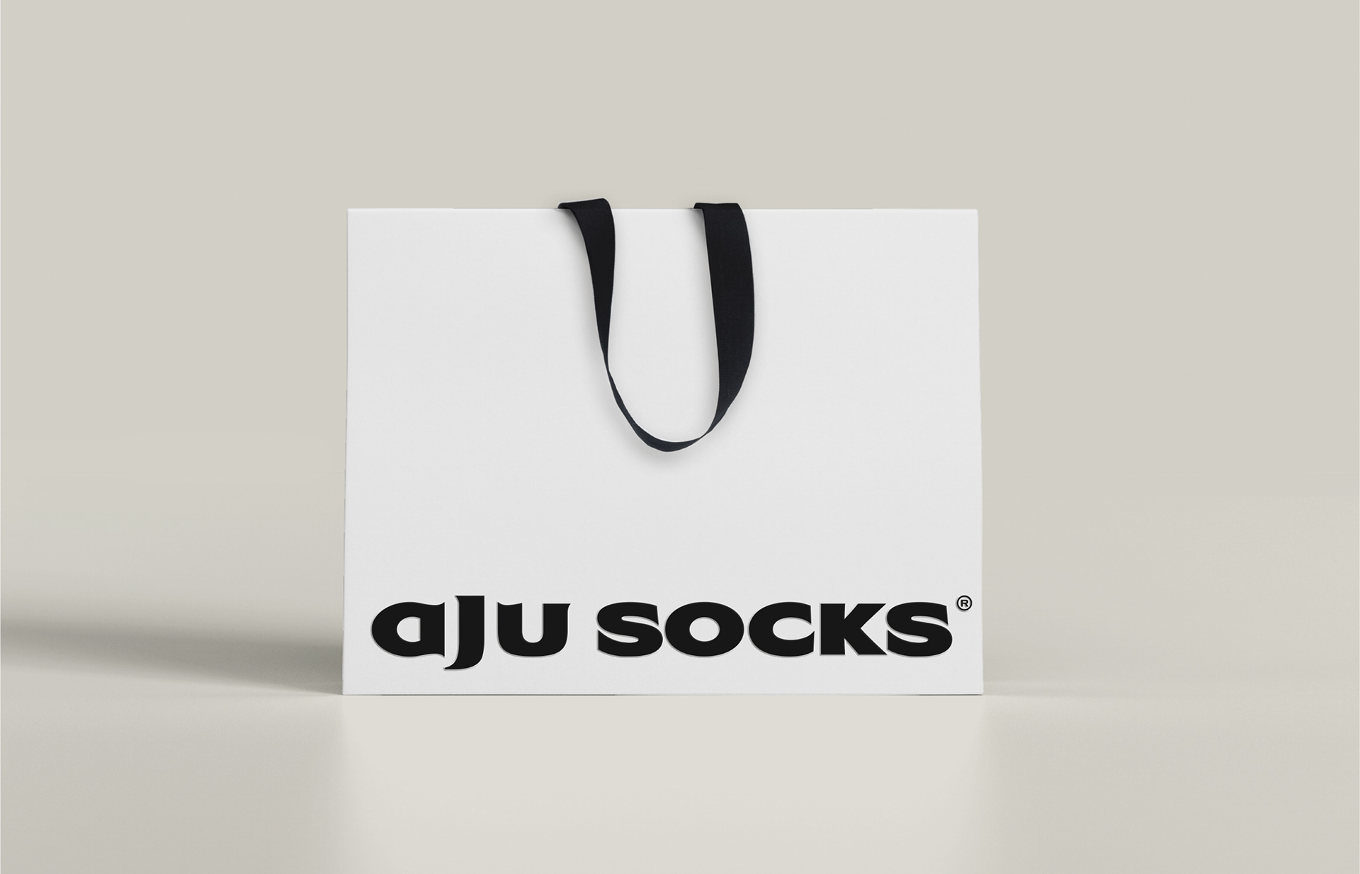
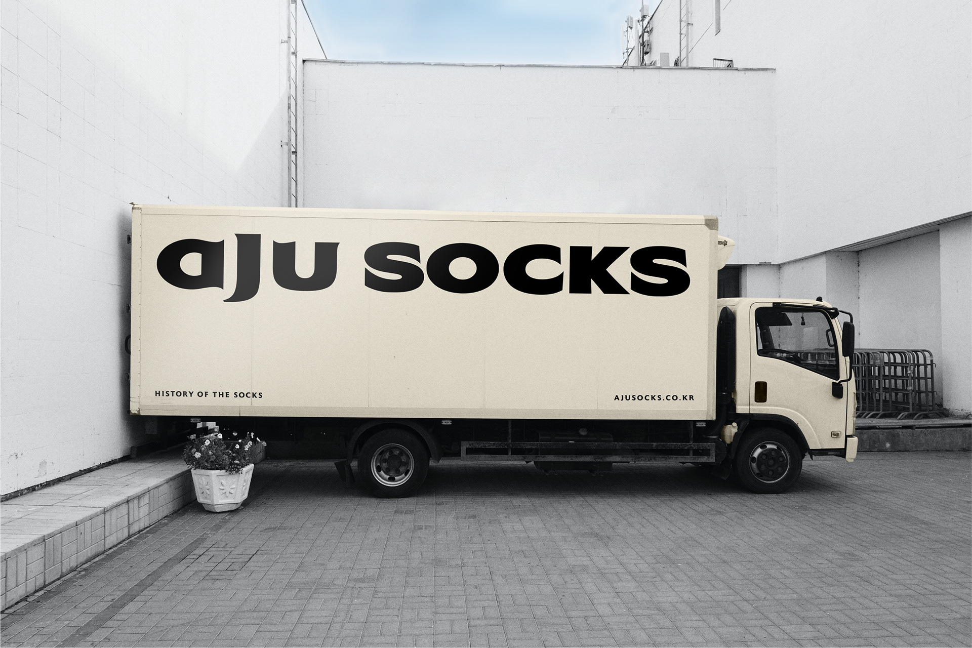
Wordmark
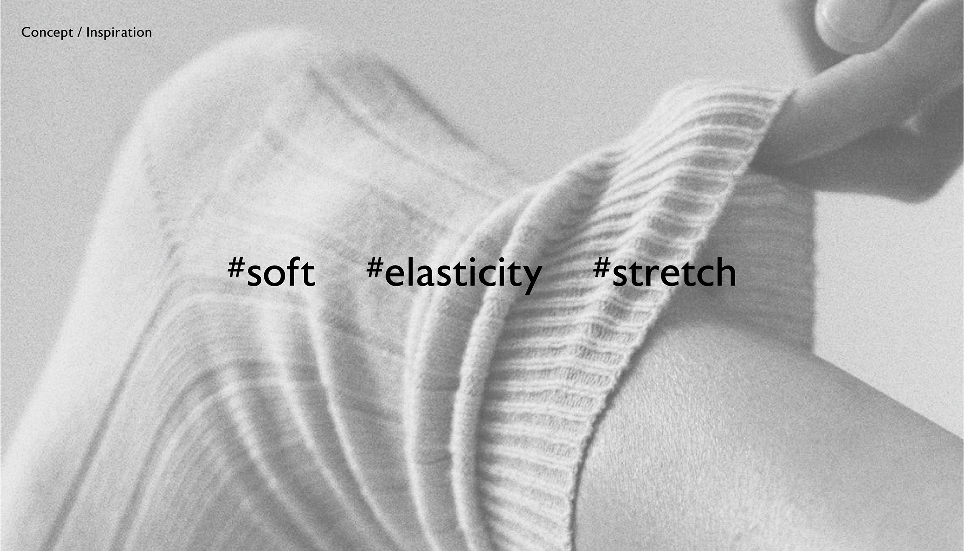
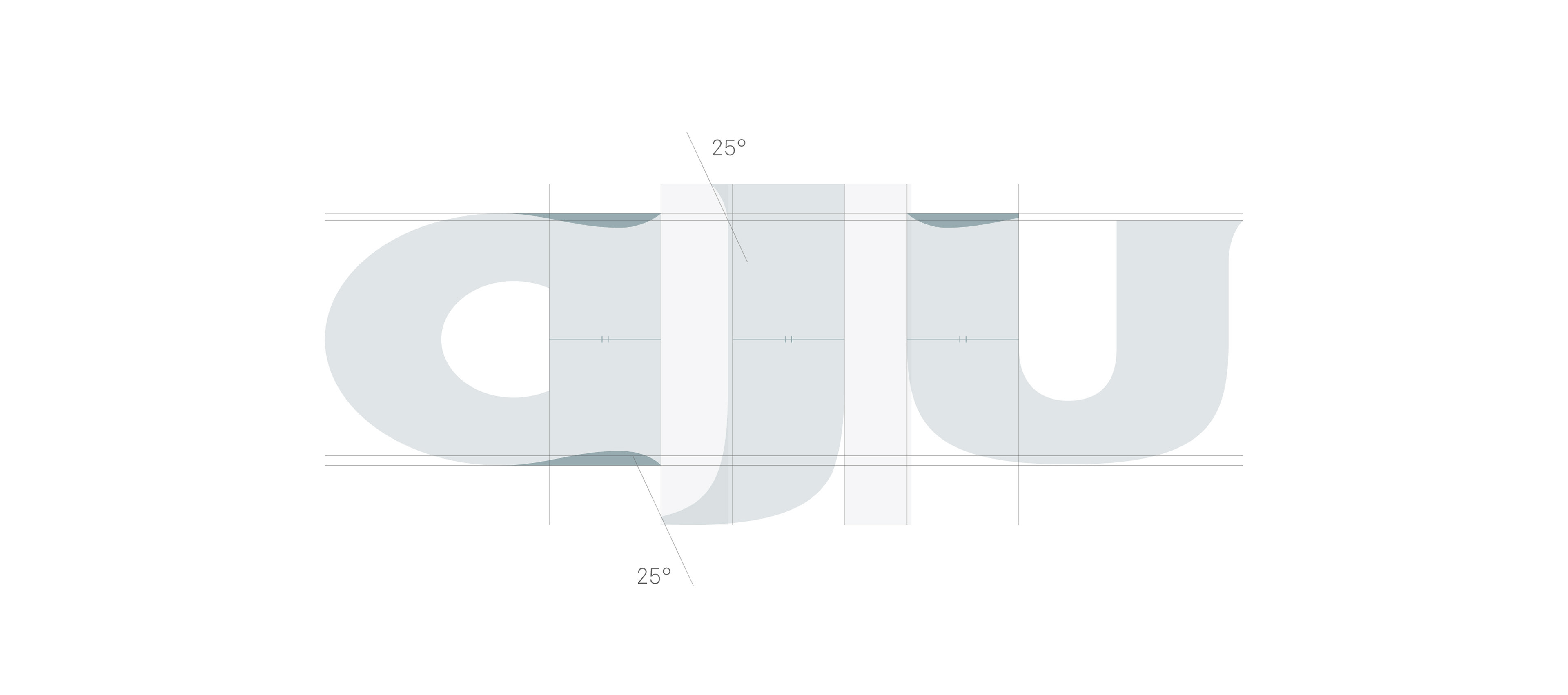
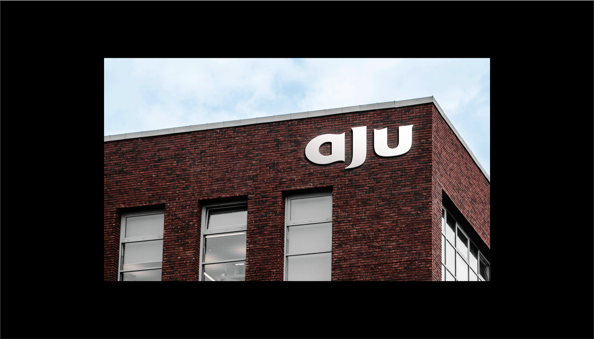
The wordmark of AJU Socks, which appeals strongly and boldly to corporate confidence, is reminiscent of socks by its shape itself. It visualizes the flexible and elastic properties of socks in the form of soft curves, and conveys to customers the business area of AJU Socks and its 60-year history devoted to socks production with its unique serif typeface and descender of J.
강하고 볼드하게 기업의 자신감을 소구하는 AJU Socks의 워드마크는 그 형태만으로 양말을 연상시킵니다. 유연하고 신축성 있는 양말의 물성을 부드러운 곡선 형태로 시각화하고, 고유한 형태의 세리프 서체와 J의 디센더로 AJU Socks의 업역과 양말 생산에 전념해온 60년 역사를 소구합니다.
강하고 볼드하게 기업의 자신감을 소구하는 AJU Socks의 워드마크는 그 형태만으로 양말을 연상시킵니다. 유연하고 신축성 있는 양말의 물성을 부드러운 곡선 형태로 시각화하고, 고유한 형태의 세리프 서체와 J의 디센더로 AJU Socks의 업역과 양말 생산에 전념해온 60년 역사를 소구합니다.
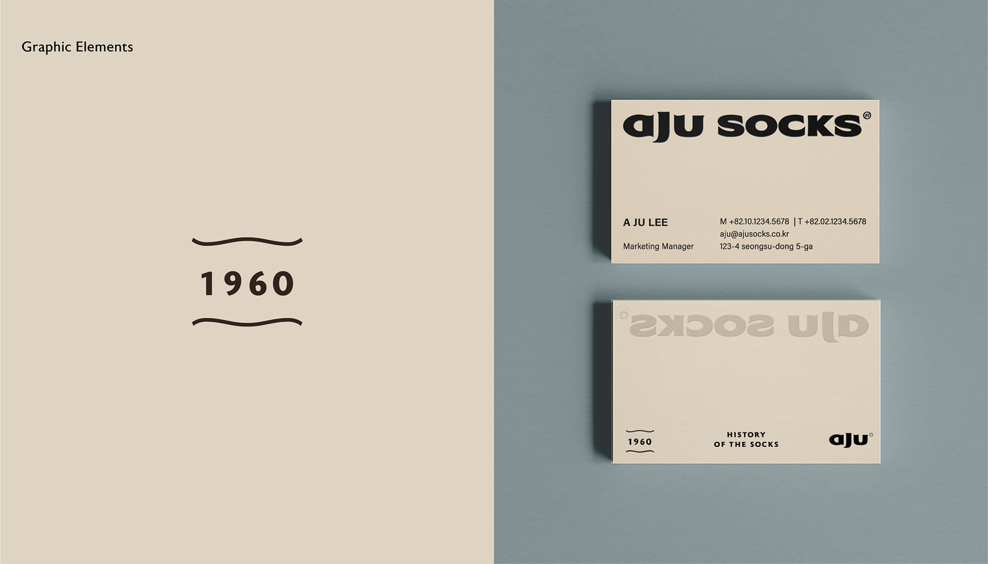
Colors & Elements
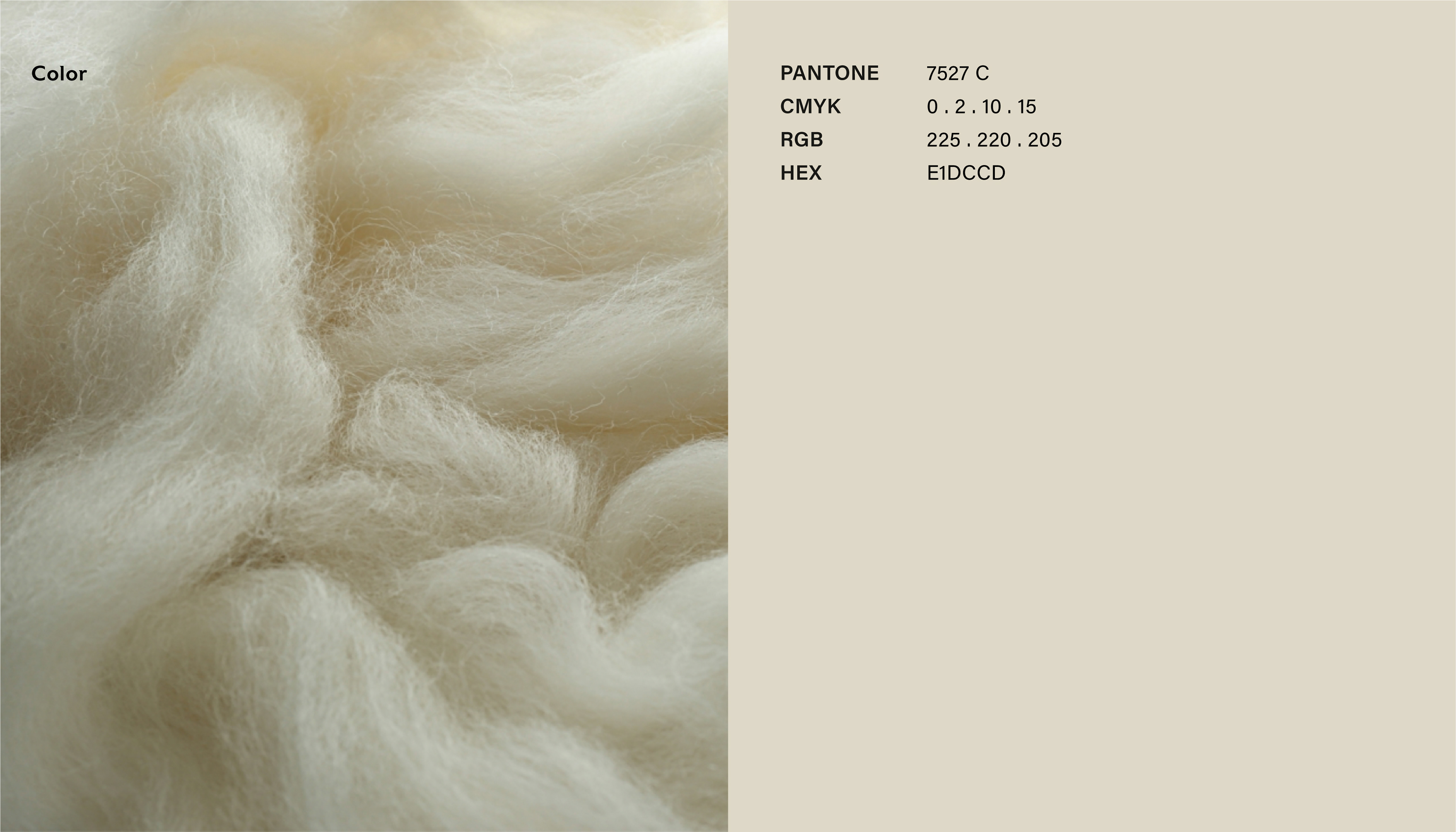
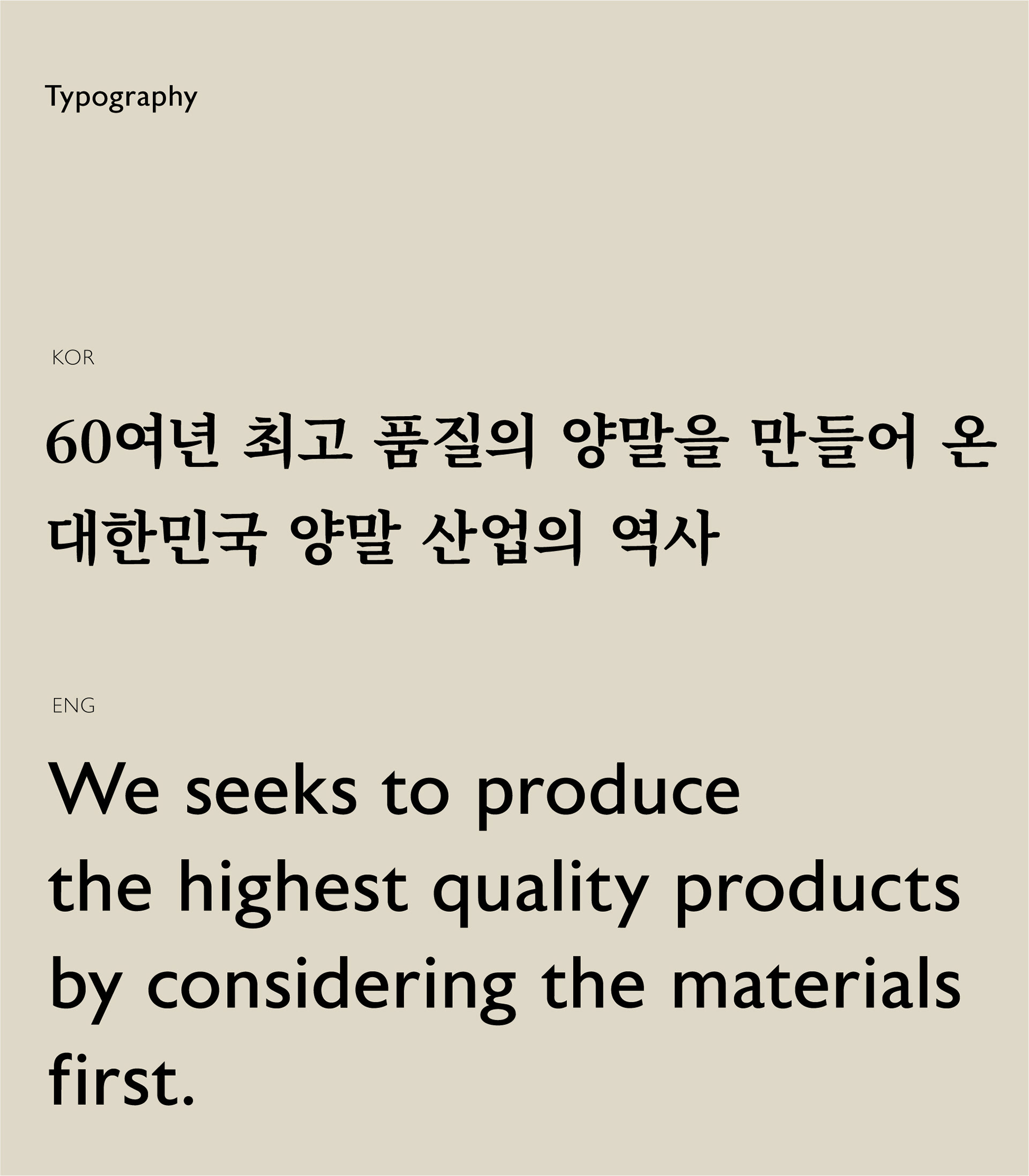
AJU Beige, the main color, expresses the sincerity of AJU Socks, which seeks to produce the highest quality products by considering the materials first. The beige, which is a fundamental color reminiscent of the yarn of socks and appeals to a comfortable and warm sensibility, is a color that can capture modernity and historicality, and solicit AJU Socks' unique identity.
메인컬러인 AJU Beige는 소재부터 고민하여 최고 품질의 제품을 만들어내고자 하는 AJU Socks의 진정성을 담았습니다. 양말의 원사를 연상시키는 근원적인 컬러이면서 편안하고 따뜻한 감성을 소구하는 베이지는 현대적이면서도 역사성을 담아낼 수 있는 컬러로 AJU Socks만의 고유한 정체성을 소구합니다.
메인컬러인 AJU Beige는 소재부터 고민하여 최고 품질의 제품을 만들어내고자 하는 AJU Socks의 진정성을 담았습니다. 양말의 원사를 연상시키는 근원적인 컬러이면서 편안하고 따뜻한 감성을 소구하는 베이지는 현대적이면서도 역사성을 담아낼 수 있는 컬러로 AJU Socks만의 고유한 정체성을 소구합니다.
The designated typeface Astoria is a typeface with a partially curved Serif applied to the upper left corner, ensuring morphological consistency with the word mark, and delivering corporate messages with solid trust and pride while symbolizing its unique historicality.
지정 서체인 Astoria는 왼쪽 상단에 부분적으로 곡선 형태의 세리프가 적용된 특징을 가진 서체로 워드마크와의 형태적 일관성을 확보하였습니다. 국문 지정 서체는 본명조로 지정하여 AJU Socks의 고유한 역사성을 상징하면서도 단단하고 견고한 신뢰와 자부심을 담아 기업의 메세지를 전달 할 수 있도록 하였습니다.
지정 서체인 Astoria는 왼쪽 상단에 부분적으로 곡선 형태의 세리프가 적용된 특징을 가진 서체로 워드마크와의 형태적 일관성을 확보하였습니다. 국문 지정 서체는 본명조로 지정하여 AJU Socks의 고유한 역사성을 상징하면서도 단단하고 견고한 신뢰와 자부심을 담아 기업의 메세지를 전달 할 수 있도록 하였습니다.
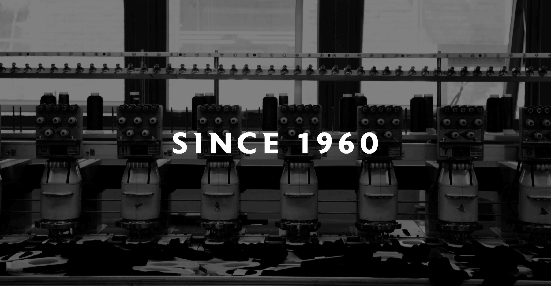
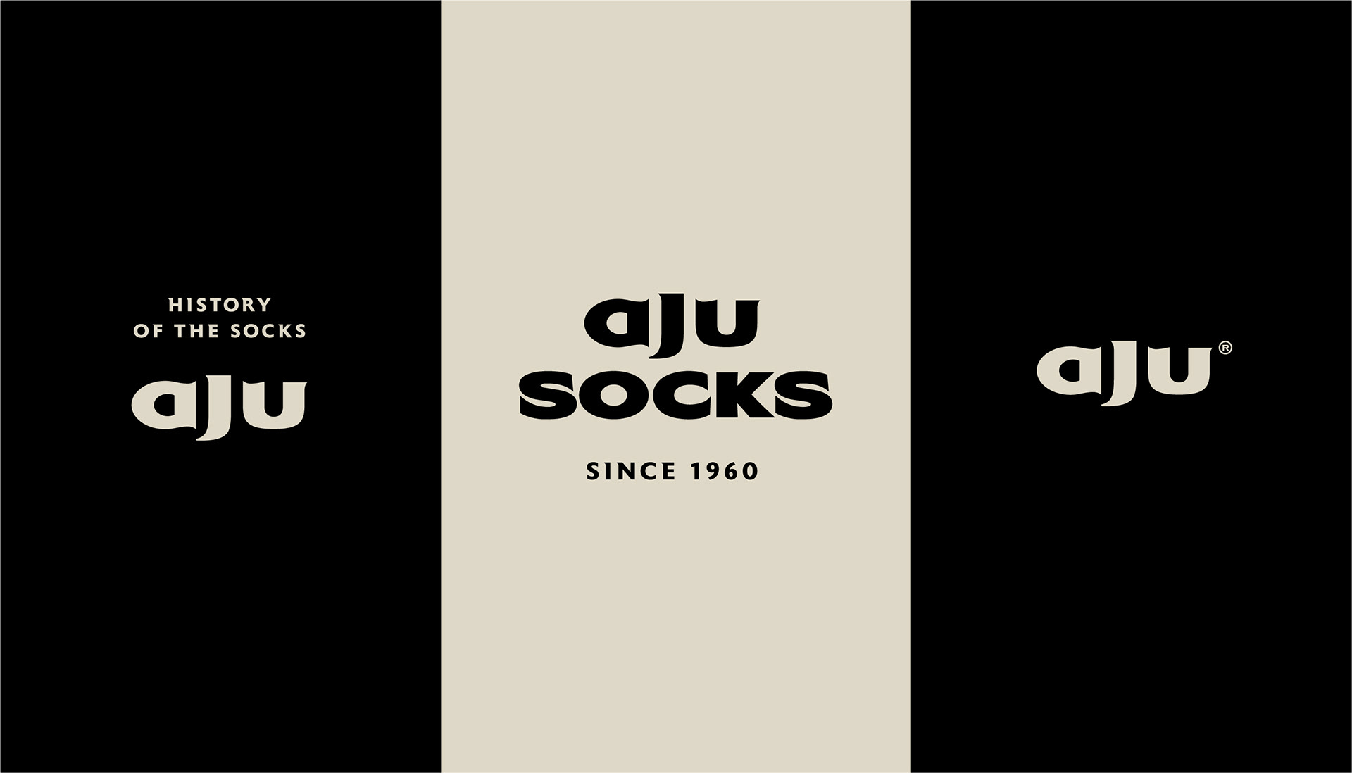
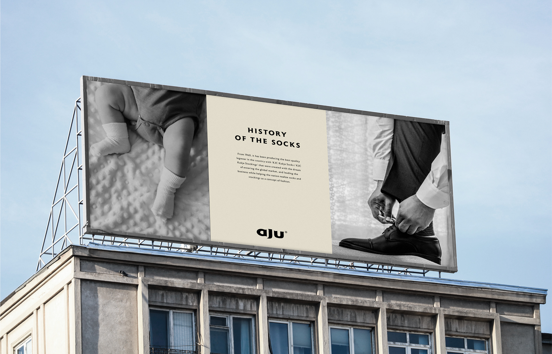
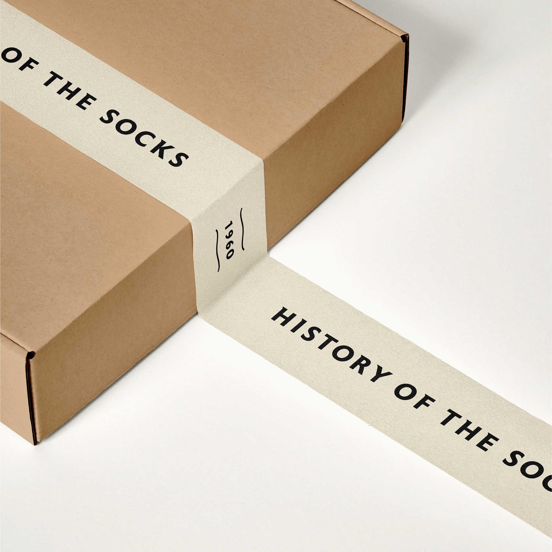
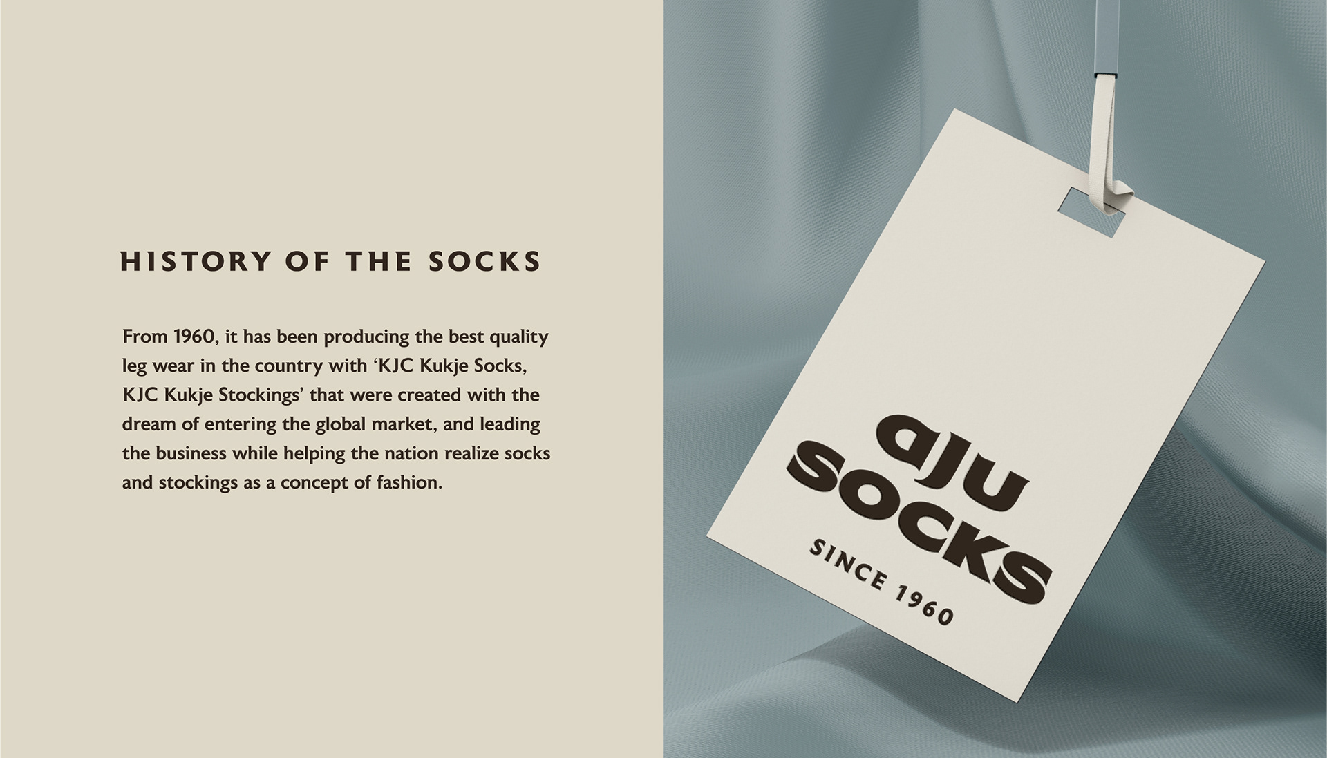
Slogan Mark
In addition, messages such as slogans 'History of the Socks' and 'SINCE 1960' can be used as auxiliary graphics and applied to applications to enrich the company's visuals and expose its features more actively.
슬로건 ‘History of the Socks’와 ‘SINCE 1960’ 등 역사성을 소구할 수 있는 메세지를 보조그래픽으로 활용하여 어플리케이션에 적용함으로써 기업의 시각물을 풍성하게 하고 특장점을 더욱 적극적으로 노출할 수 있도록 하였습니다.
슬로건 ‘History of the Socks’와 ‘SINCE 1960’ 등 역사성을 소구할 수 있는 메세지를 보조그래픽으로 활용하여 어플리케이션에 적용함으로써 기업의 시각물을 풍성하게 하고 특장점을 더욱 적극적으로 노출할 수 있도록 하였습니다.
Client AJU Socks
Discipline Corporate Identity / Slogan / Signage / Website Development
Director Jaeyong Jang
Design Hyeyoung Jung, Rihyeon Ju, Yoona Kim, Yeohae Song
Discipline Corporate Identity / Slogan / Signage / Website Development
Director Jaeyong Jang
Design Hyeyoung Jung, Rihyeon Ju, Yoona Kim, Yeohae Song