
LG DISPLAY
Exhibition Graphic & Design Standards
Project Overview
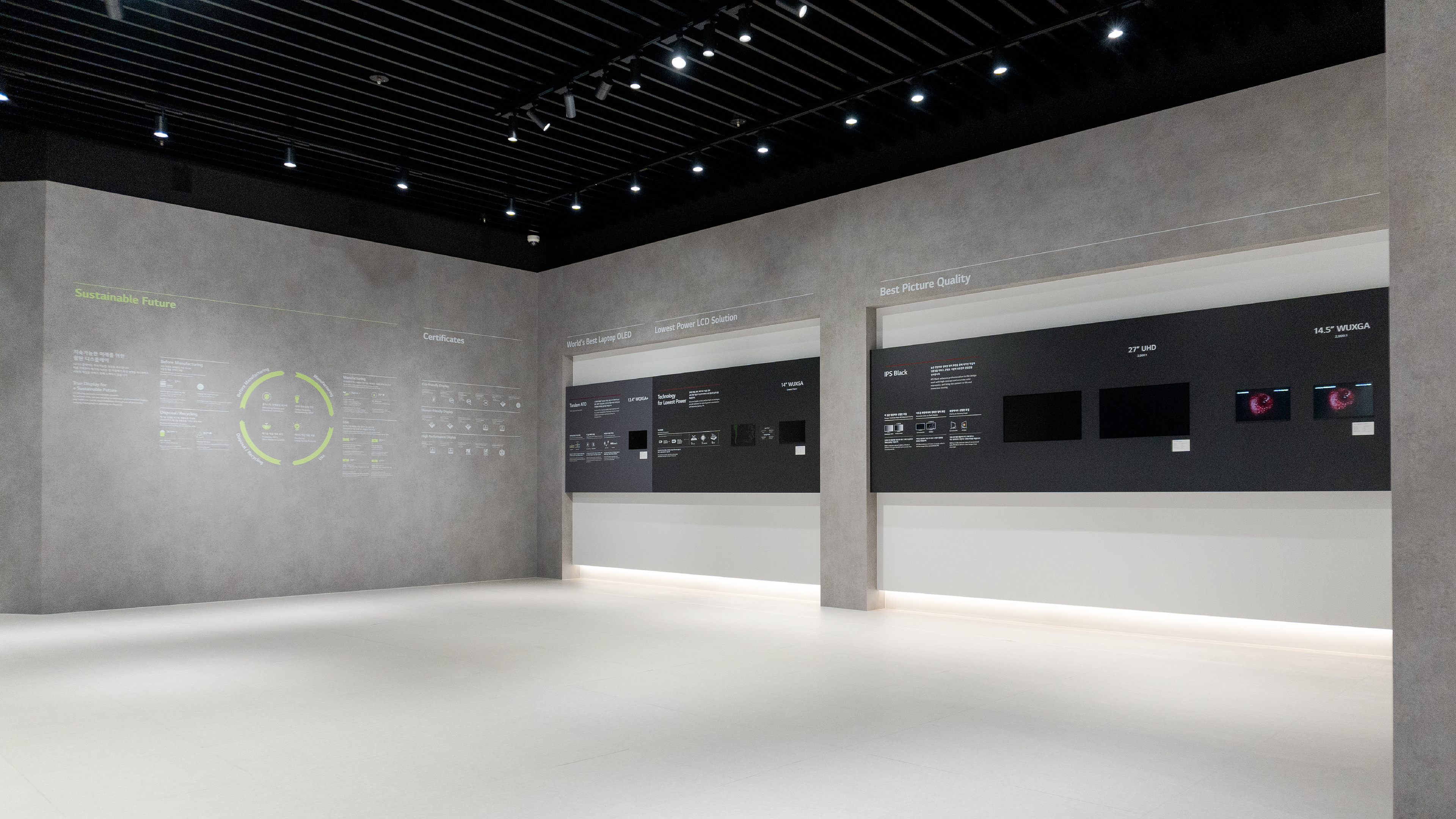
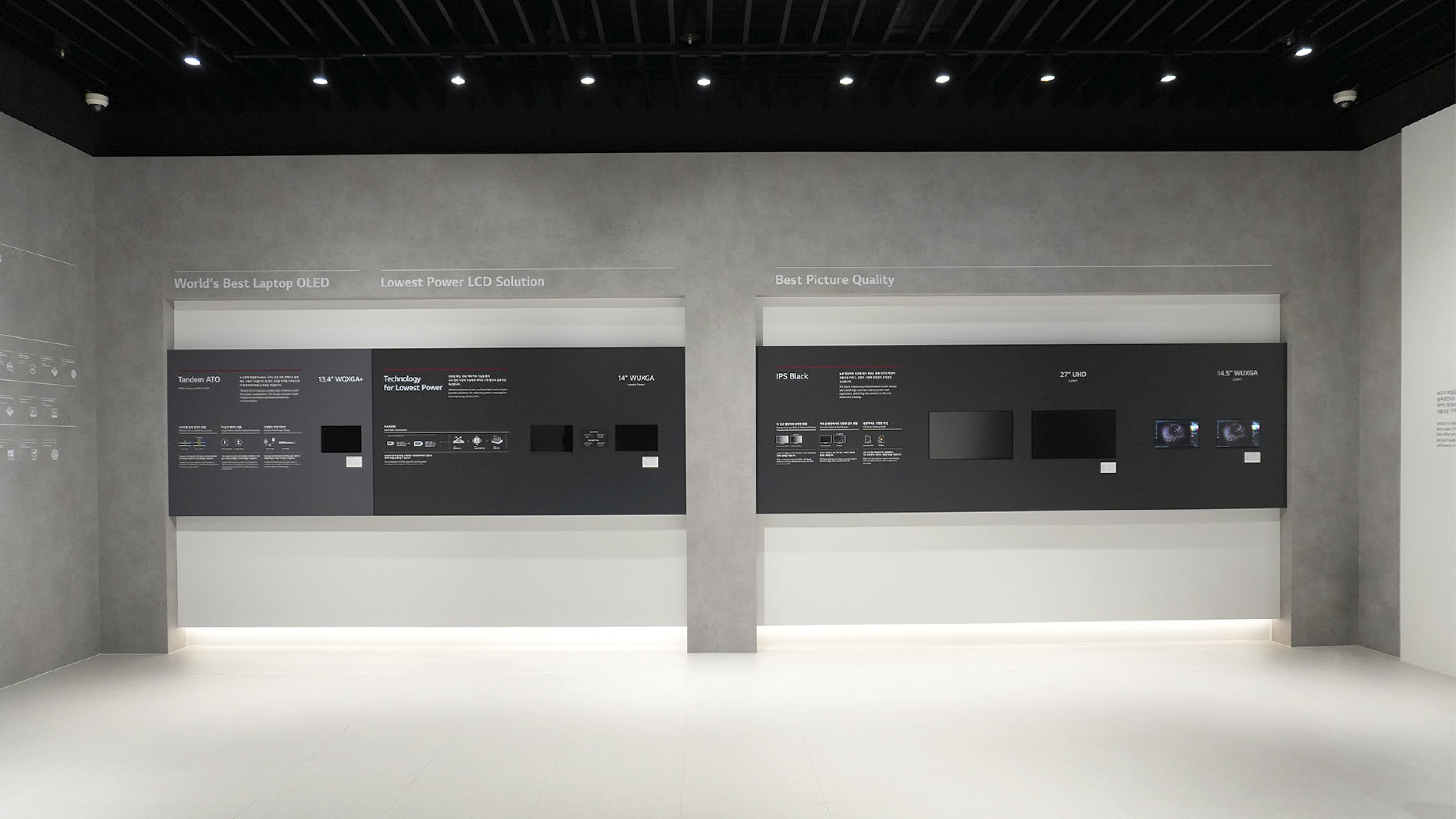
We designed LG Display’s exhibition graphics and design standards to create a cohesive visual system that enhances brand identity and ensures a consistent, engaging experience, effectively showcasing LG Display’s advanced technology.
LG디스플레이의 전시 그래픽 표준화 프로젝트를 진행했습니다. 베이그는 다양한 전시 환경에 적용할 수 있는 일관된 시각 체계를 구축하여, 표준화된 시각 언어로 브랜드 정체성을 강화하고 몰입감 있는 관람 경험을 제공함으로써 LG디스플레이의 첨단 이미지를 효과적으로 전달할 수 있도록 디자인하였습니다.
LG디스플레이의 전시 그래픽 표준화 프로젝트를 진행했습니다. 베이그는 다양한 전시 환경에 적용할 수 있는 일관된 시각 체계를 구축하여, 표준화된 시각 언어로 브랜드 정체성을 강화하고 몰입감 있는 관람 경험을 제공함으로써 LG디스플레이의 첨단 이미지를 효과적으로 전달할 수 있도록 디자인하였습니다.
Graphic Standards Elements
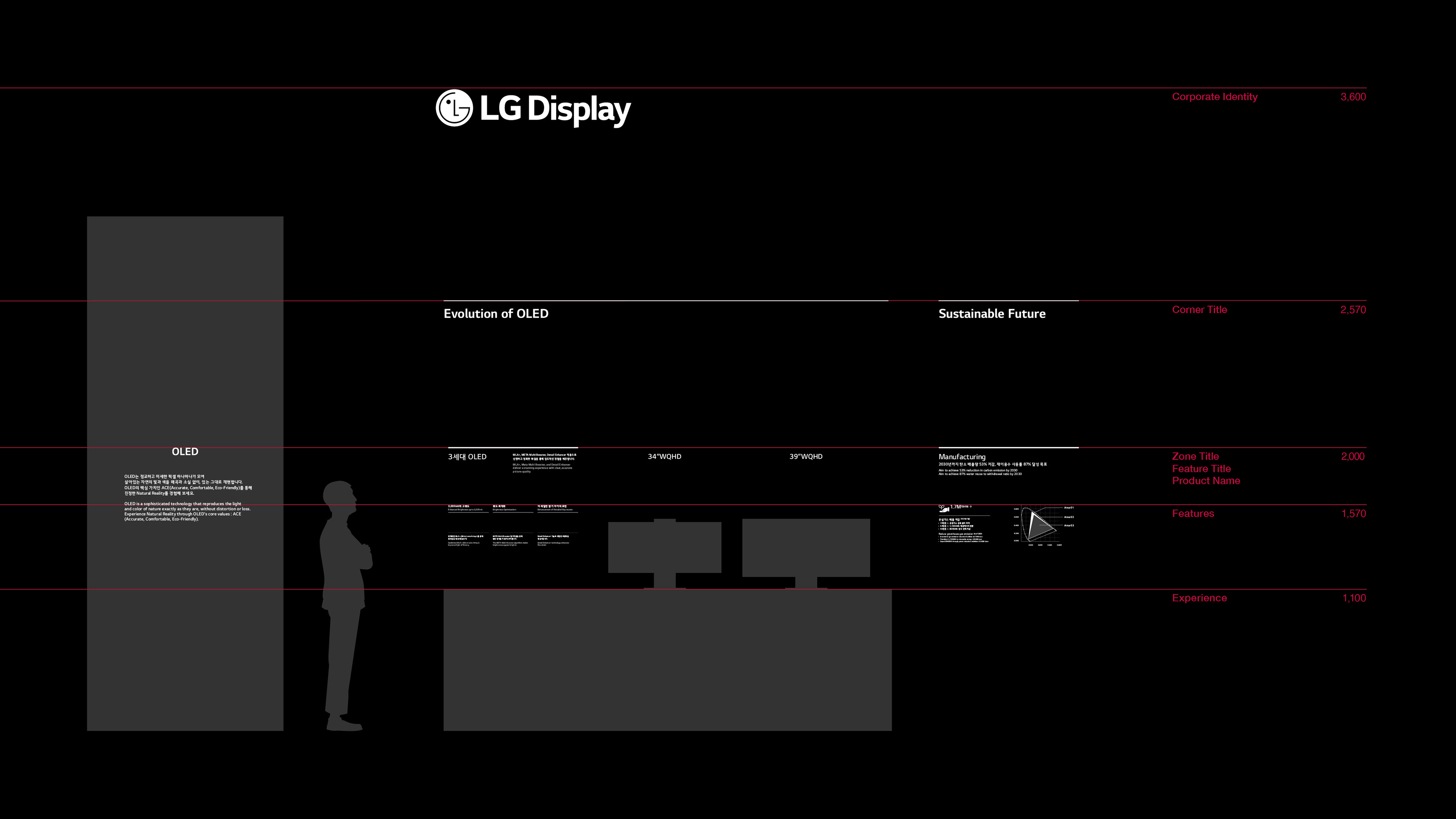
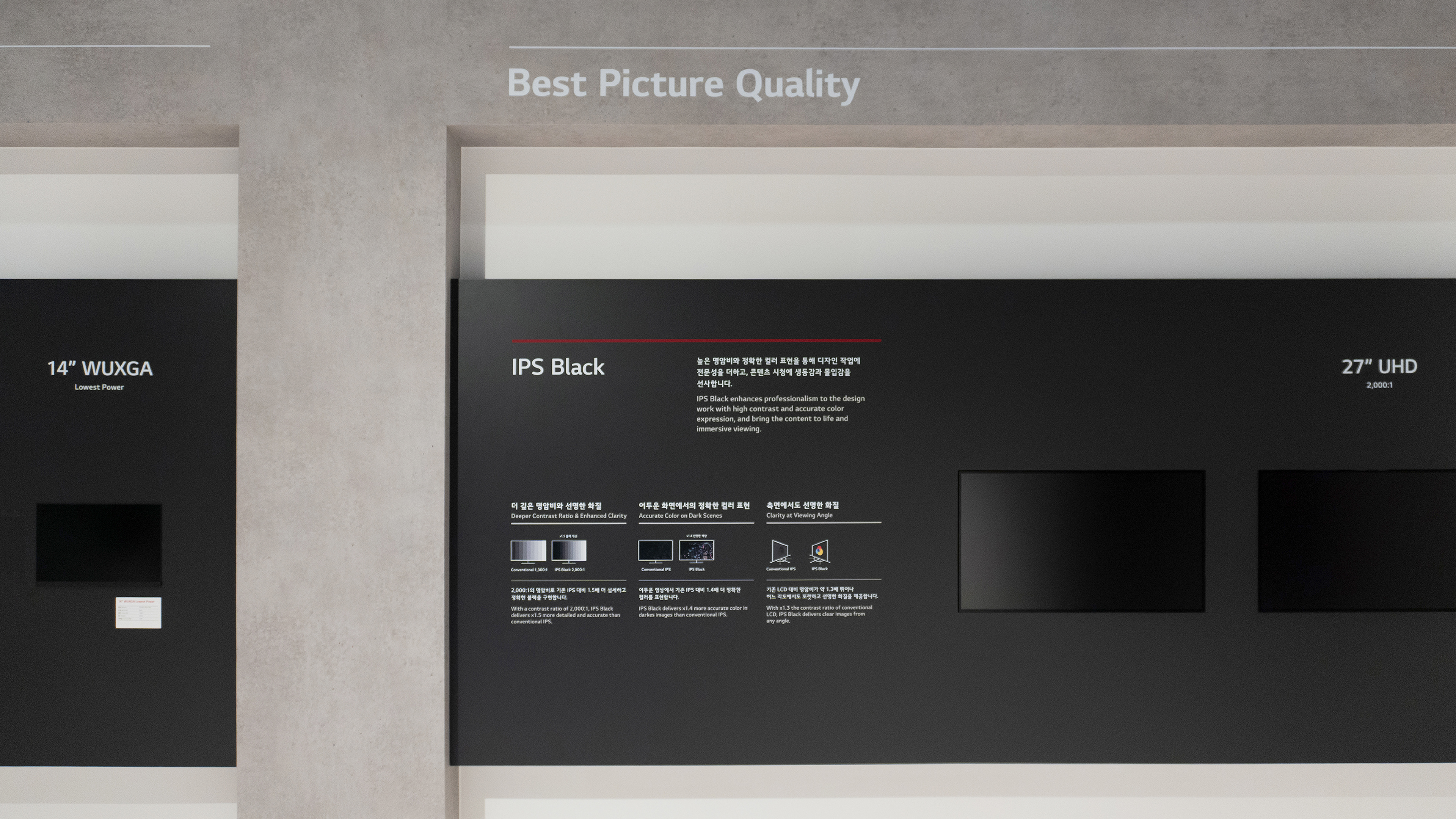
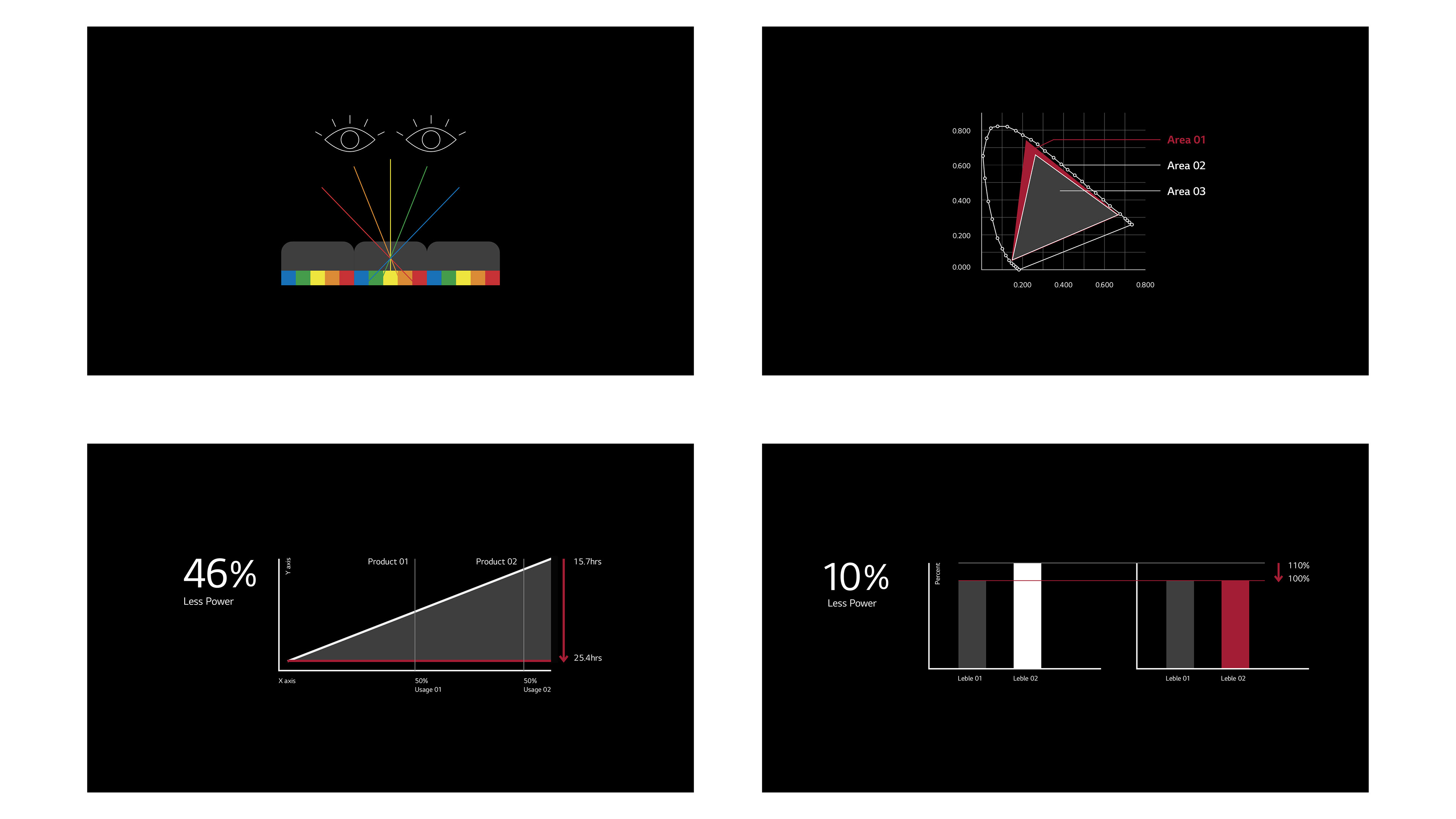
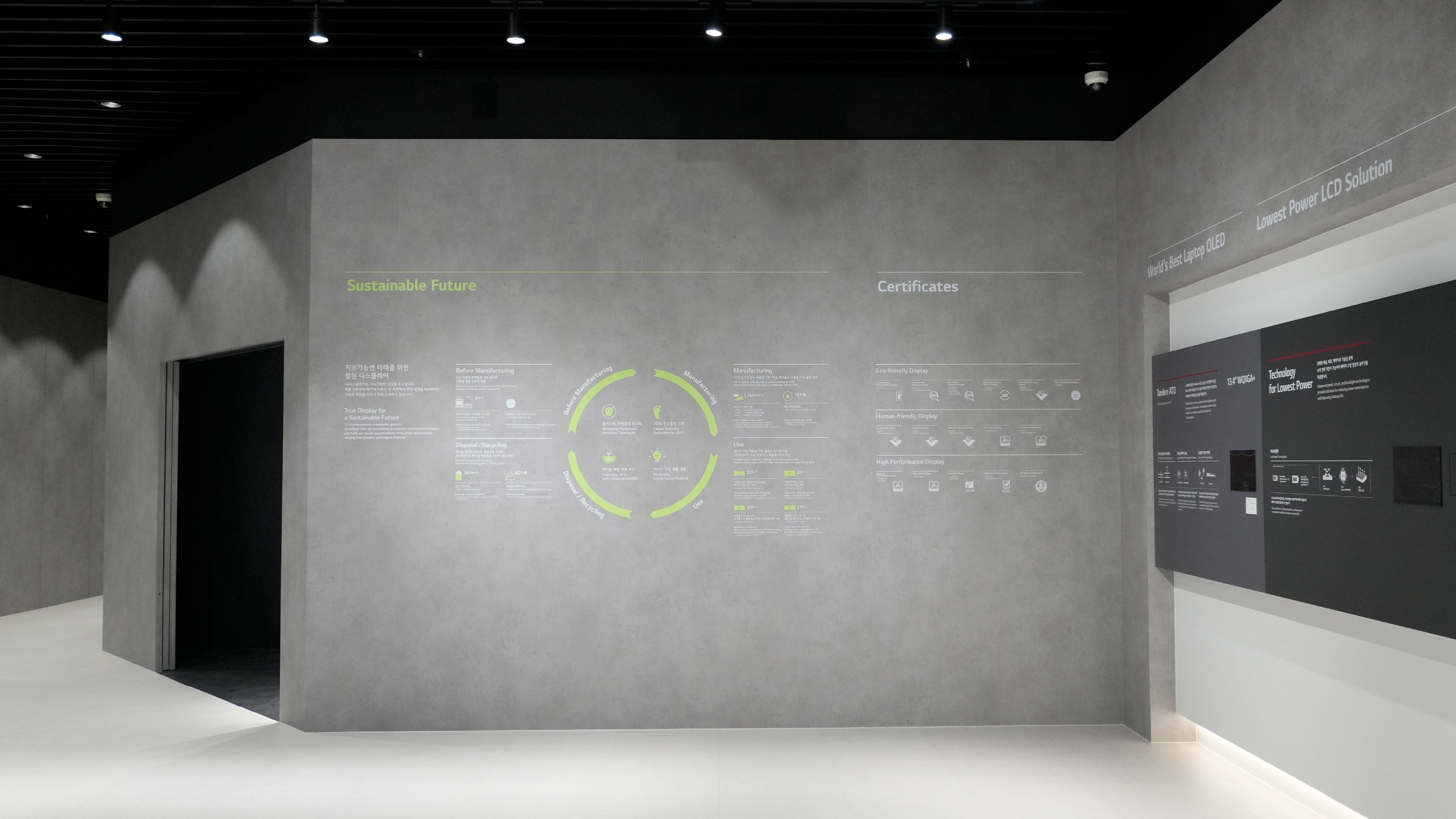
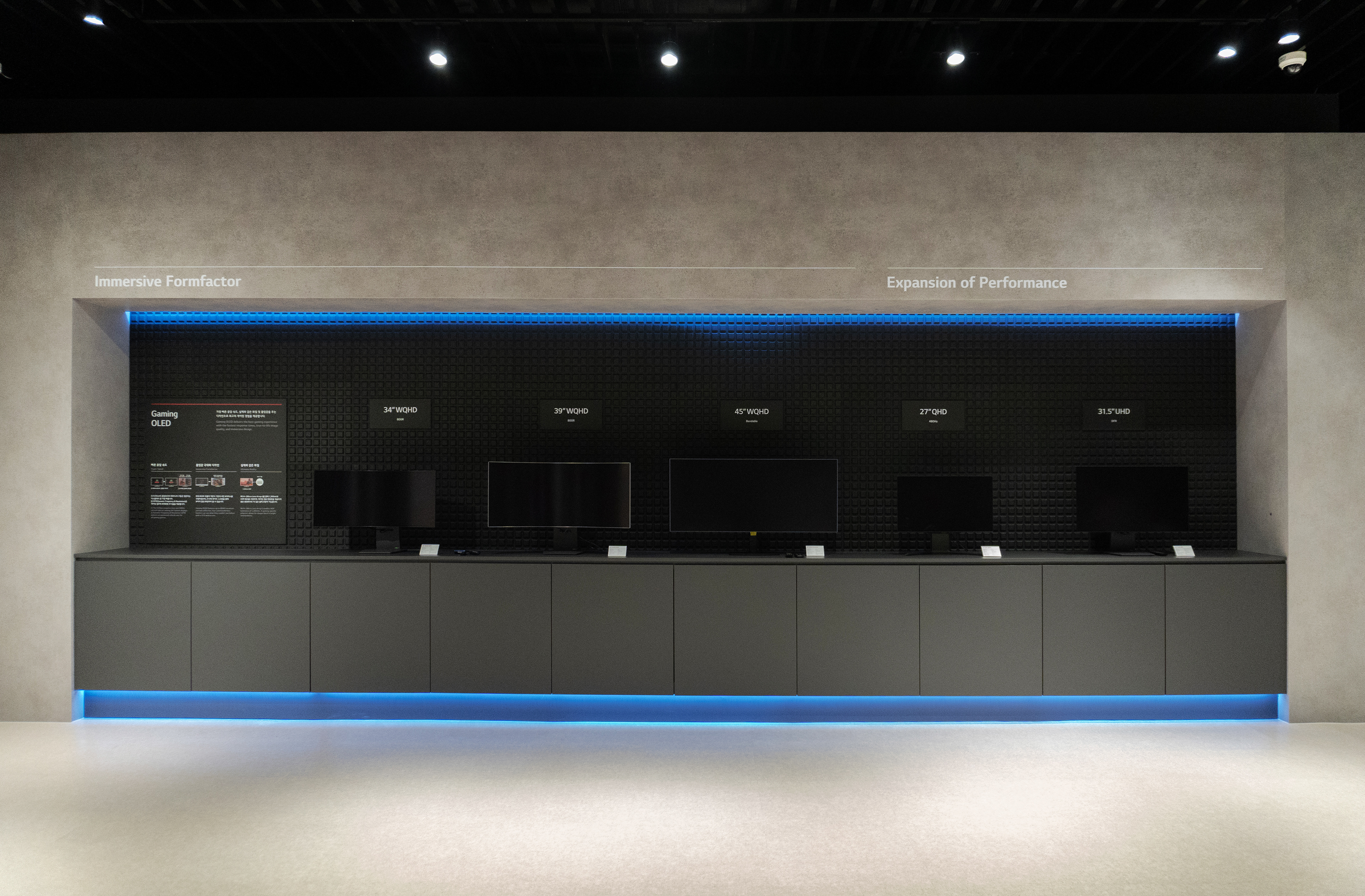
Grid System A flexible grid with guide lines ensures clear communication of technical information.
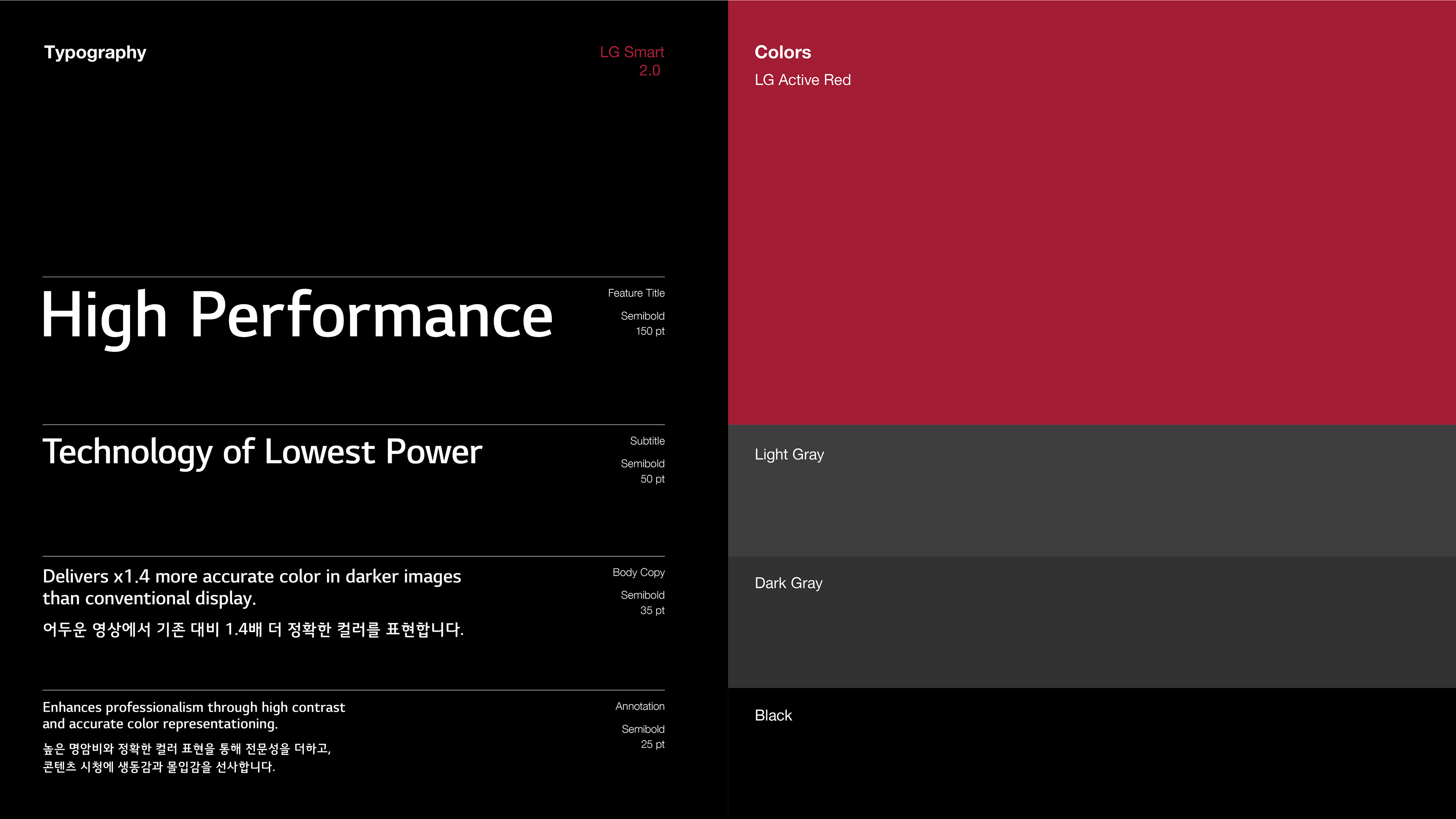
Typography LG Smart 2.0 enhances brand consistency and readability.
Color The color system integrates LG Display’s brand colors seamlessly.
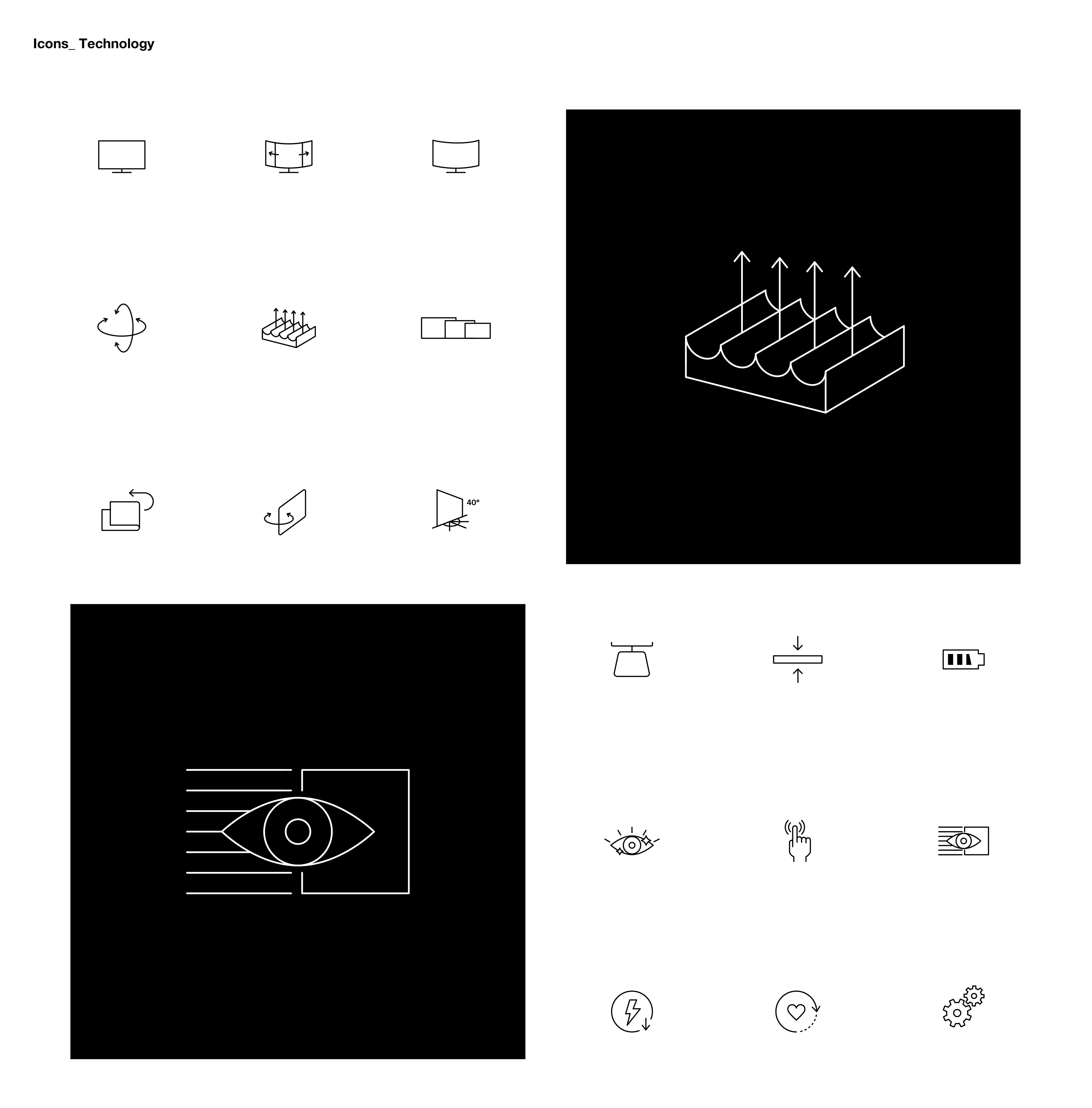
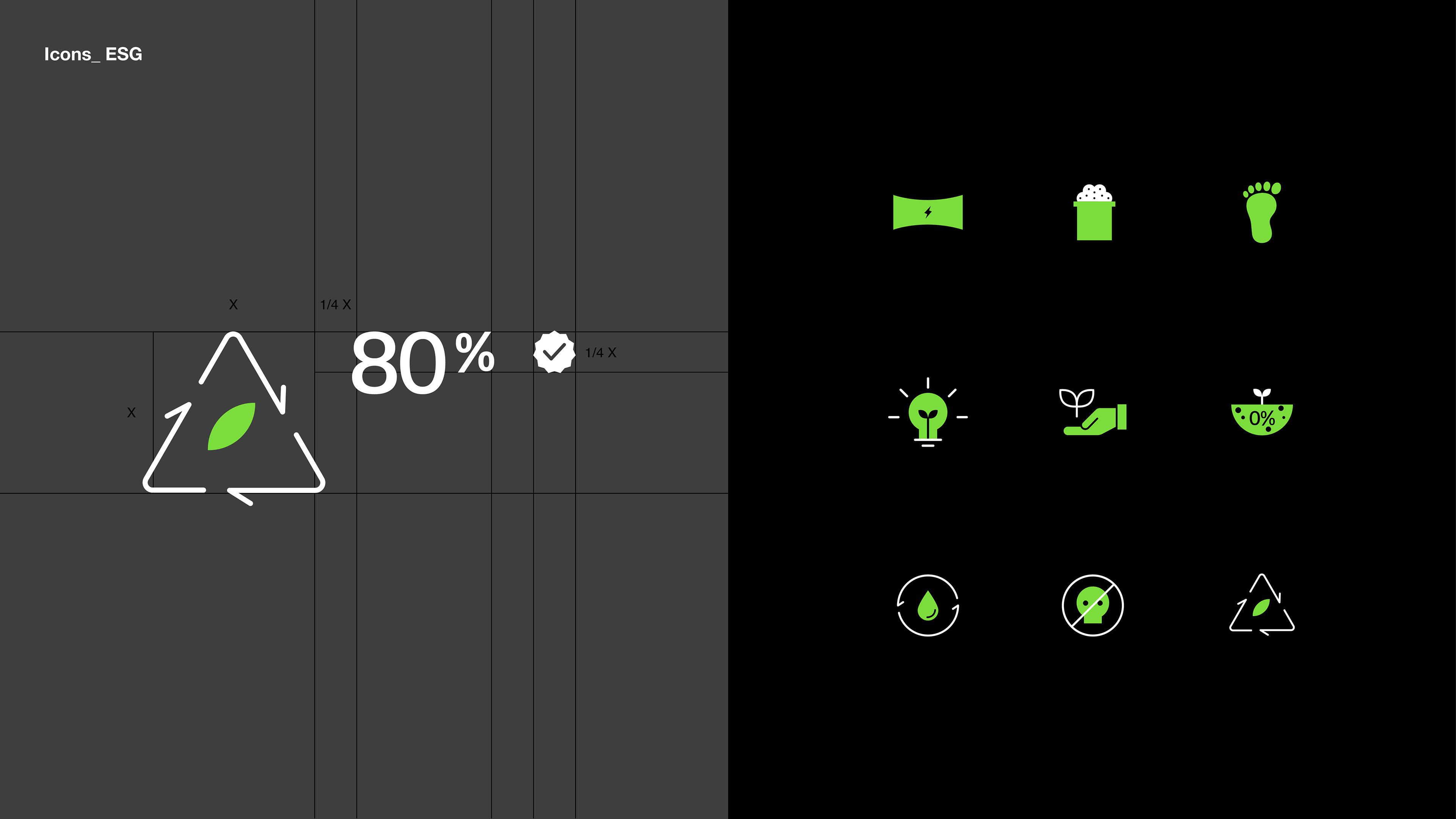
Icons Icons are designed to simplify key information visually, making it easy for visitors to understand technical details.
Eye-level Focal Point Information is positioned at eye level to reduce visual strain and maximize clarity.
Grid System 괘선과 함께 변주가 용이한 그리드 시스템을 통해 많은 기술 정보를 짜임새 있고 명확하게 전달
Typography LG스마트 서체를 통해 브랜드의 일관성, 정보 가독성 향상
Color 전시공간에서 브랜드 컬러가 자연스럽게 느껴지도록 컬러 체계 정립
Icons 정보의 핵심을 간결하게 시각화한 아이콘을 통해 관람객이 기술정보를 쉽게 이해할 수 있도록 디자인
Eye-level Focal Point 주요 정보는 관람객의 시선 높이에 배치, 시각적 피로를 줄이고 정보 전달 효과 향상

Client LG Display
Discipline Exhibition Graphic & Design Standards / Guidelines
Director Jaeyong Jang
Design Soohyun Cho, Dohee Ham, Yoona Kim, Hyeyoung Jung
Discipline Exhibition Graphic & Design Standards / Guidelines
Director Jaeyong Jang
Design Soohyun Cho, Dohee Ham, Yoona Kim, Hyeyoung Jung