
OUTTAKES
Cross-Culture Design Collaboration Exhibition
Overview
OUTTAKES is a cross-cultural exhibition by VEIG (Korea), PBB&O, and FARMGROUP (Thailand), highlighting the “B-cuts”, unselected design concepts accumulated through years of projects. A B-cut is not a discarded outcome, but a record of alternative possibilities and a trace of creative depth within the process. VEIG conceived this exhibition to reveal the hidden value behind these works, sharing the journeys of designers while celebrating the diversity and spirit of Asian design.
OUTTAKES는 한국의 VEIG, 태국의 PBB&O와 FARMGROUP이 오랜 시간 쌓아온 프로젝트 속 ‘선택되지 않은 시안(B-cut)’을 새롭게 조명하는 전시입니다. B컷은 단순히 버려진 결과물이 아니라 또 다른 가능성의 기록이자, 창작 과정의 깊이를 보여주는 흔적입니다. 베이그는 이러한 B컷의 숨겨진 가치를 알리고, 디자이너의 여정을 공유하며 아시아 디자인의 다양성과 의미를 함께 나누고자 이번 전시를 기획하였습니다.
Logotype
The OUTTAKES logotype visualizes the core concept of the exhibition, the contrasting destinies of the final design and the unselected B-cut. By combining two distinct typefaces, “OUT” represents the unchosen drafts, while “TAKES” symbolizes the final outcome. This contrast intuitively conveys the relationship between completion and incompletion, selection and rejection, capturing the exhibition’s idea of “the unseen possibilities behind every choice.”
OUTTAKES의 로고타입은 전시의 핵심 개념인 ‘최종안과 선택받지 못한 비컷의 상반된 운명’을 시각화한 디자인입니다. 서로 다른 두 서체를 조합해 ‘OUT’은 선택되지 않은 시안을, ‘TAKES’는 최종으로 선택된 결과를 상징하며, 이 대비를 통해 완성과 미완, 선택과 배제의 관계를 직관적으로 표현했습니다. 이는 전시가 말하고자 하는 ‘선택의 이면에 존재하는 또 다른 가능성’을 함축적으로 표현한 것입니다.
Visual Elements
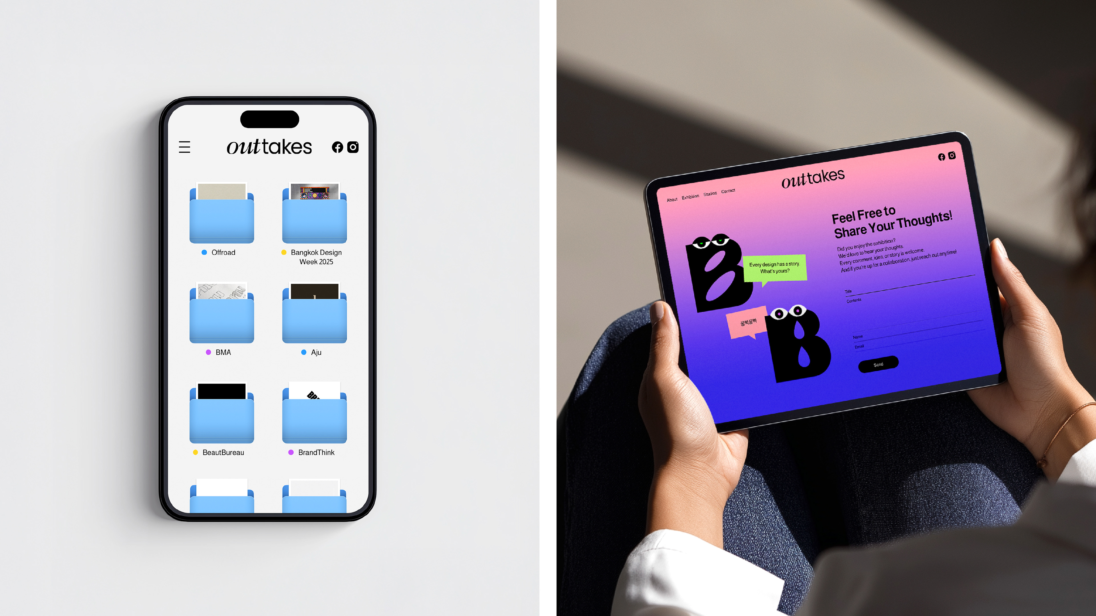
The visual identity of OUTTAKES was inspired by the desktops of designers everywhere. Familiar elements such as folders, filenames, and cursors were used as graphic motifs, creating the feeling of peeking into another designer’s workspace. The color palette was drawn from the dawn sky that greets designers after long hours of work, symbolizing the time of deep focus. B-cut characters, each with unique expressions and personalities, bring the “unselected designs” to life and build an emotional connection with the audience. While addressing the challenges and unchosen B-cuts, the tone remains light and witty, making it easy for every designer to relate to.
OUTTAKES의 비주얼 아이덴티티는 세상 모든 디자이너의 데스크톱에서 출발했습니다. 폴더, 파일명, 커서 등 디자이너에게 익숙한 오브제를 그래픽 모티프로 차용해, 마치 다른 디자이너의 작업 폴더를 엿보는 듯한 흥미로운 몰입감을 유도했습니다. 컬러는 디자이너가 긴 작업 끝에 맞이하는 새벽녘의 하늘빛에서 가져와, 오랜 집중의 시간을 은유한 것입니다. 또한 B컷을 의인화한 캐릭터를 개발해 각기 다른 표정과 개성을 부여함으로써 ‘선택되지 않은 디자인’에 생명력을 더하고 관람자와의 정서적 연결을 형성했습니다. 크리에이티브의 험난한 과정과 선택되지 못한 B컷을 이야기하면서도 가볍고 위트 있는 시선을 유지해, 모든 디자이너가 공감할 수 있는 비주얼 언어로 풀어냈습니다.
UX/UI
The online exhibition of OUTTAKES reflects the design characteristics of both Korea and Thailand. Based on the structural clarity and systematic layout typical of Korean design, the interface presents information in a natural and easily readable flow. Inspired by the flexibility and experimental energy of Thai design, playful details, such as cursor-responsive B-cut characters and subtle interactions, add a sense of wit. These touches allow visitors to intuitively explore each project’s context and background, experiencing not only the final outcomes but also the creative process behind them.
OUTTAKES의 온라인 전시는 한국과 태국 두 문화의 디자인적 특성을 UX/UI 전반에 담았습니다. 한국 디자인의 구조적 명료함과 체계적인 구성 방식을 기반으로, 정보의 흐름이 자연스럽고 읽기 쉬운 레이아웃을 구축했습니다. 여기에 태국 디자인 특유의 유연한 상상력과 실험적인 감각을 반영해, 마우스 움직임에 반응하는 B컷 캐릭터와 섬세한 인터랙션으로 위트를 더했습니다. 이러한 디테일을 통해 관람자는 각 프로젝트의 맥락과 배경을 탐색하듯 경험할 수 있으며, 결과물뿐 아니라 그 뒤에 숨은 ‘과정의 가치’를 자연스럽게 느낄 수 있도록 했습니다.
Promotion
OUTTAKES was introduced through digital campaigns accompanying the launch of the online exhibition. Across various channels, including the website, social media, and newsletters, the exhibition’s visual identity was extended, with content tailored to the character of each platform. A wide range of content, including images, short videos, interviews, and articles was developed, along with offline elements such as stickers and merchandise, to further enrich the exhibition’s narrative and context.
OUTTAKES는 온라인 전시의 공개와 함께 단계적인 디지털 캠페인을 통해 소개되었습니다. 웹사이트, 소셜미디어, 뉴스레터 등 다양한 채널에서 전시의 비주얼 아이덴티티를 기반으로, 각 플랫폼의 성격에 맞춘 콘텐츠를 전개했습니다. 이미지, 짧은 영상, 인터뷰, 아티클 등 다양한 형식의 콘텐츠를 개발하고, 스티커와 굿즈 등 오프라인 요소로도 전시의 맥락과 이야기를 더욱 풍성하게 전달하고자 합니다.
Online Exhibition
Online Gallery : www.outtakes.design
Instagram : @outtakes.design
Online Gallery : www.outtakes.design
Instagram : @outtakes.design
On-site Exhibition
See you at Bangkok Design Week 2026🇹🇭👋
See you at Bangkok Design Week 2026🇹🇭👋
Organized by
VEIG (Seoul) | veig-bx.com
PinkBlueBlack&Orange (Bangkok) | pinkblueblack.com
FARMGROUP (Bangkok) | farmgroup.co.th
Hann (Seoul+Bangkok)
VEIG (Seoul) | veig-bx.com
PinkBlueBlack&Orange (Bangkok) | pinkblueblack.com
FARMGROUP (Bangkok) | farmgroup.co.th
Hann (Seoul+Bangkok)
Planning & Creative Direction
Jaeyong Jang | VEIG
Jaeyong Jang | VEIG
Planning Collaboration
Yoona Kim, Hyeyoung Jung | VEIG
Siam Attariya | PinkBlueBlack&Orange
Tap Kruavanichkit | FARMGROUP
Hann
Yoona Kim, Hyeyoung Jung | VEIG
Siam Attariya | PinkBlueBlack&Orange
Tap Kruavanichkit | FARMGROUP
Hann
Design
Yoona Kim, Dohee Ham, Jongchan Yoon, Eunseo Kwak, Sol Kim | VEIG
Yoona Kim, Dohee Ham, Jongchan Yoon, Eunseo Kwak, Sol Kim | VEIG
Design Collaboration
Paputh Nimchuar, Teerapat Lowsuwannawong | PinkBlueBlack&Orange
Korada Srithongkird | FARMGROUP
Paputh Nimchuar, Teerapat Lowsuwannawong | PinkBlueBlack&Orange
Korada Srithongkird | FARMGROUP