
Packaging Design for ZERO FEEL
Design Solutions & Services
Brand Strategy
Research & Market Analysis
Internal Design Workshop
Packaging Design
Icon Design
Research & Market Analysis
Internal Design Workshop
Packaging Design
Icon Design
브랜드 전략
리서치 및 시장 분석
디자인 워크샵 진행
패키징 디자인
아이콘 디자인
리서치 및 시장 분석
디자인 워크샵 진행
패키징 디자인
아이콘 디자인
Project Overview
Redefining Clean Confidence
Under the message ‘Absorption is Confidence’, WHITE has been a leading brand of Yuhan-Kimberly since 1995, supporting women’s everyday lives with trust and comfort. Moving beyond the conventional image that emphasized traditional femininity, WHITE introduced its premium line ZERO FEEL, redefining the brand message to align with a new generation of confident and self-driven women. ZERO FEEL was developed to meet the needs of active modern women through its ultra-thin, lightweight design, rapid absorption, and flexible structure that minimize weight and discomfort. We visually highlighted these product strengths to build a refined and contemporary brand image that resonates with and inspires a new generation.
Under the message ‘Absorption is Confidence’, WHITE has been a leading brand of Yuhan-Kimberly since 1995, supporting women’s everyday lives with trust and comfort. Moving beyond the conventional image that emphasized traditional femininity, WHITE introduced its premium line ZERO FEEL, redefining the brand message to align with a new generation of confident and self-driven women. ZERO FEEL was developed to meet the needs of active modern women through its ultra-thin, lightweight design, rapid absorption, and flexible structure that minimize weight and discomfort. We visually highlighted these product strengths to build a refined and contemporary brand image that resonates with and inspires a new generation.
‘흡수는 자신감’이라는 메시지로 1995년부터 여성들의 일상을 지켜온 유한킴벌리의 대표 브랜드 화이트는, 기존의 전형적인 여성성을 강조했던 이미지에서 벗어나 자신감 있고 주체적인 라이프스타일을 지향하는 새로운 세대의 등장에 맞춰 브랜드를 새롭게 정의하며 프리미엄 라인 ‘제로필’을 선보였습니다. ‘제로필’은 얇고 가벼운 착용감, 빠른 흡수력, 유연한 설계로 여성 위생용품의 무게와 불편함을 최소화한 제품으로, 활동적인 현대 여성의 니즈를 반영해 개발되었습니다. 베이그는 이러한 제품력을 시각적으로 강조하고, 새로운 세대가 공감하고 선망할 수 있는 세련된 브랜드 이미지를 구축했습니다.
Design Concept
Light Moves, Bold Feels
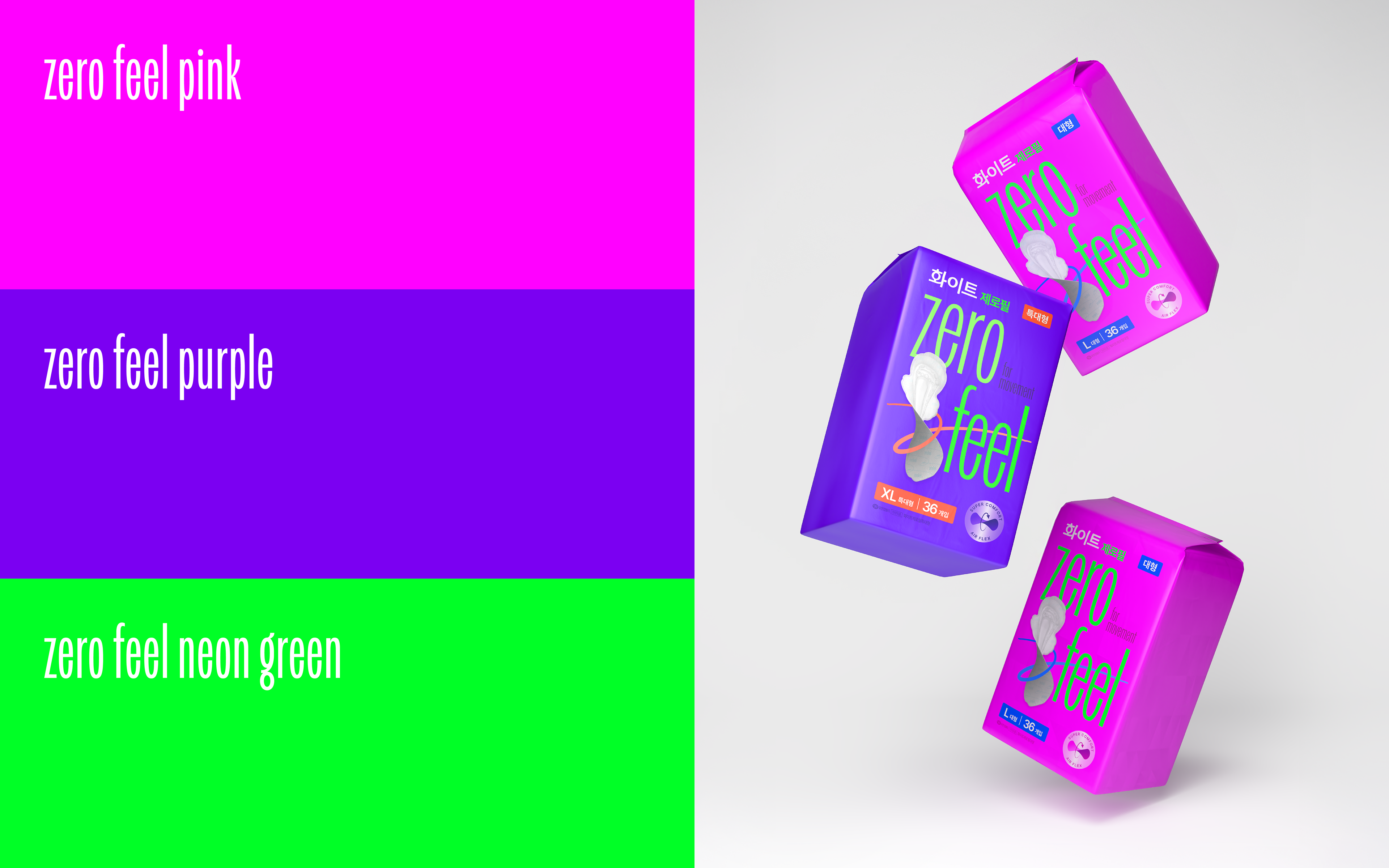
Rooted in the needs of modern women who seek to stay bright, confident, and uninterrupted throughout their day, we defined the concept “Light Moves, Bold Feels.” To visualize the sense of lightness and refined sensitivity, we developed a condensed, lightweight wordmark, vivid high-chroma colors, and dynamic linear motifs that express ZERO FEEL’s performance and the emotional rhythm of a new generation.
Rooted in the needs of modern women who seek to stay bright, confident, and uninterrupted throughout their day, we defined the concept “Light Moves, Bold Feels.” To visualize the sense of lightness and refined sensitivity, we developed a condensed, lightweight wordmark, vivid high-chroma colors, and dynamic linear motifs that express ZERO FEEL’s performance and the emotional rhythm of a new generation.
베이그는 그날에도 밝고 에너지 넘치는 일상을 방해받고 싶지 않은 현대 여성의 니즈를 기반으로 ‘Light Moves, Bold Feels’라는 브랜드의 컨셉을 정의했습니다. 이를 바탕으로 제품의 가벼움과 정제된 감도를 시각적으로 구현하기 위해, 얇고 컨덴스드된 워드마크, 생동감 있는 높은 채도의 컬러, 역동적인 라인 모티프를 개발하여 제로필의 제품력과 새로운 세대의 감성을 반영한 브랜드의 정체성을 표현했습니다.
Packaging Design
Made to Move a New Generation
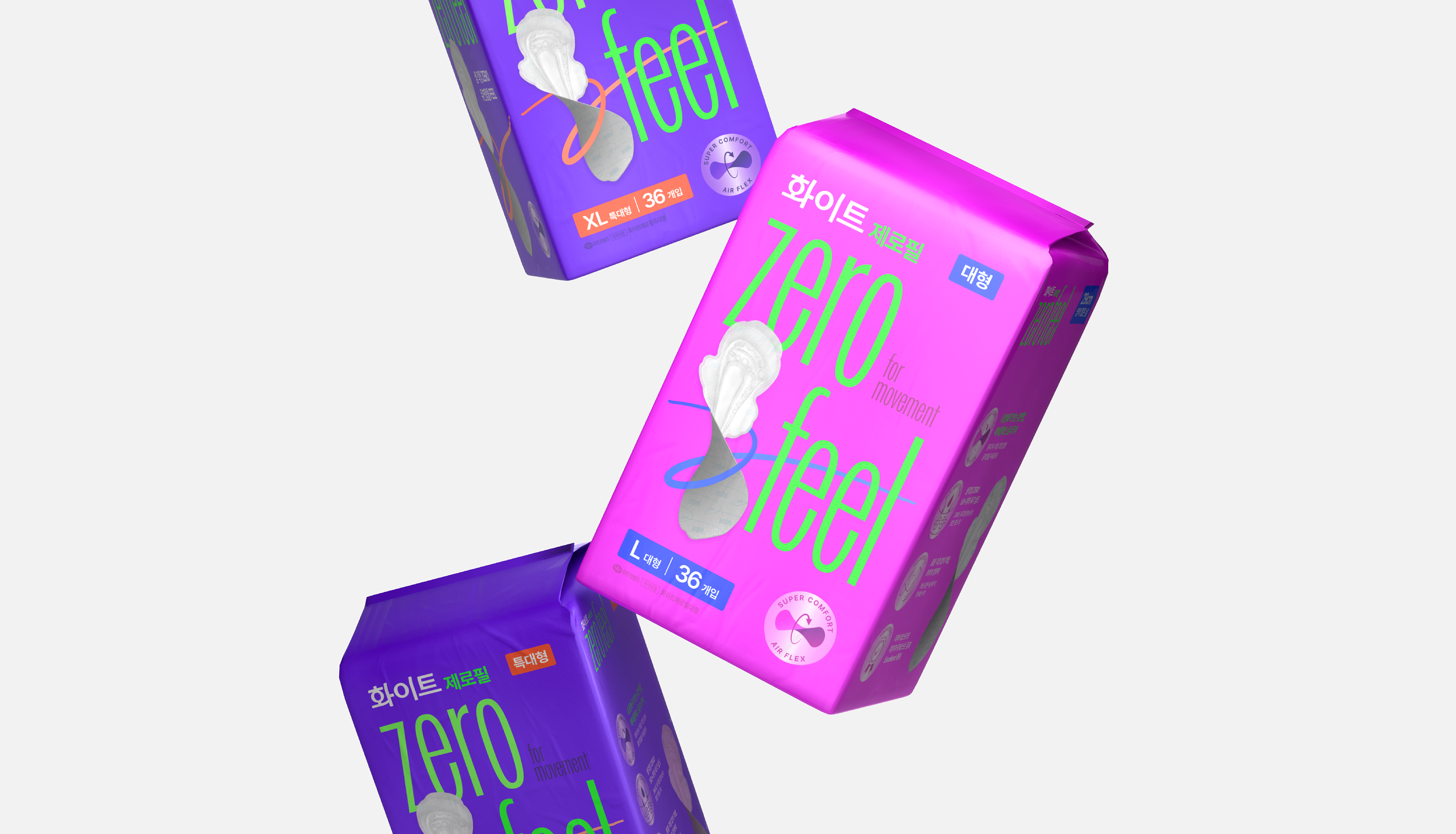
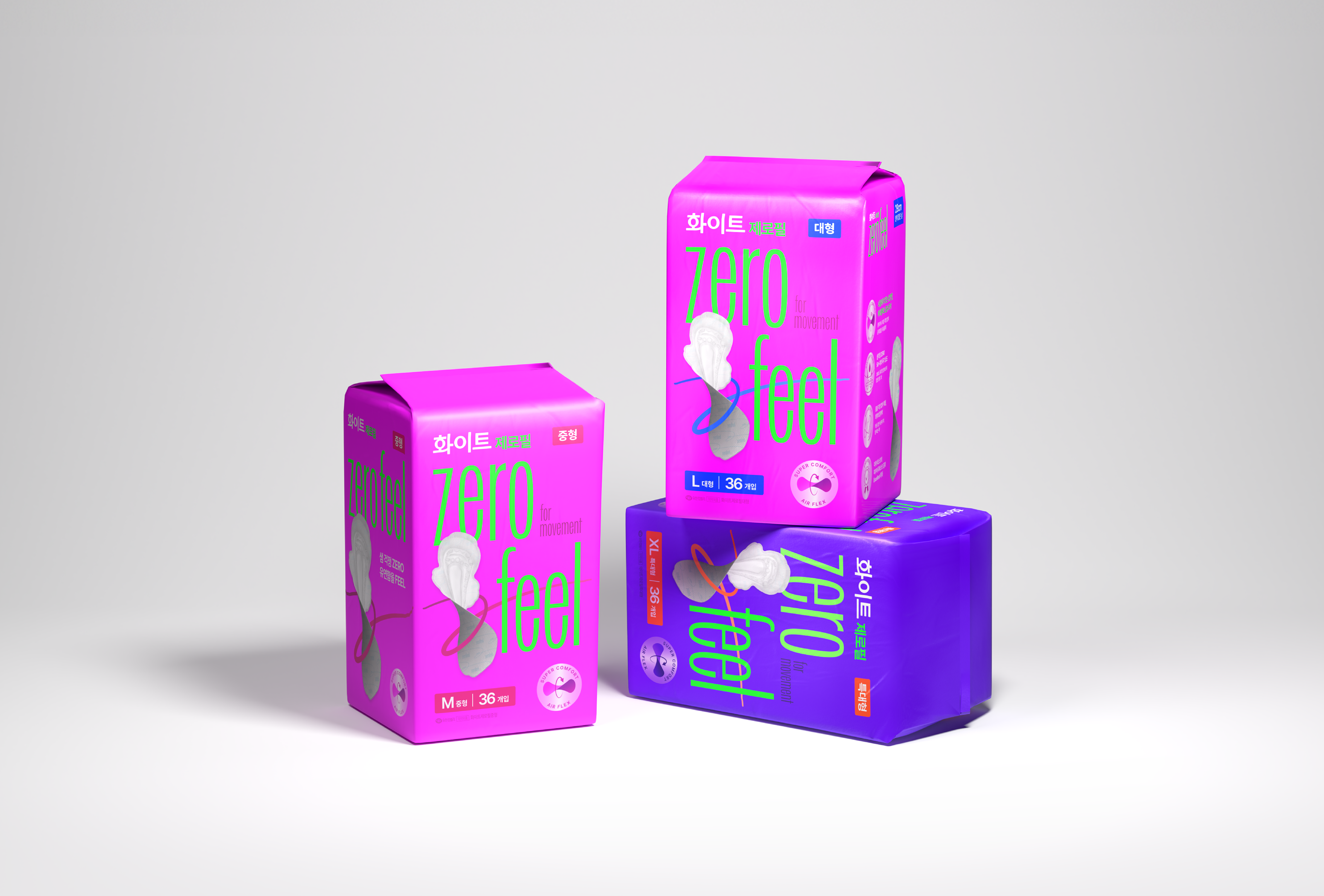
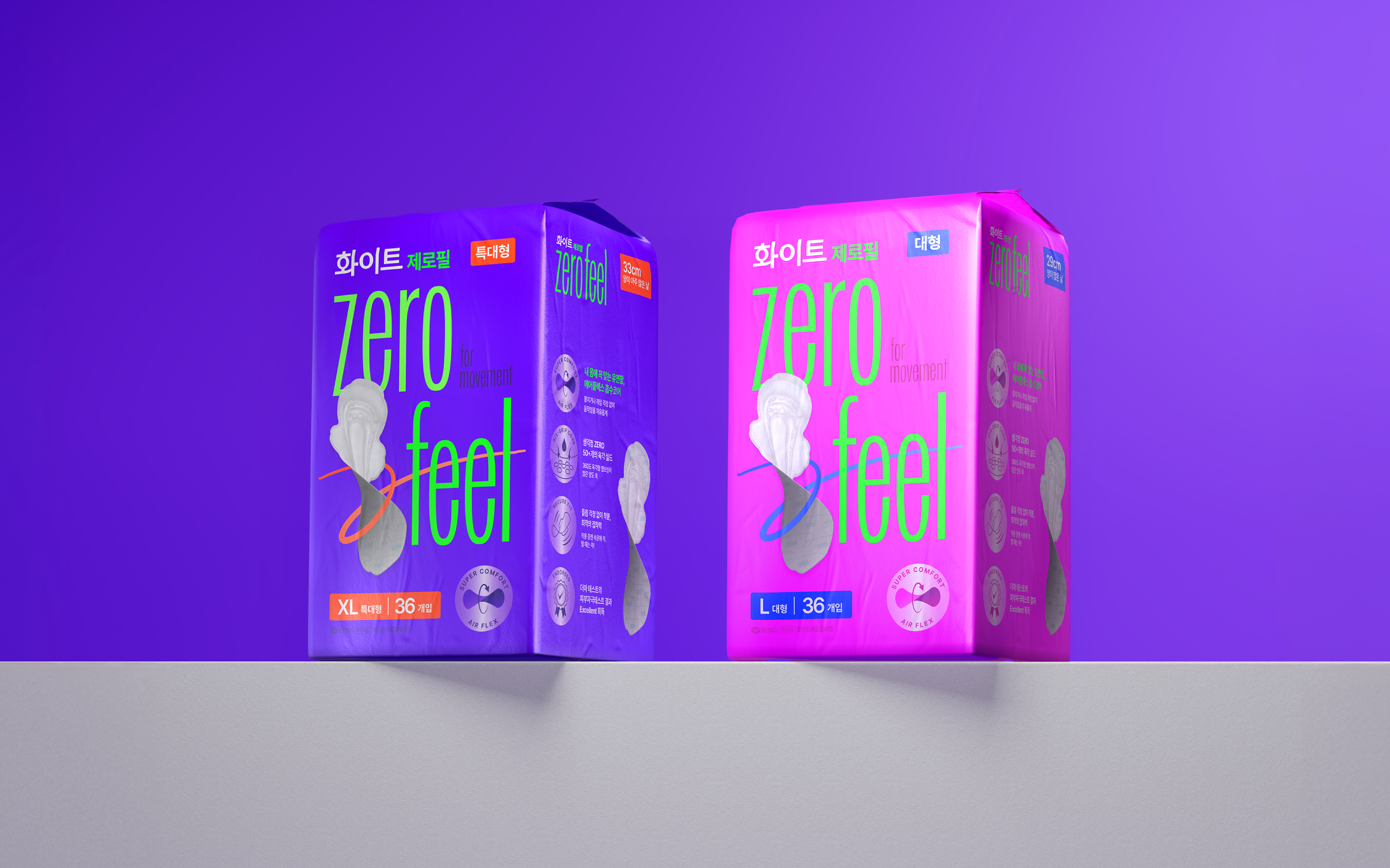
To intuitively convey ZERO FEEL’s core value of ‘light and flexible comfort’, we placed the softly lifted product image at the forefront, complemented by a dynamic line motif, intuitive icons, and a confident wordmark. This composition captures attention at first glance, delivering a powerful and differentiated presence on the shelf. Furthermore, by maintaining structural consistency with WHITE’s existing brand assets, we built a scalable packaging system that can flexibly respond to future line extensions. Through this approach, ZERO FEEL establishes itself as a premium line that embodies both contemporary sensitivity and trusted credibility, crafted to move a new generation.
To intuitively convey ZERO FEEL’s core value of ‘light and flexible comfort’, we placed the softly lifted product image at the forefront, complemented by a dynamic line motif, intuitive icons, and a confident wordmark. This composition captures attention at first glance, delivering a powerful and differentiated presence on the shelf. Furthermore, by maintaining structural consistency with WHITE’s existing brand assets, we built a scalable packaging system that can flexibly respond to future line extensions. Through this approach, ZERO FEEL establishes itself as a premium line that embodies both contemporary sensitivity and trusted credibility, crafted to move a new generation.
베이그는 제로필의 핵심 가치인 ‘가볍고 유연한 착용감’을 직관적으로 전달하기 위해, 가볍게 날아오른 제품 이미지를 전면에 배치하고 워드마크와 함께 역동적 라인 모티프, 직관적인 아이콘을 활용해 제품력과 키 클레임을 효과적으로 전달합니다. 이를 통해 매대 위에서 소비자의 시선을 사로잡고, 경쟁 제품과 차별화된 강렬한 첫인상을 형성합니다. 또한, 제로필의 향후 다양한 라인업 확장에 대응할 수 있도록 화이트의 기존 브랜드 자산과 구조적 일관성을 유지한 패키징 시스템을 구축하여, 제로필이 현대적 감도와 브랜드 신뢰성을 모두 갖춘 새로운 세대의 프리미엄 라인으로 자리매김할 수 있도록 했습니다.
본 프로젝트의 일부 이미지는 AI(Midjourney)를 활용해 생성되었습니다. Some images in this project were generated using AI (Midjourney).
Client Yuhan Kimberly
Director Jaeyong Jang
Design Sol Kim, Dohee Ham, Yoona Kim
3D Design Jongchan Yoon
Director Jaeyong Jang
Design Sol Kim, Dohee Ham, Yoona Kim
3D Design Jongchan Yoon