
Le HonnETE,
Prestigious country club
Project Overview
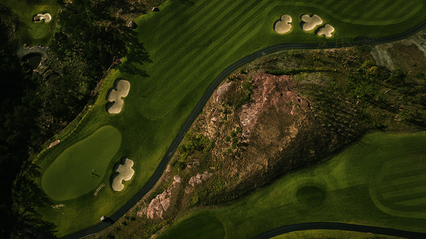
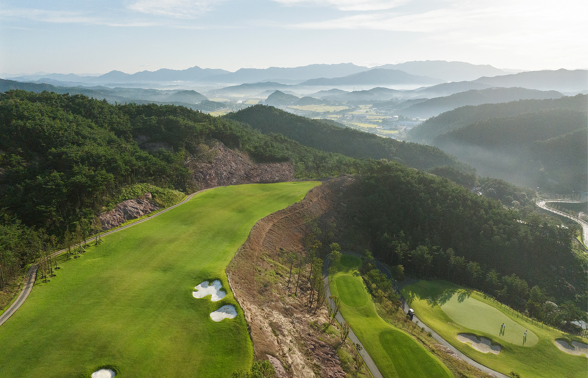
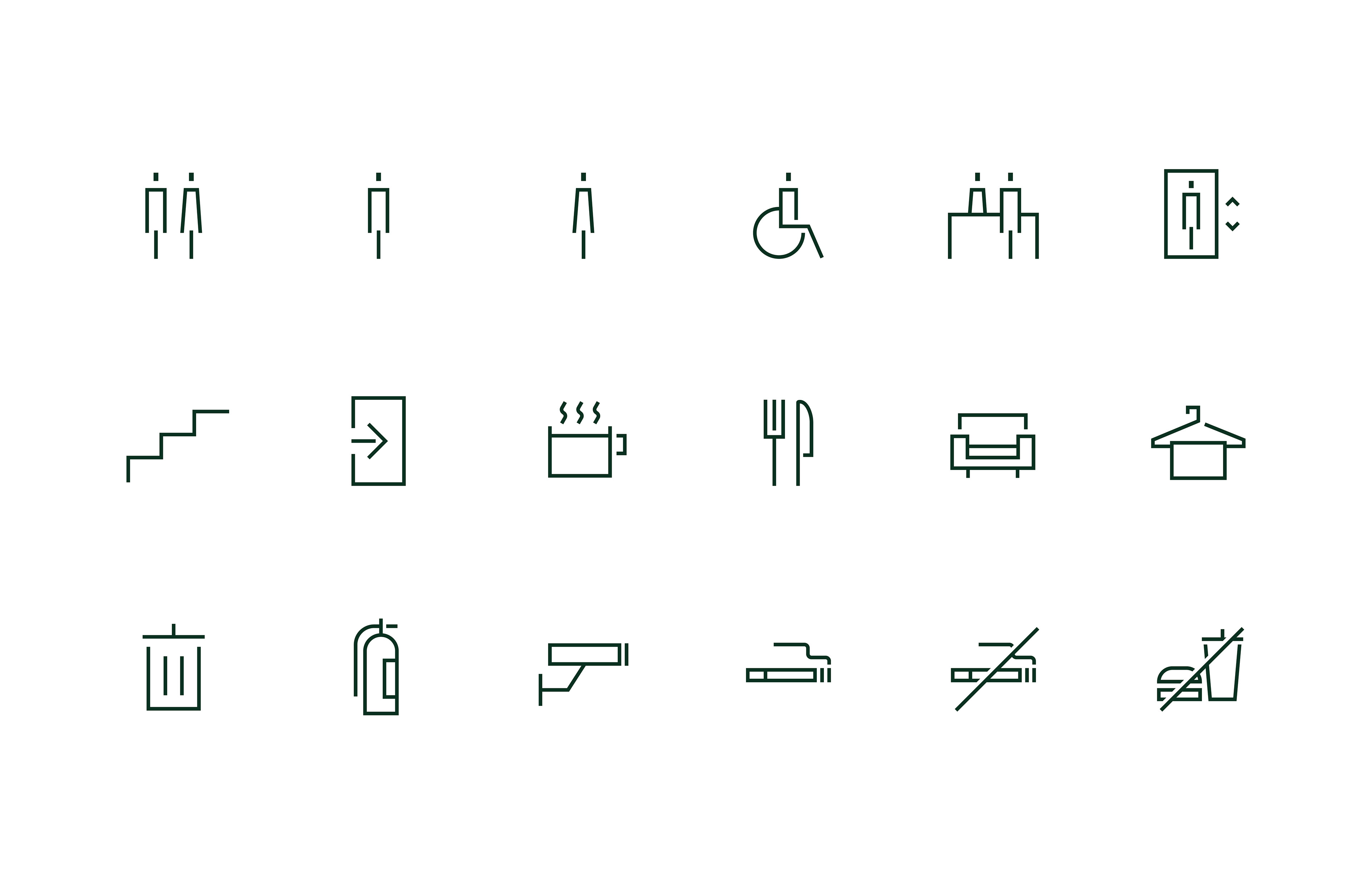
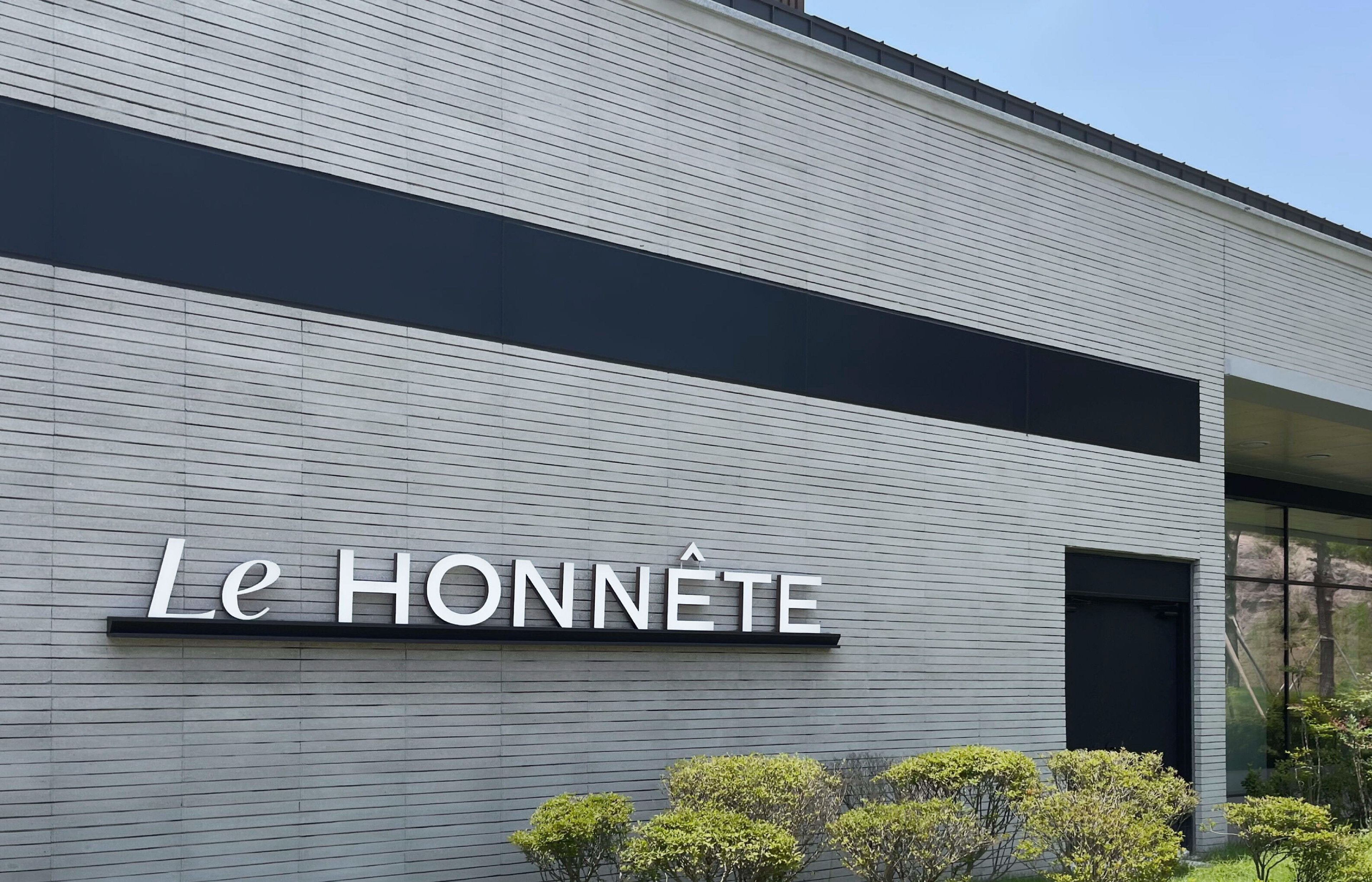
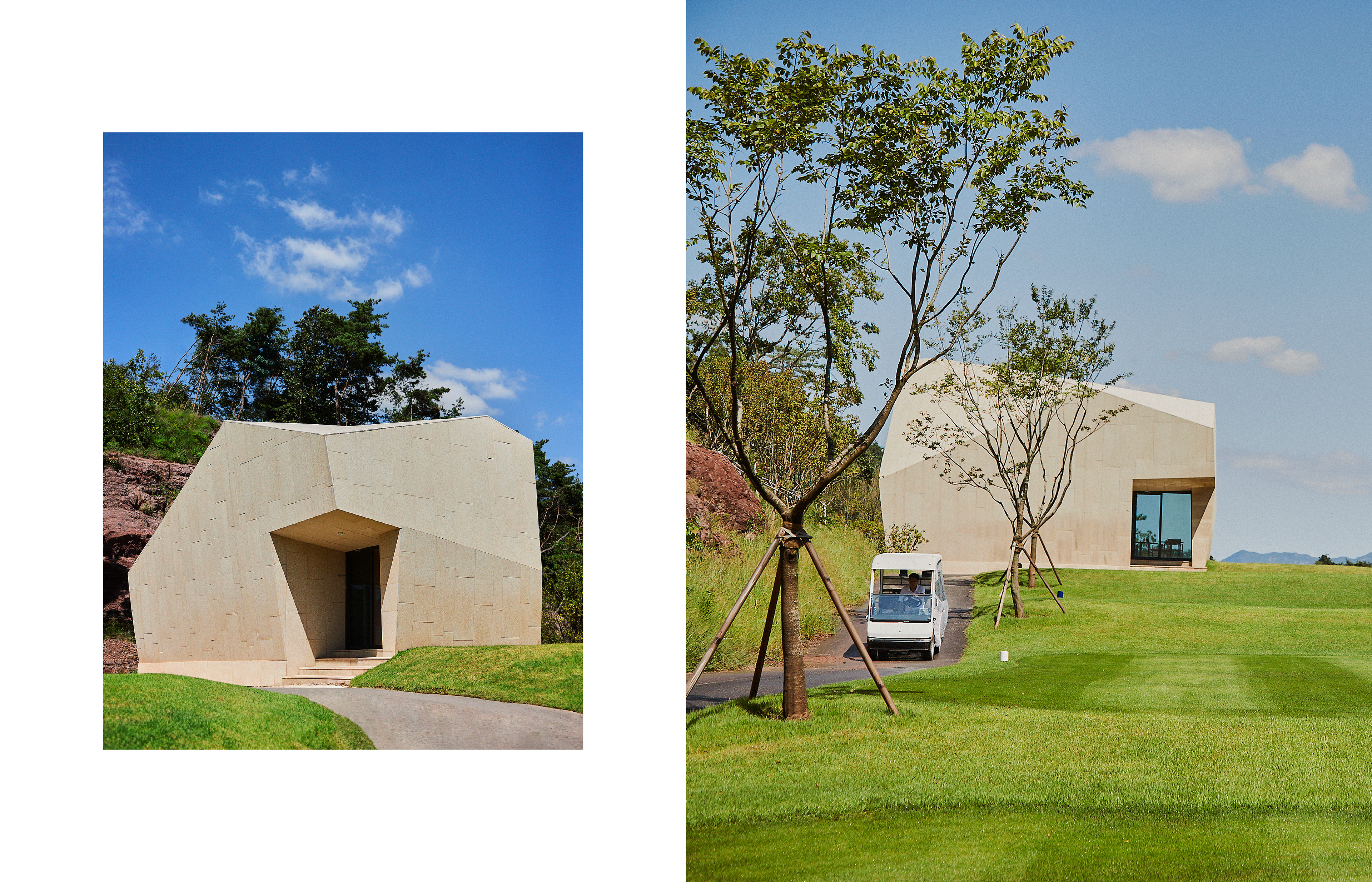
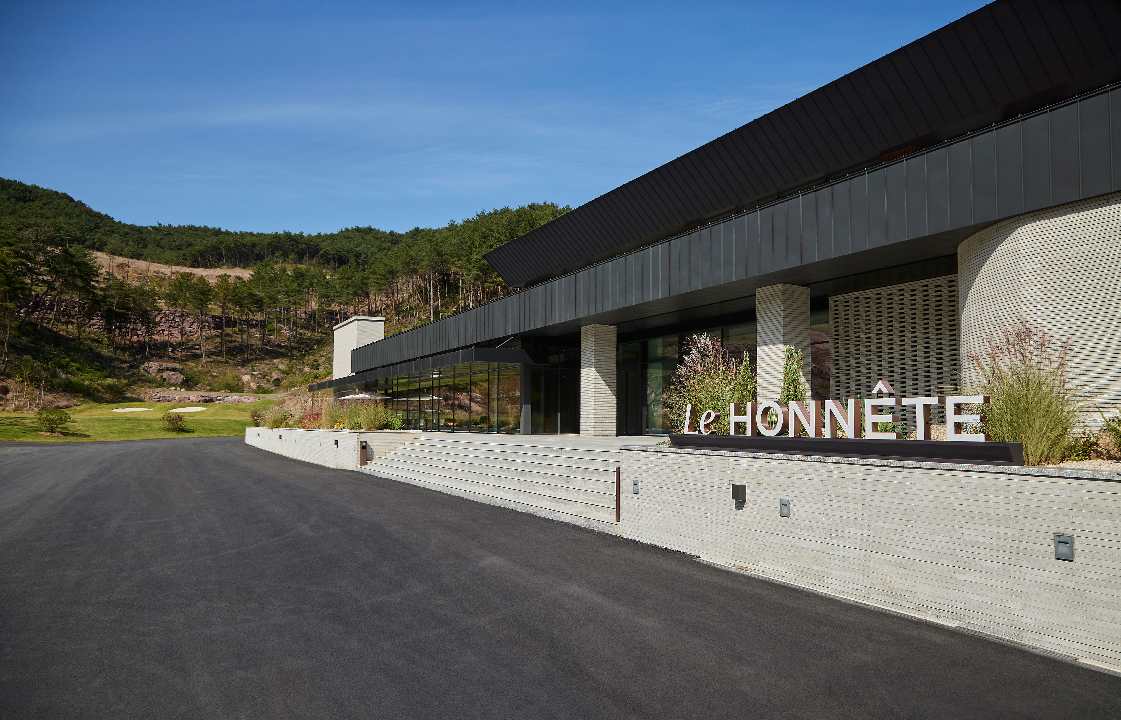
We developed a brand identity for Namhai Construction’s country club, LE HONNETE. It is located in Gokseong-gun, Jeollanam-do, Korea, and it provides high-quality golf course and the best service. We incorporated Namhai’s honesty and trust-based values to solidify the identity of LE HONNETE as Namhai’s pride and premium country club. We also designed brand’s visual materials into a manual to establish a system to minimize misuse with family brands of the same name.
남해종합건설의 컨트리클럽 르오네뜨(LE HONNETE)의 브랜드 아이덴티티를 개발하였습니다. 전라남도 곡성군에 위치한 르오네뜨는 차원 높은 코스와 최상의 서비스를 제공하는 컨트리클럽입니다 . 베이그는 정직/신용의 가치에 기반한 남해종합건설의 신념을 담아 기업의 자부심이자 자랑이 되는 프리미엄 컨트리클럽으로서의 아이덴티티를 공고히 하고, 다양한 범위의 브랜드 시각물들을 매뉴얼화하여 동명의 패밀리 브랜드와의 오용을 최소화할 수 있는 시스템을 확립하였습니다.
남해종합건설의 컨트리클럽 르오네뜨(LE HONNETE)의 브랜드 아이덴티티를 개발하였습니다. 전라남도 곡성군에 위치한 르오네뜨는 차원 높은 코스와 최상의 서비스를 제공하는 컨트리클럽입니다 . 베이그는 정직/신용의 가치에 기반한 남해종합건설의 신념을 담아 기업의 자부심이자 자랑이 되는 프리미엄 컨트리클럽으로서의 아이덴티티를 공고히 하고, 다양한 범위의 브랜드 시각물들을 매뉴얼화하여 동명의 패밀리 브랜드와의 오용을 최소화할 수 있는 시스템을 확립하였습니다.
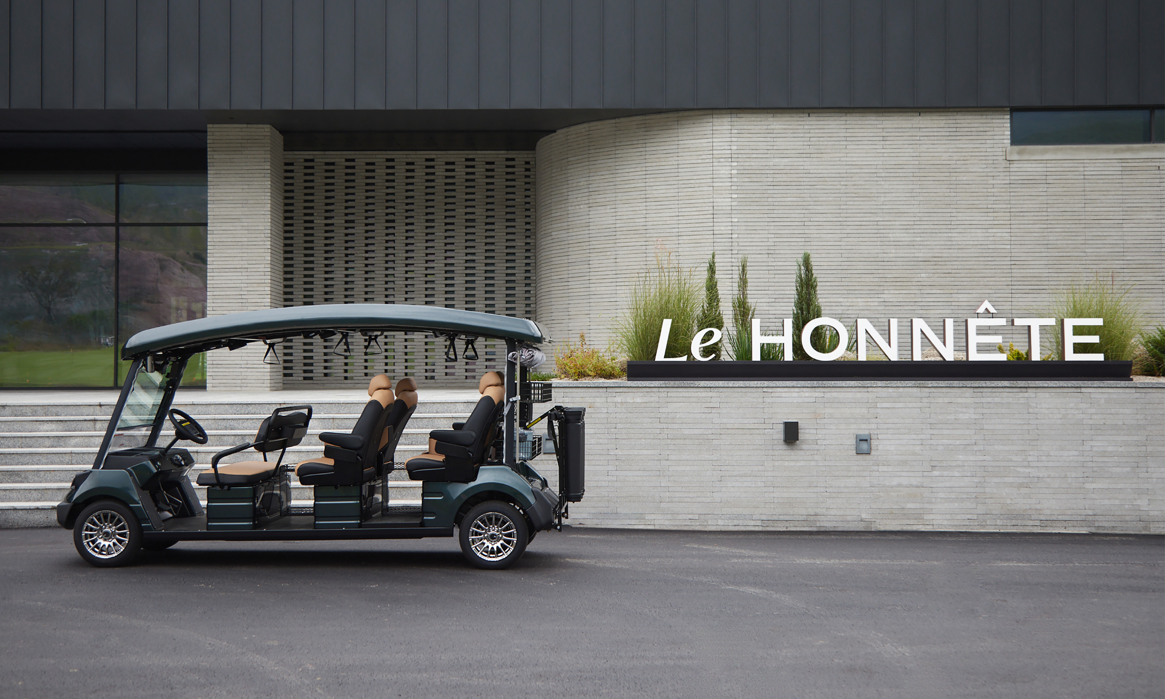
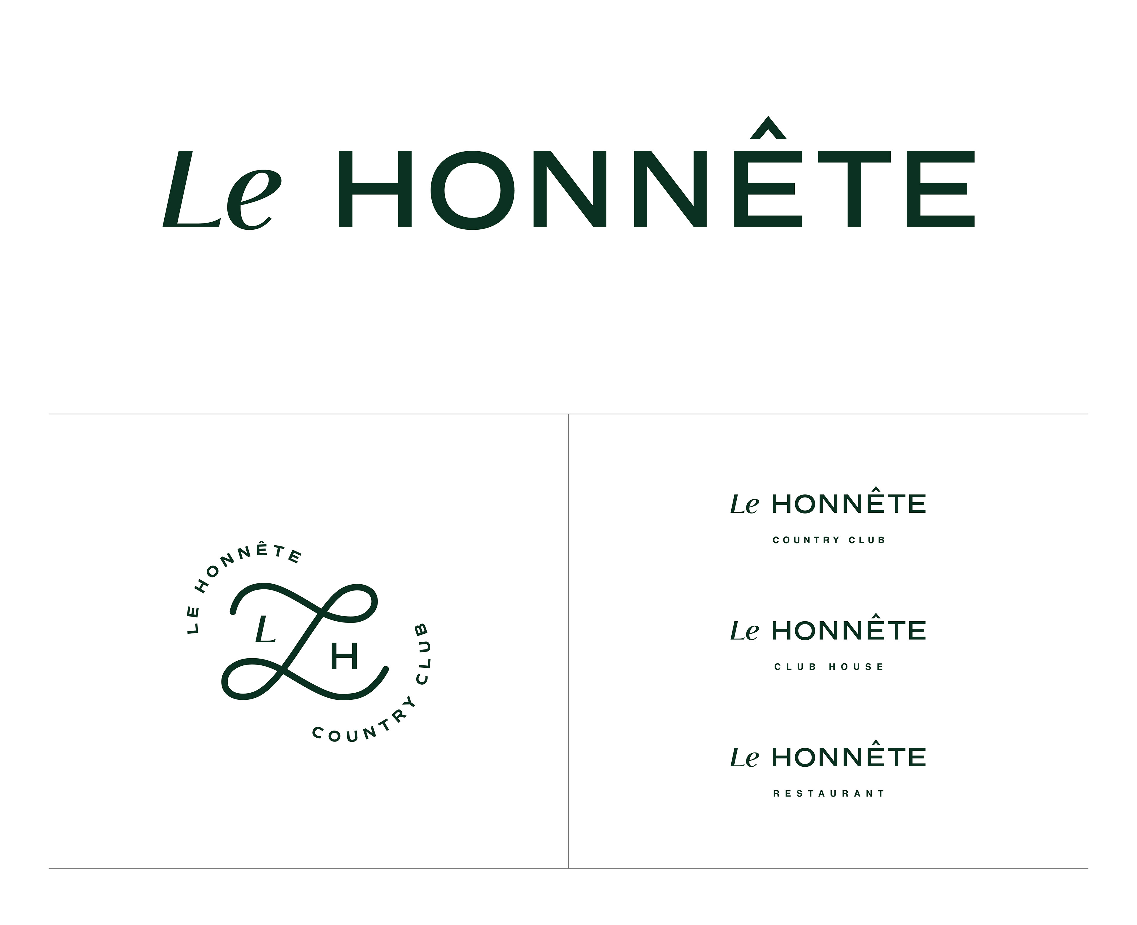
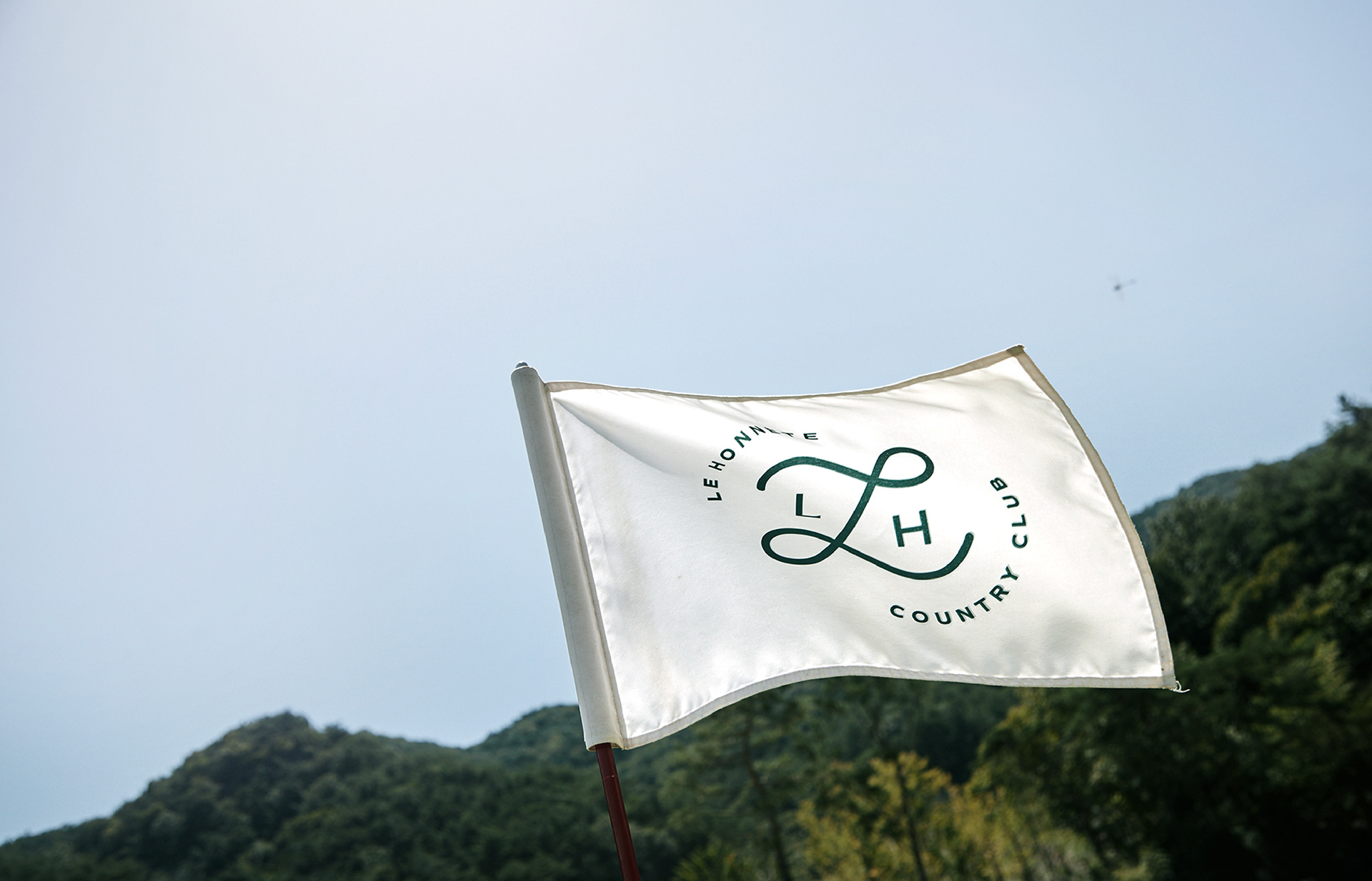
Primary Identifier
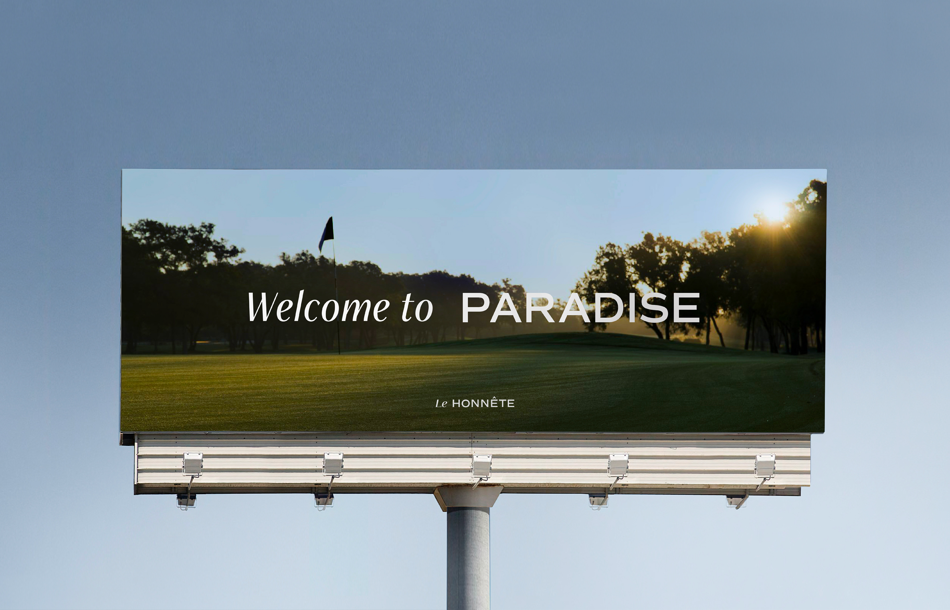
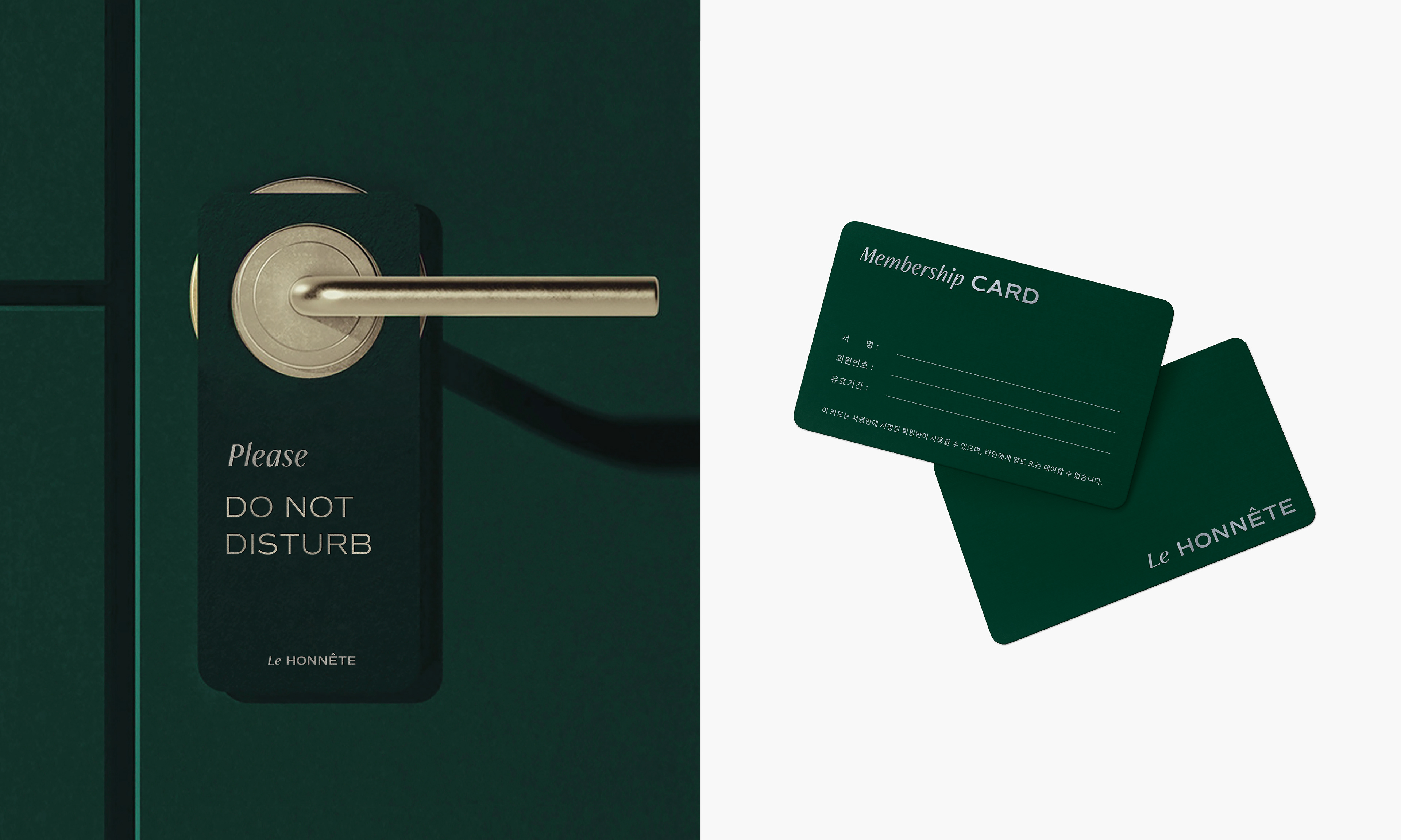
The logotype is designed with Italic font and Sans serif font to show the brand’s premium features and solid and unchanging value of trust that Namhai has been keeping for a long time. We also designed an emblem to be used in various media, and it captures powerful golf swing and rhythm by using curves.
이탤릭 서체와 산세리프 서체의 조합으로 이루어진 로고타입을 통해 르오네뜨만의 프리미엄한 특별함과 남해종합건설이 오랜 시간 지켜온 변하지 않는 견고한 신뢰의 가치를 소구하였습니다. 또한 경쾌한 곡선이 강조된 형태로 골프의 힘찬 스윙과 그 리듬감을 담아낸 엠블럼을 개발하여 다양한 매체에 활용될 수 있게 하였습니다.
이탤릭 서체와 산세리프 서체의 조합으로 이루어진 로고타입을 통해 르오네뜨만의 프리미엄한 특별함과 남해종합건설이 오랜 시간 지켜온 변하지 않는 견고한 신뢰의 가치를 소구하였습니다. 또한 경쾌한 곡선이 강조된 형태로 골프의 힘찬 스윙과 그 리듬감을 담아낸 엠블럼을 개발하여 다양한 매체에 활용될 수 있게 하였습니다.
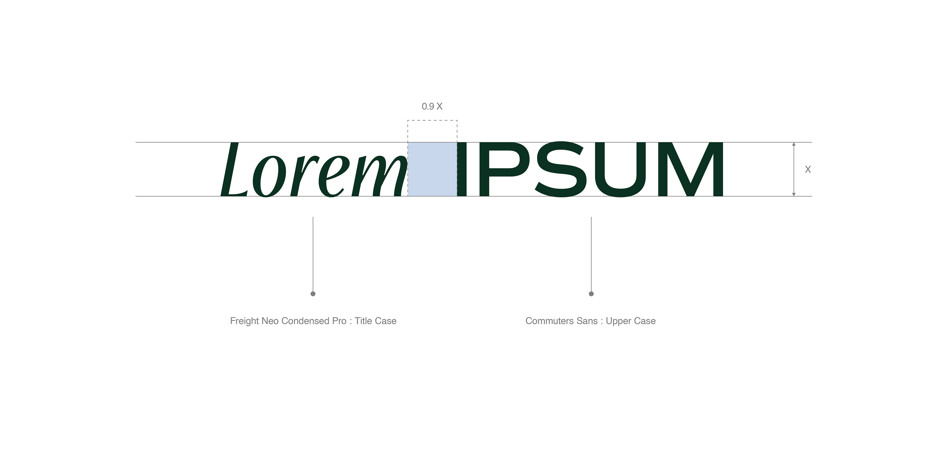
Typography
We developed a typography system designed with contrast of Freight Neo font and Commuter Sans font. Freight Neo font has stylish stroke finish and elegant but moderate strokes in different thicknesses. Commuter Sans font uses architectural solidity and strokes in uniform thicknesses and interval to express a modern texture on the typeface.
세련된 획 끝단 처리와 우아하지만 과하지 않은 획 굵기 차이를 가진 Freight Neo와 전체적으로 건축적인 견고함과 일정한 획의 굵기, 글자 폭을 통해 활자면에 고른 현대적 질감을 구현하는 Commuter Sans의 대비를 활용한 서체 시스템을 개발하였습니다. 로고타입에 적용된 두 가지 서체의 대비는 르오네뜨의 브랜드 개성을 표현해 주는 주요 비주얼 에센스로 이를 다양한 커뮤니케이션 시스템에도 동일하게 활용하여 브랜드의 여러 접점에서 일관된 아이덴티티의 경험을 제공하고자 하였습니다.
세련된 획 끝단 처리와 우아하지만 과하지 않은 획 굵기 차이를 가진 Freight Neo와 전체적으로 건축적인 견고함과 일정한 획의 굵기, 글자 폭을 통해 활자면에 고른 현대적 질감을 구현하는 Commuter Sans의 대비를 활용한 서체 시스템을 개발하였습니다. 로고타입에 적용된 두 가지 서체의 대비는 르오네뜨의 브랜드 개성을 표현해 주는 주요 비주얼 에센스로 이를 다양한 커뮤니케이션 시스템에도 동일하게 활용하여 브랜드의 여러 접점에서 일관된 아이덴티티의 경험을 제공하고자 하였습니다.
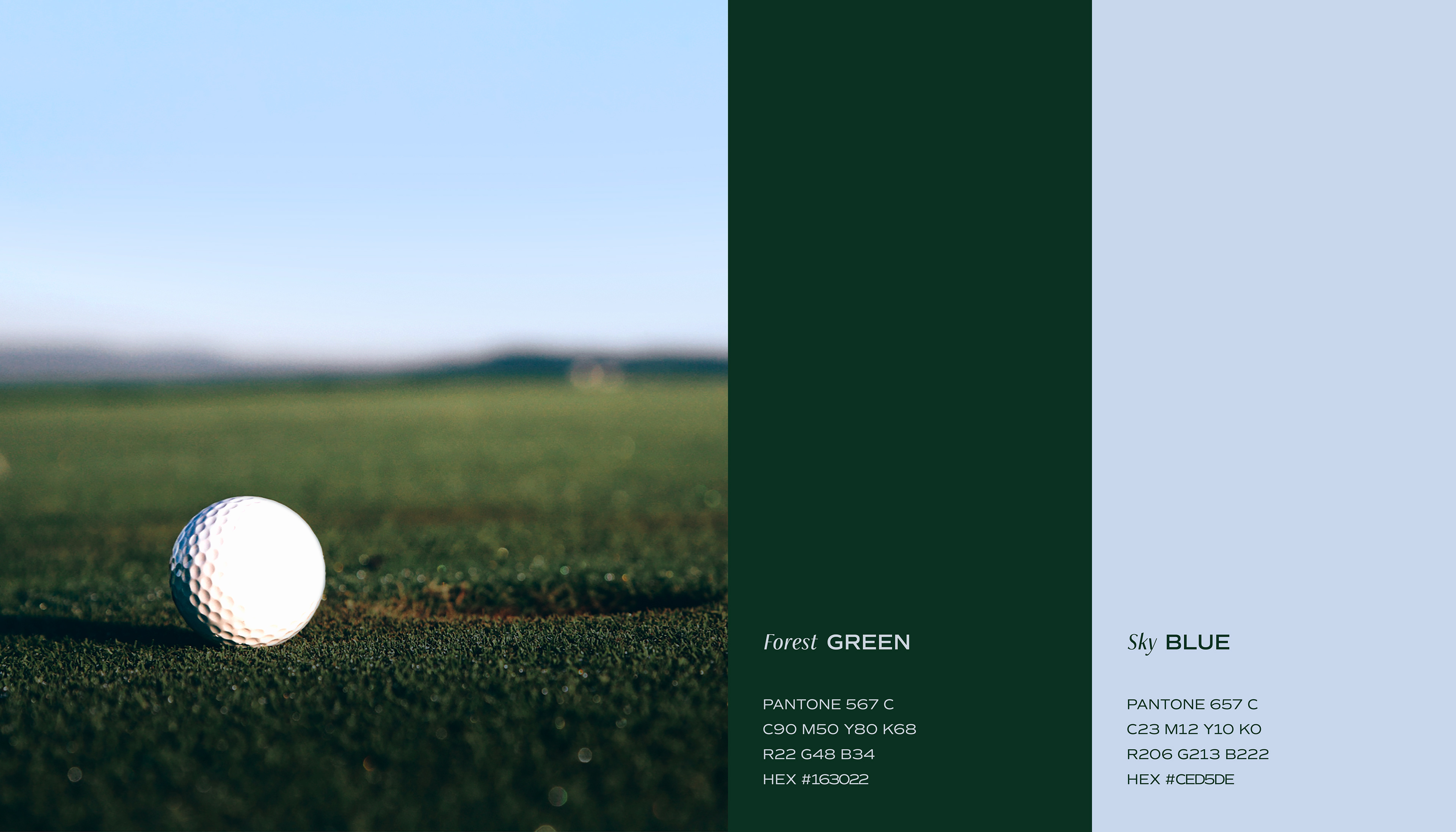
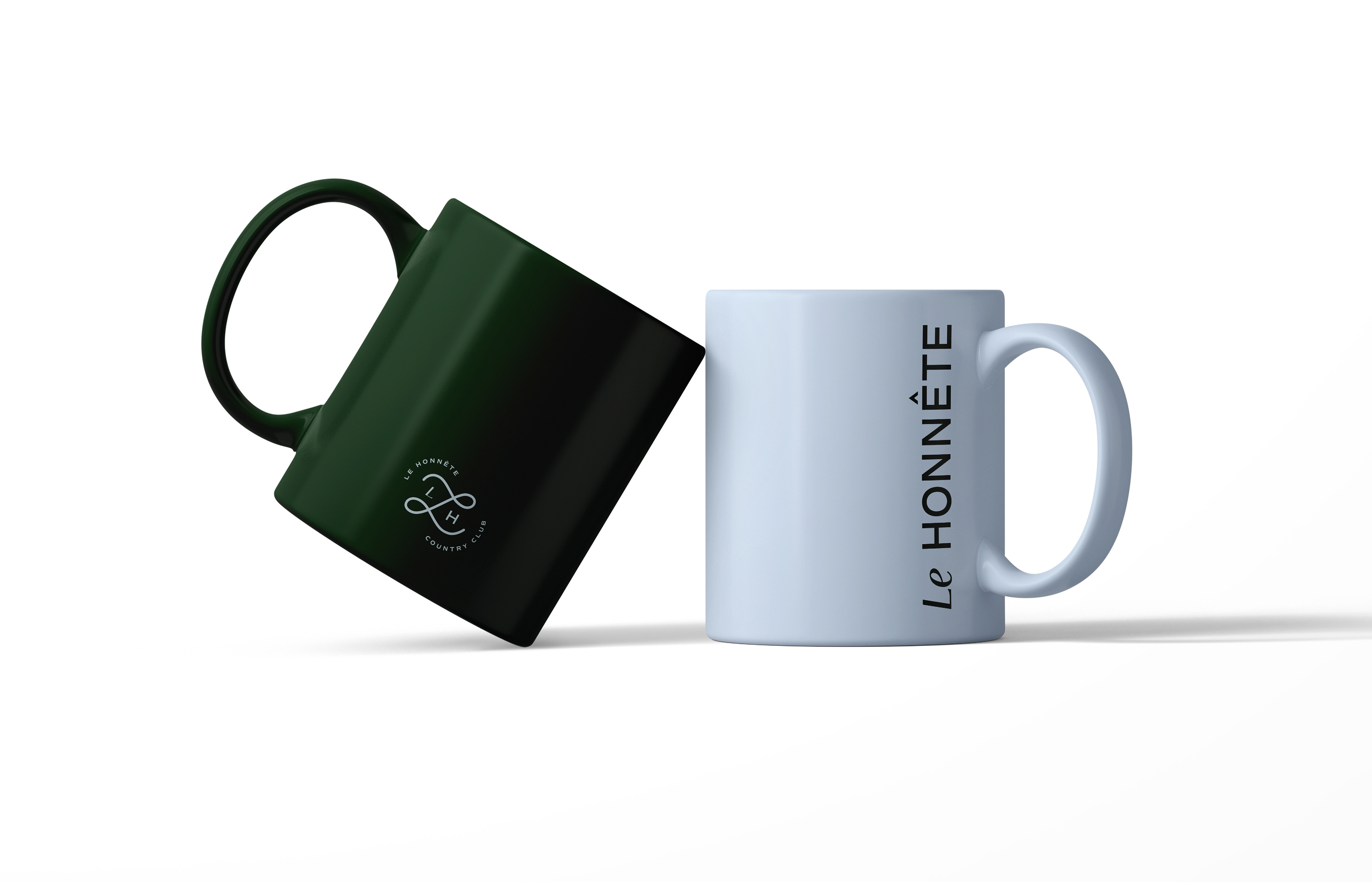
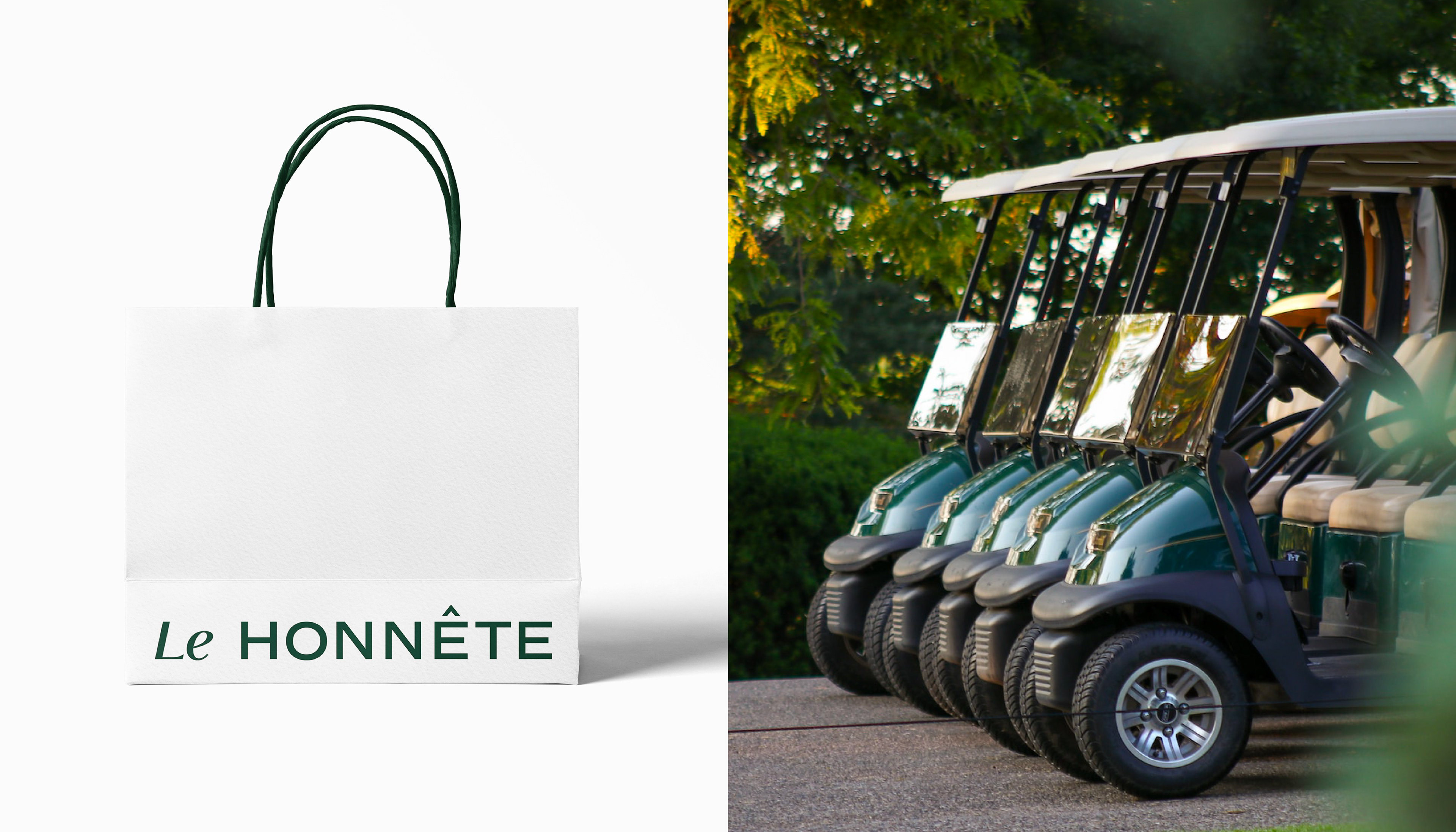
Colors
VEIG selected a brand color that resembles the colors of astonishing landscape by incorporating the brand value of LE HONNETE that offers a perfect day at hillsides as high as clouds and clean nature. LE HONNETE Forest Green is a deep color that symbolizes a full rest at deep mountains. It is combined with LE HONNETE Sky Blue in a subdued color chroma to make the brand look more stylish.
구름과 나란한 산 중턱, 청정 자연 속에서의 완벽한 하루를 선사하는 르오네뜨의 브랜드 가치를 담아 경이로운 풍경의 색을 닮은 브랜드 컬러를 선정하였습니다. 르오네뜨 포레스트 그린은 딥한 감도를 통해 깊은 산속에서 경험하는 온전한 휴식을 상징하는 색입니다. 여기에 차분한 채도의 르오네뜨 스카이 블루를 조합하여 세련된 무드를 브랜드에 추가하였습니다.
구름과 나란한 산 중턱, 청정 자연 속에서의 완벽한 하루를 선사하는 르오네뜨의 브랜드 가치를 담아 경이로운 풍경의 색을 닮은 브랜드 컬러를 선정하였습니다. 르오네뜨 포레스트 그린은 딥한 감도를 통해 깊은 산속에서 경험하는 온전한 휴식을 상징하는 색입니다. 여기에 차분한 채도의 르오네뜨 스카이 블루를 조합하여 세련된 무드를 브랜드에 추가하였습니다.
Client Namhai Construction
Discipline Brand Naming / Brand Identity / Brand Guidelines
Director Jaeyong Jang
Design Yoona Kim, Yeohae Song, Hyeyoung Jung, Rihyeon Ju
Photograph Sungryong Kim(Studio BoB)
Discipline Brand Naming / Brand Identity / Brand Guidelines
Director Jaeyong Jang
Design Yoona Kim, Yeohae Song, Hyeyoung Jung, Rihyeon Ju
Photograph Sungryong Kim(Studio BoB)
Official Website