
Gong Myung,
Recovering body and mind
Recovering body and mind
Project Overview
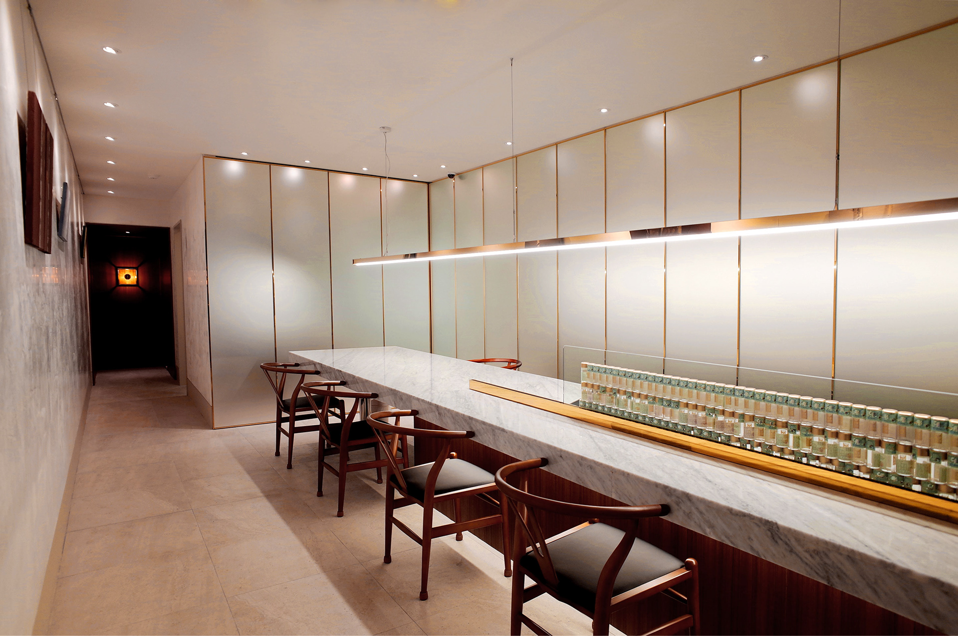
A brand identity development project for the Korean Medicine Clinic ‘Gong Myung’ make most fine and pure Gongjin-dan, located in Seo-chon, a Korean traditional village in Seoul, Korea. Our clinic aspires to become a brand where customers can experience herbal medicine easily and comfortably, breaking preconceptions about traditional medicine and providing a café-like space where visitors can feel relaxed and at ease. Gongmyung needed to transcend the traditional image and create a modern and sophisticated brand identity.
공명한의원은 종로구 통의동에 위치한 공명한의원은 공진단이 주력 제품인 한의원입니다. 본 한의원은 고객들이 한의원에 대한 선입견을 깨고 부담 없이 방문할 수 있는 카페 같은 공간과 이미지로 쉽고 편하게 한약재를 경험할 수 있는 브랜드가 되길 바랐습니다. 공명한의원은 옛것의 이미지를 탈피하고 현대적이고 세련된 한의원 브랜드 이미지 구현이 필요했습니다.
공명한의원은 종로구 통의동에 위치한 공명한의원은 공진단이 주력 제품인 한의원입니다. 본 한의원은 고객들이 한의원에 대한 선입견을 깨고 부담 없이 방문할 수 있는 카페 같은 공간과 이미지로 쉽고 편하게 한약재를 경험할 수 있는 브랜드가 되길 바랐습니다. 공명한의원은 옛것의 이미지를 탈피하고 현대적이고 세련된 한의원 브랜드 이미지 구현이 필요했습니다.
Selected as a Finalist
in the ‘2018 IDEA’.
.
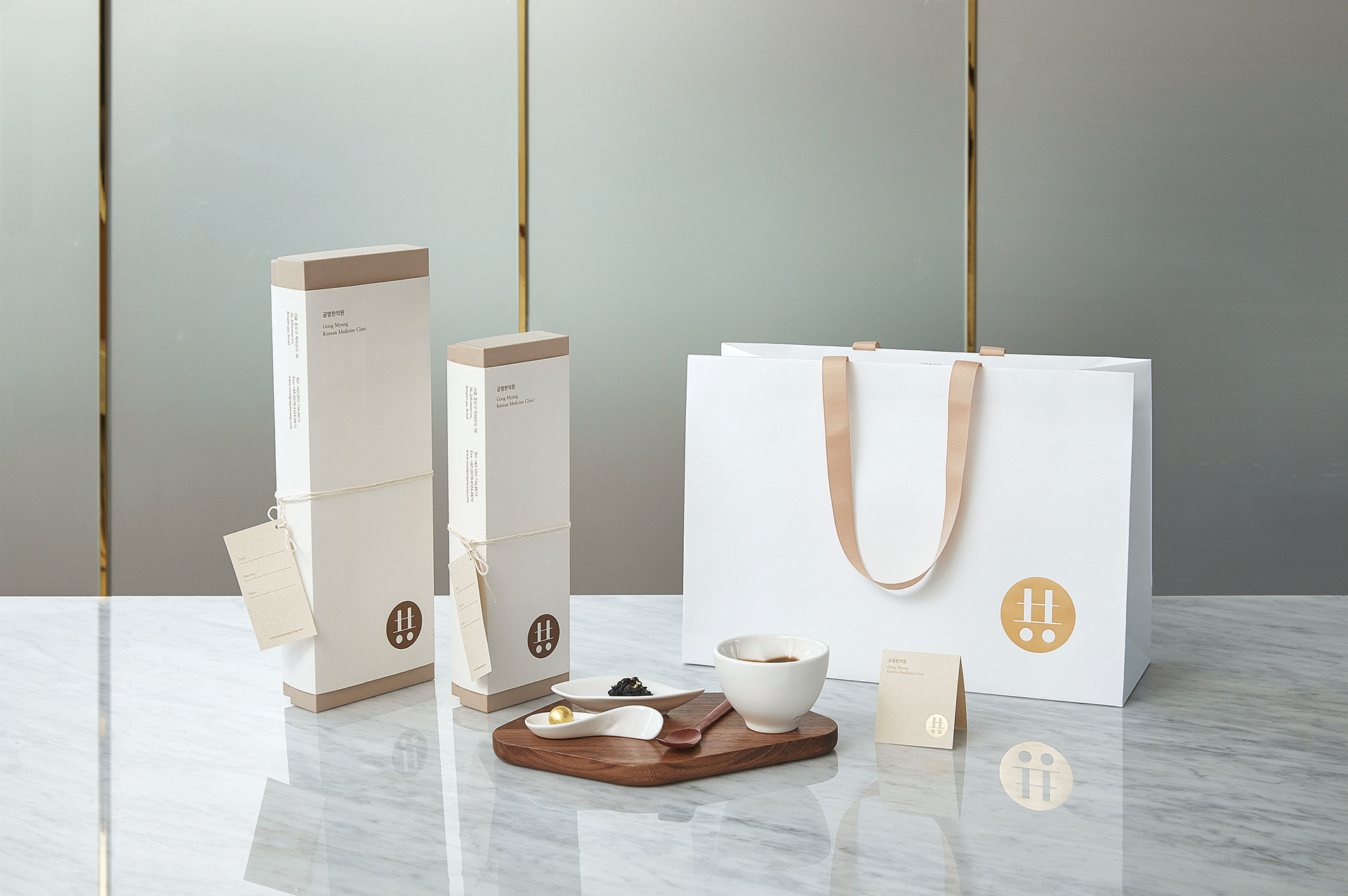
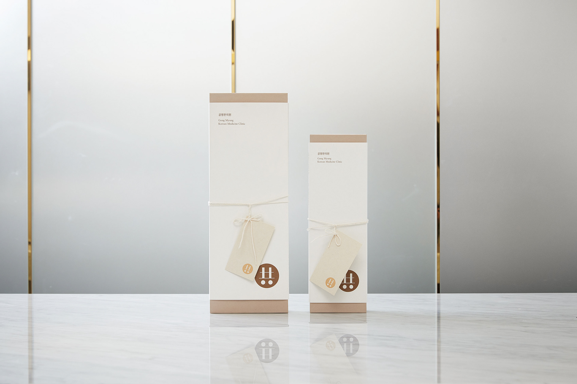
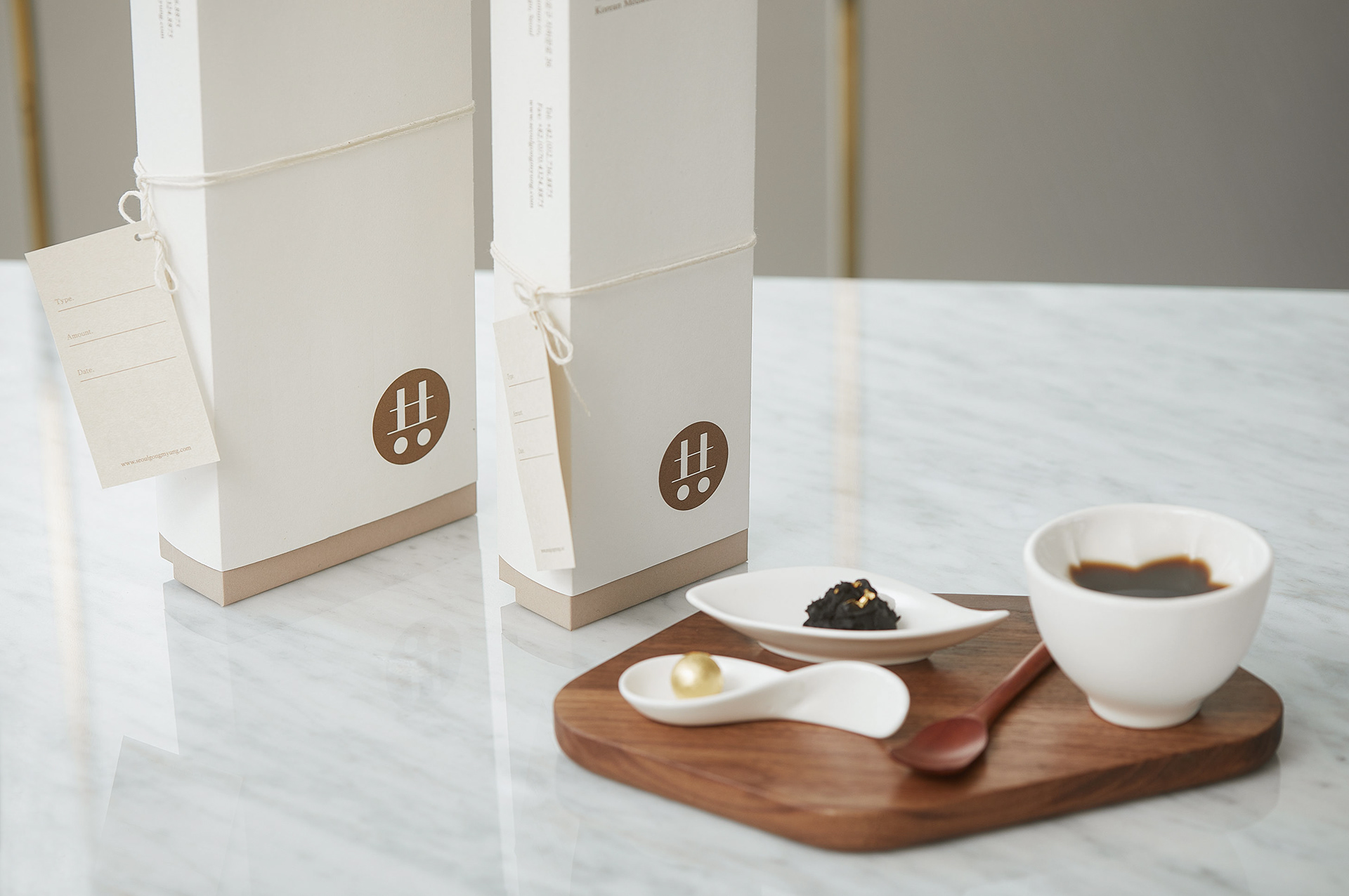
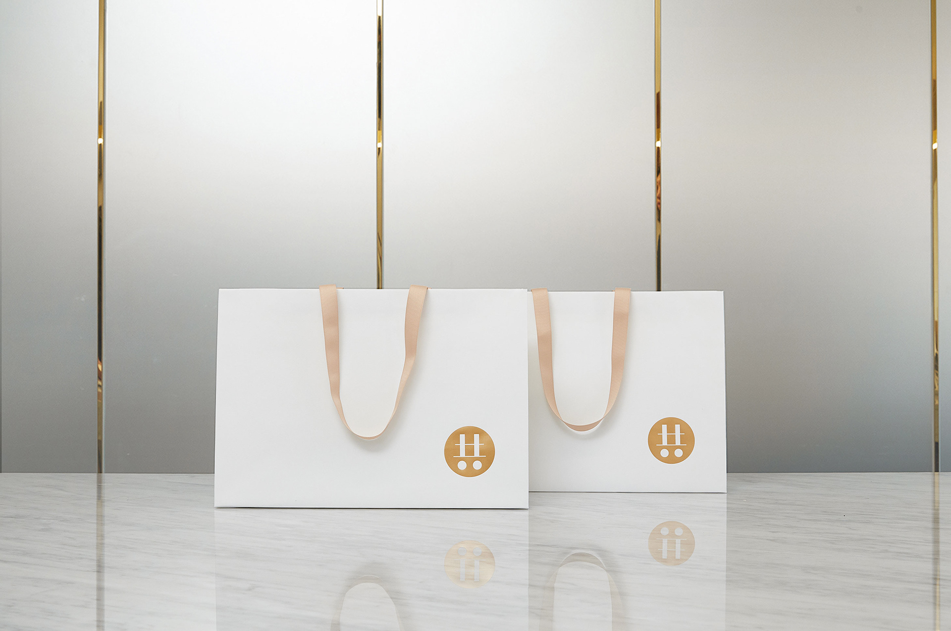
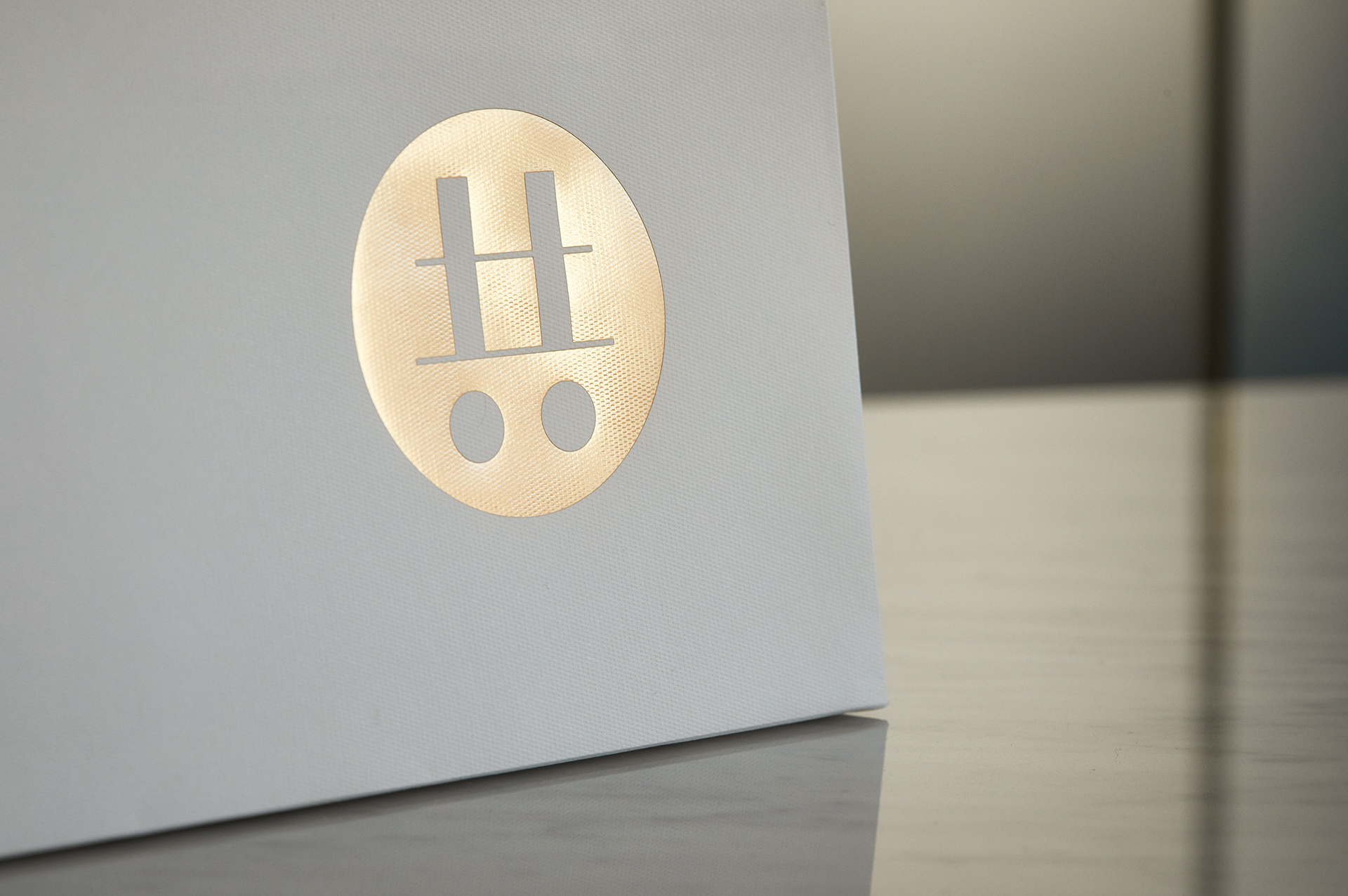
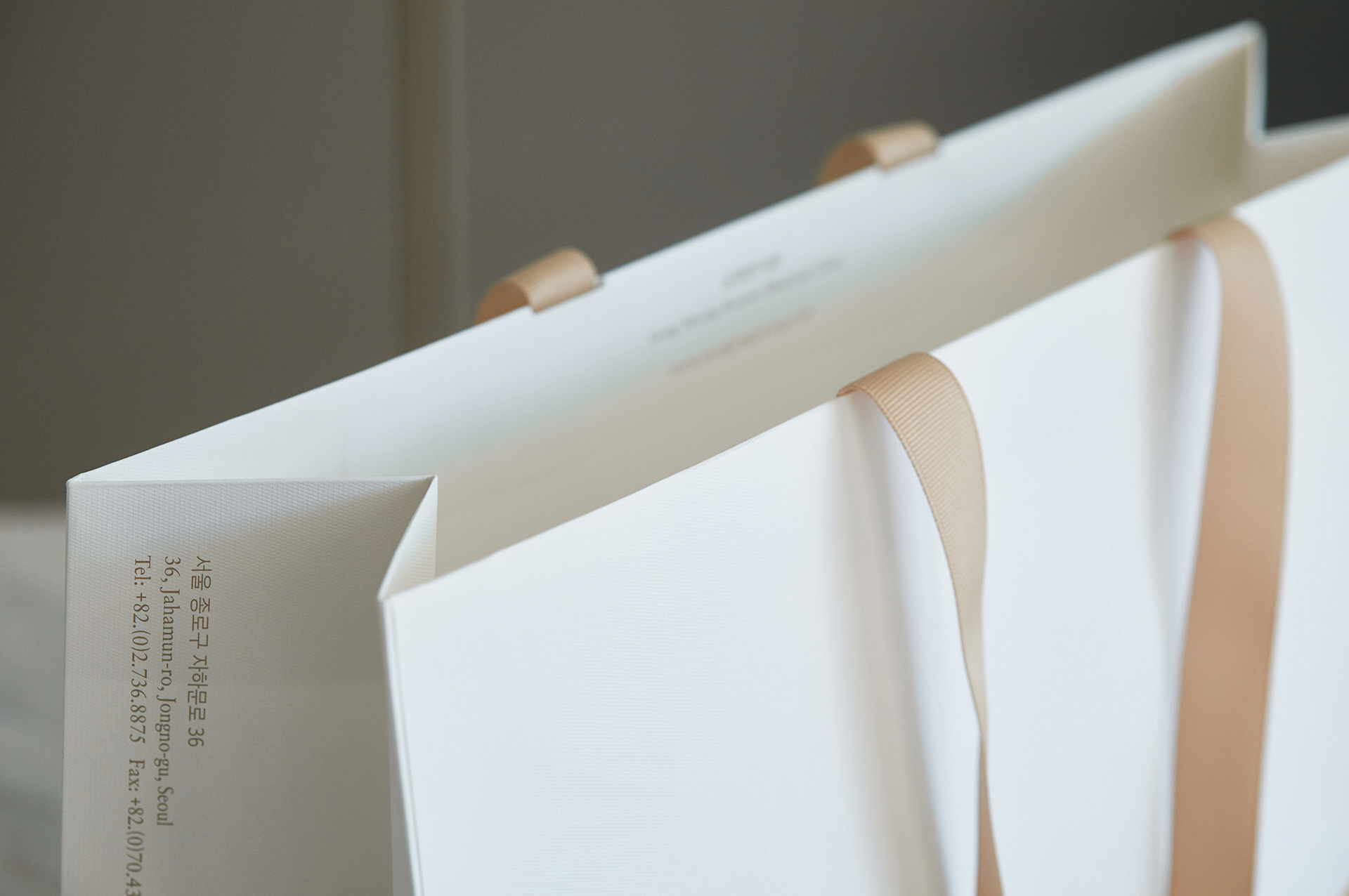
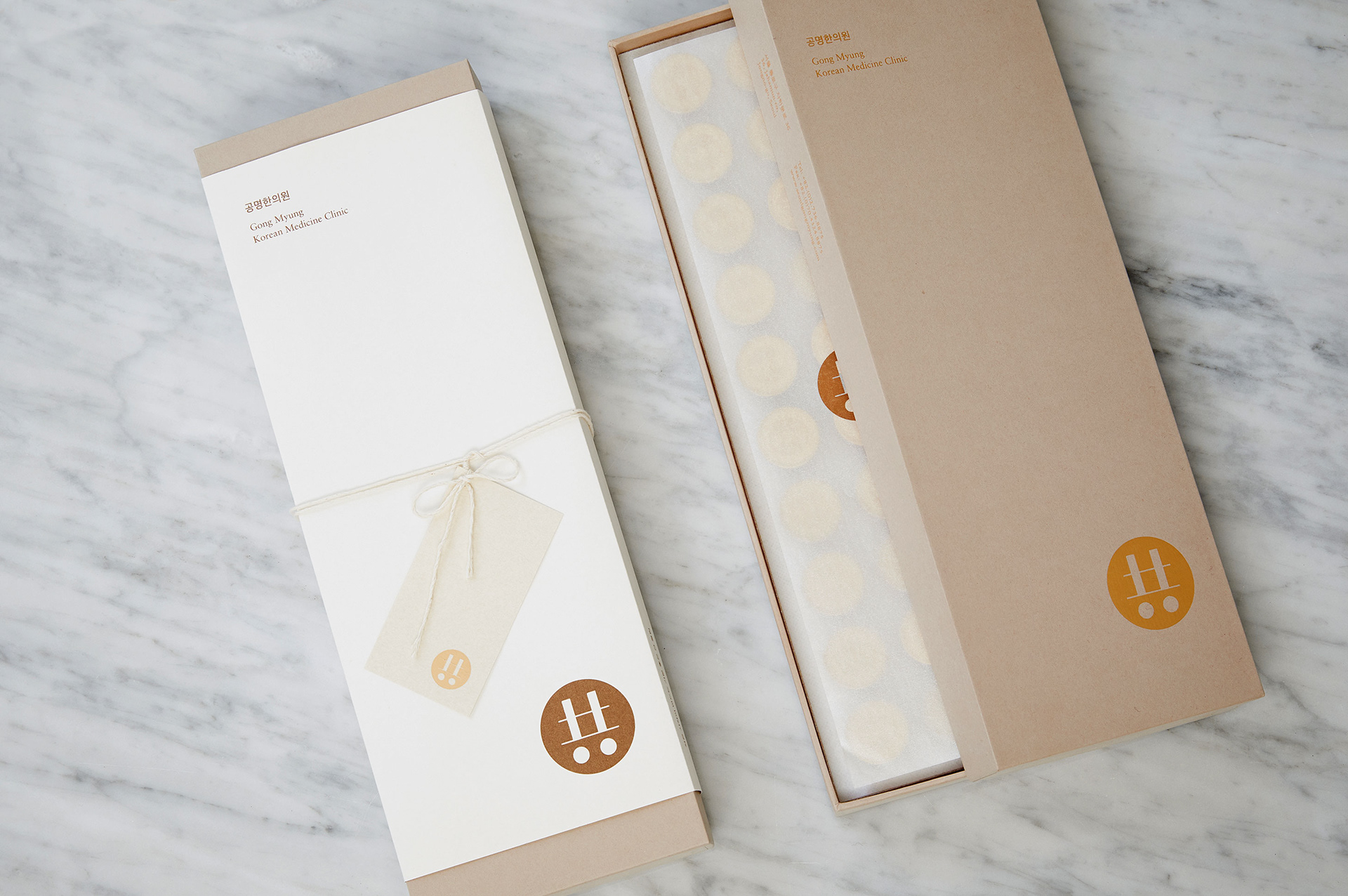
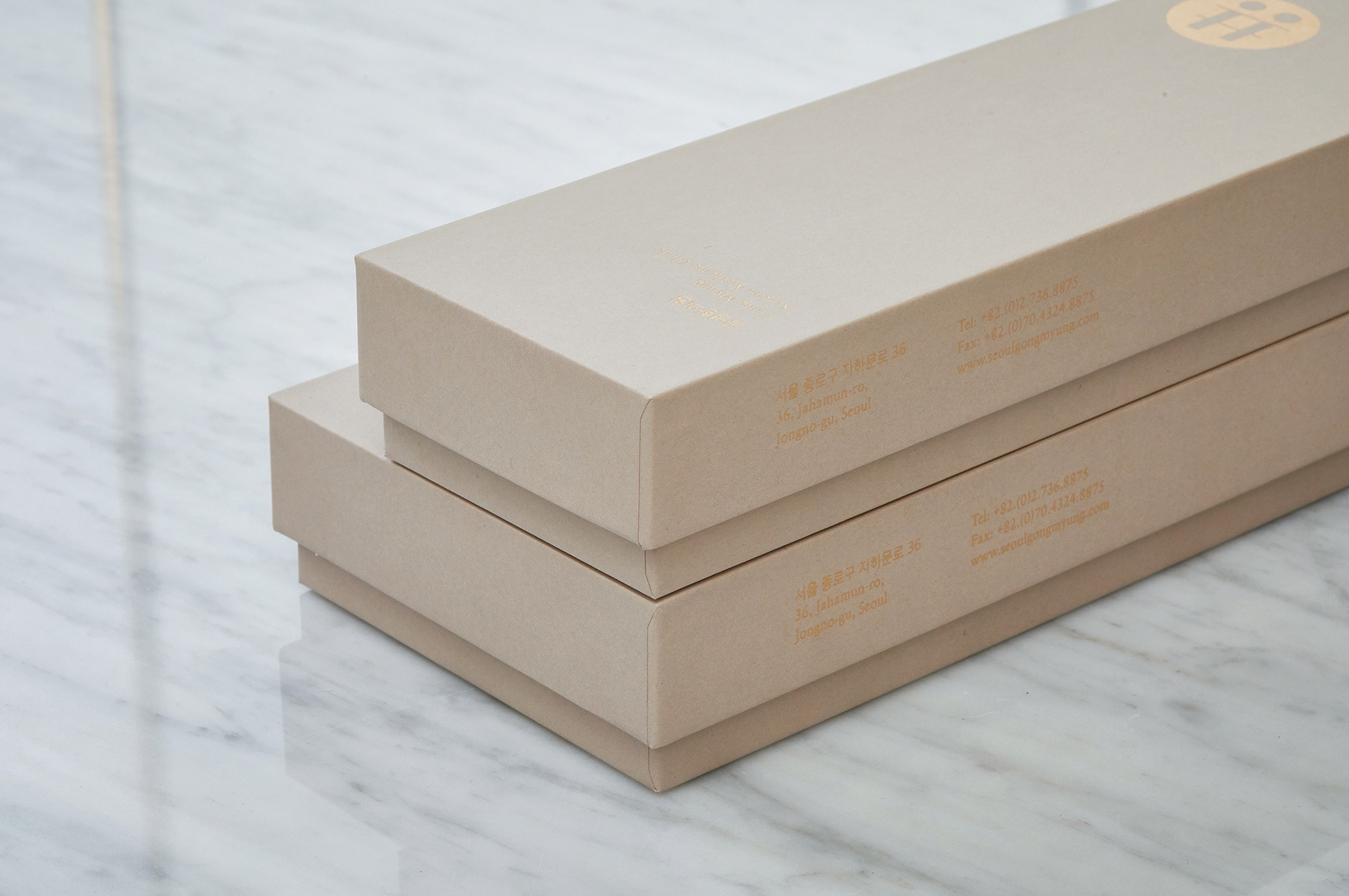
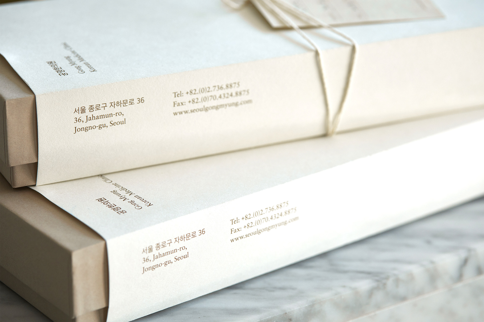
The perceived values of the Korean Medicine Clinic ‘Gong Myung’ have been credible but traditional and conservative, because it is being specialized with Gong-Jin-Dan. It sometimes keeps people from visiting more often as if they spend time at a Starbucks café. In pursing of increasing friendliness, accessibility and frequency of visits, we tried to change the brand image by adopting a wooden ingredient and colors of gold and white, which represent the interior materials of the clinic and the main colors of Gong-Jin-Dan respectively.
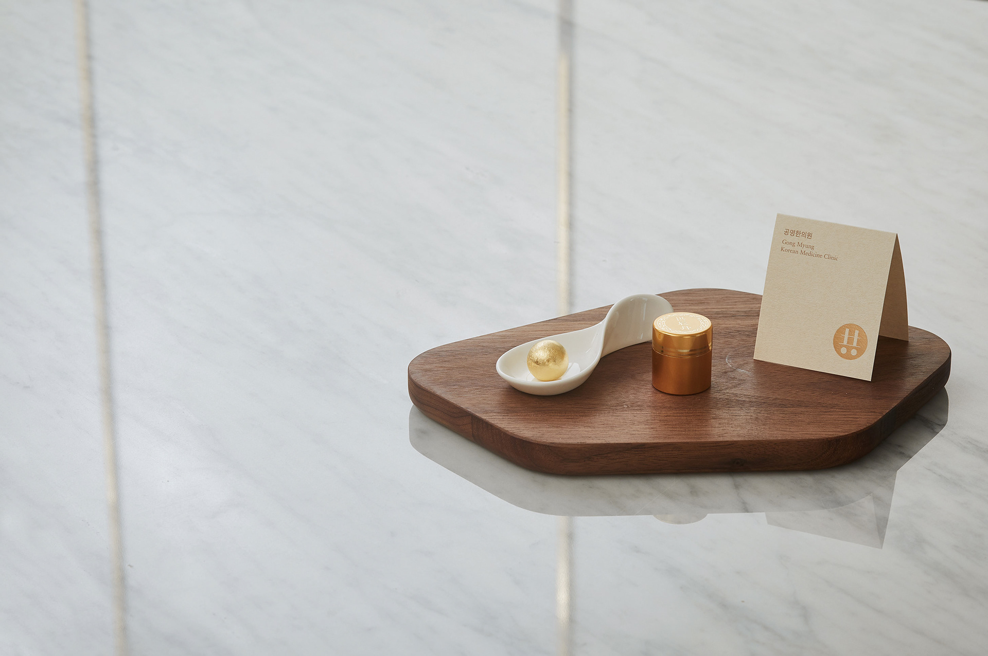
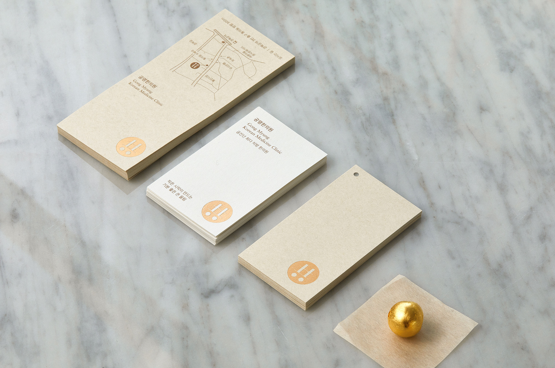
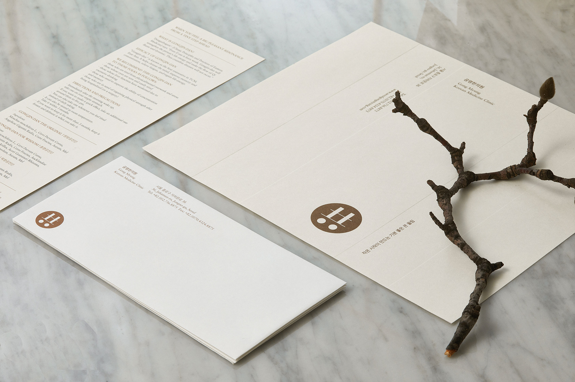
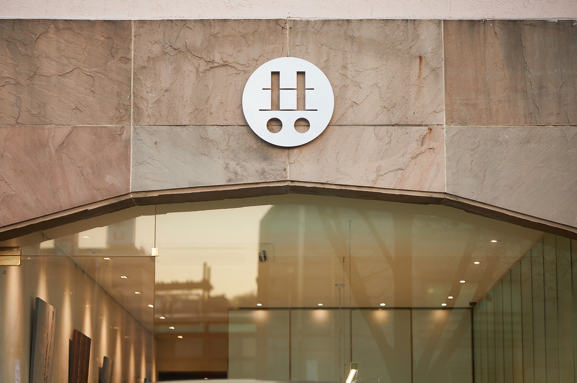
공명의 ‘공(共)’을 심볼화한 로고와 함께 공진단 고유의 골드 컬러를 메인컬러로 활용하여 현대적이면서도 최고급 한약재를 담아낼 수 있는 고급스러움을 소구하였습니다. 한의원의 공간 또한, 카페처럼 편히 방문하여 한방차와 함께 여유를 즐길 수 있는 개념으로 운영되어 공간을 한의원으로 규정하는 사인을 설치하지 않고 심볼만을 적용하여 현대적 무드의 한의원 공간을 구현하였습니다.
공명의 ‘공(共)’을 심볼화한 로고와 함께 공진단 고유의 골드 컬러를 메인컬러로 활용하여 현대적이면서도 최고급 한약재를 담아낼 수 있는 고급스러움을 소구하였습니다. 한의원의 공간 또한, 카페처럼 편히 방문하여 한방차와 함께 여유를 즐길 수 있는 개념으로 운영되어 공간을 한의원으로 규정하는 사인을 설치하지 않고 심볼만을 적용하여 현대적 무드의 한의원 공간을 구현하였습니다.
Client Gong Myung Korean Medicine Clinic
Discipline Brand Identity
Director Jaeyong Jang
Design Myungjin Kim, Jeonghoo Lee, Hyeyoung Jung
Discipline Brand Identity
Director Jaeyong Jang
Design Myungjin Kim, Jeonghoo Lee, Hyeyoung Jung