
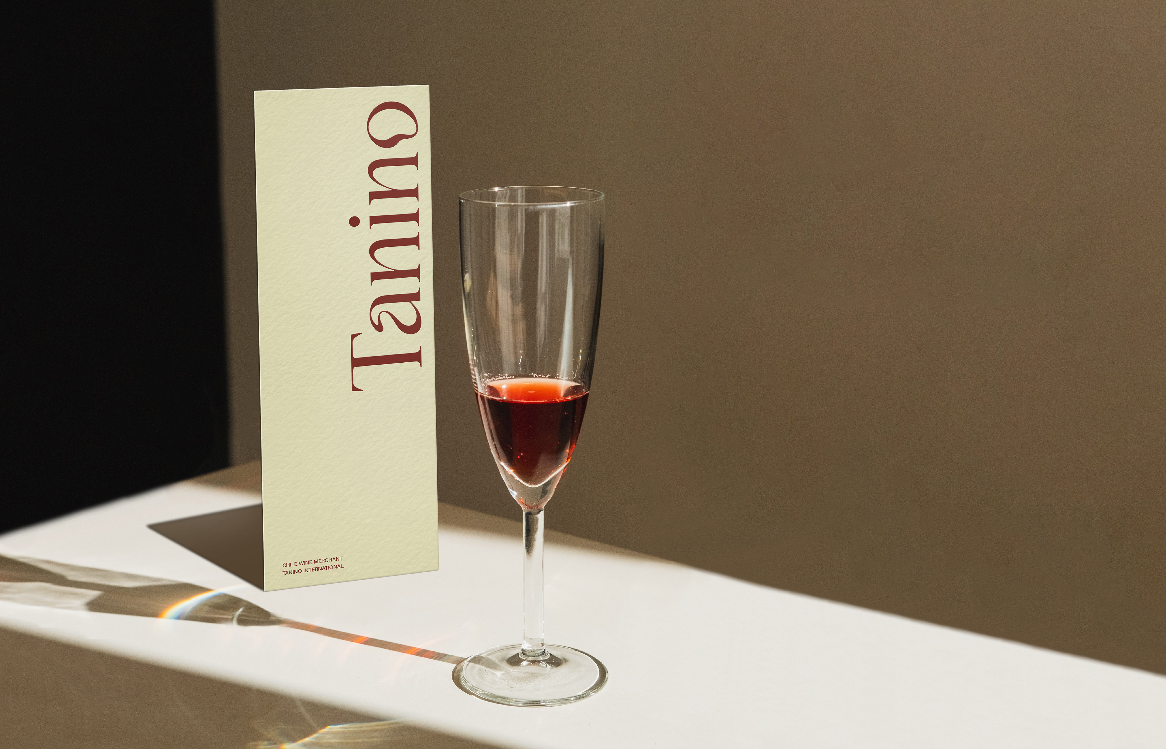
TANINO,
Rolling excitement from a glass of wine
Rolling excitement from a glass of wine
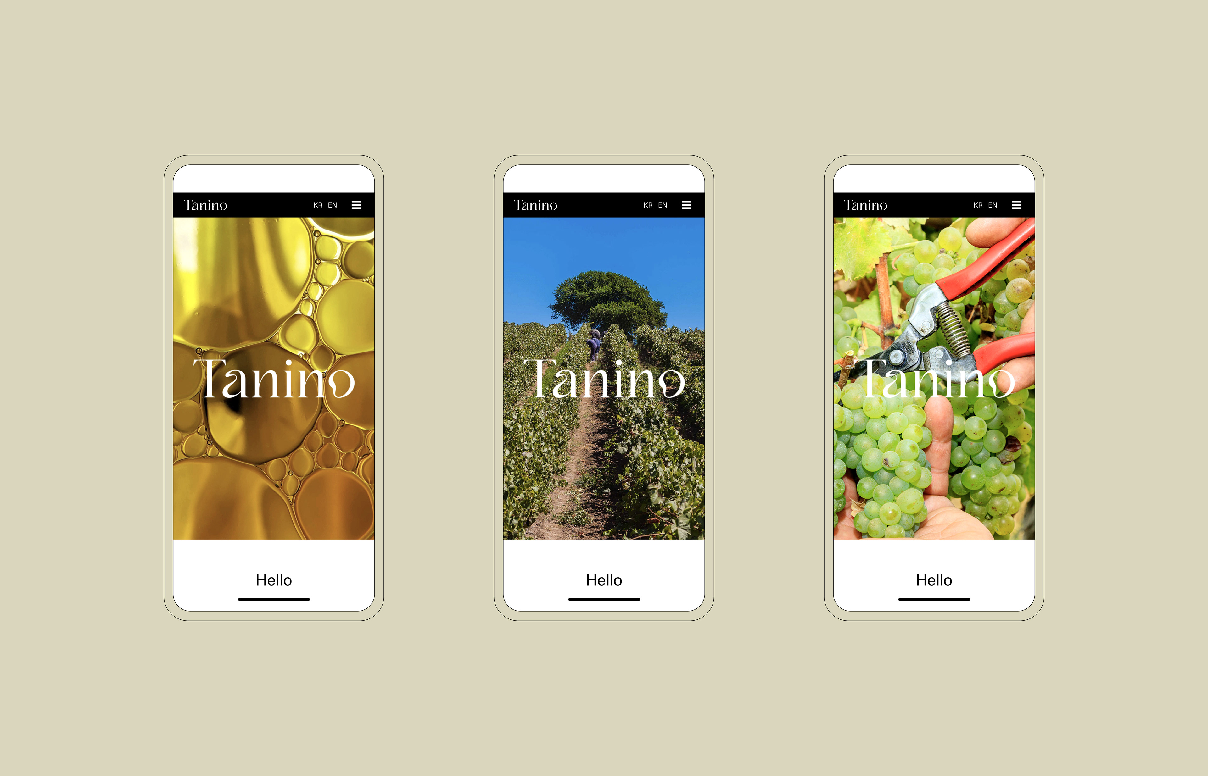
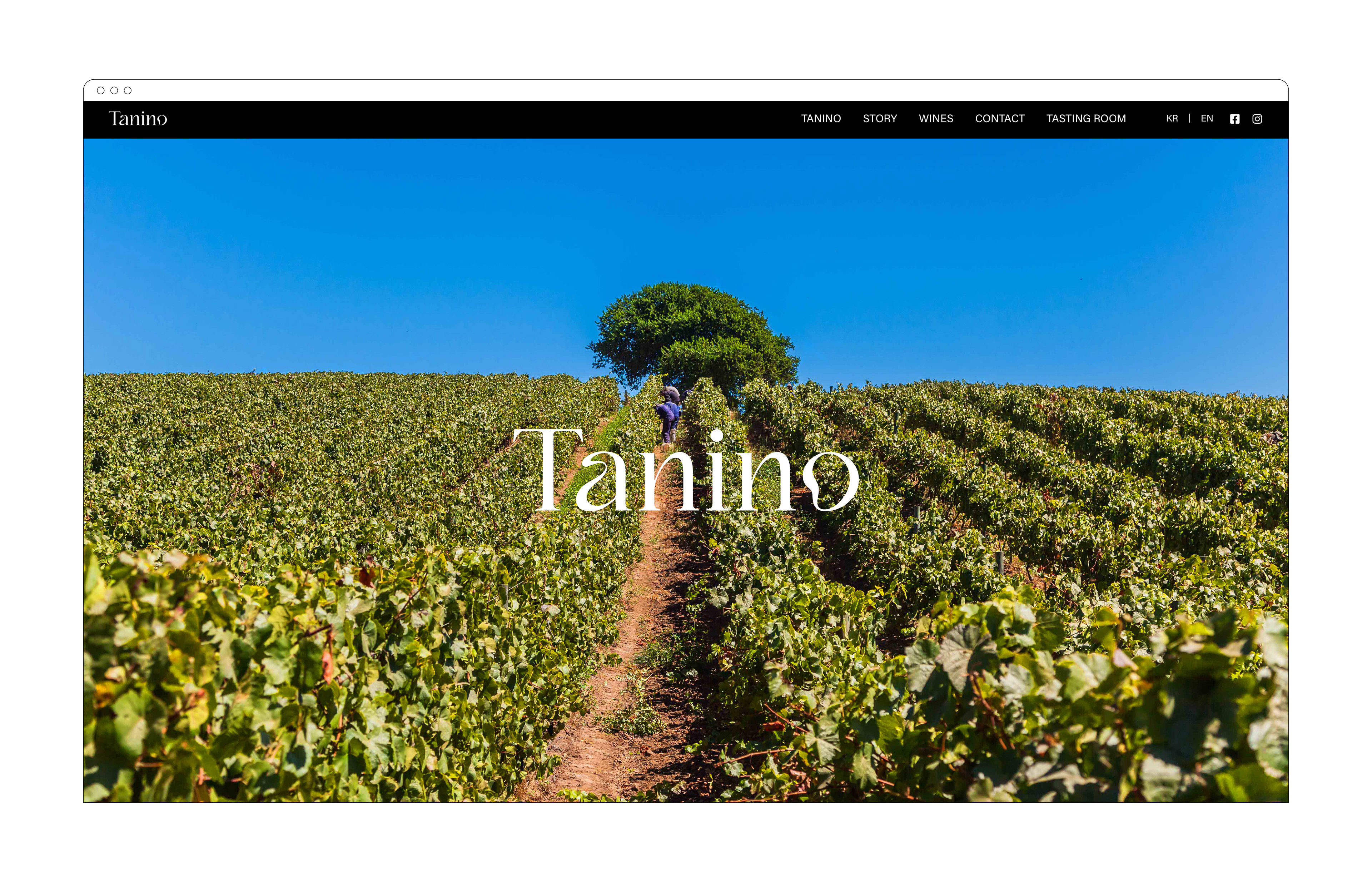
Project Overview
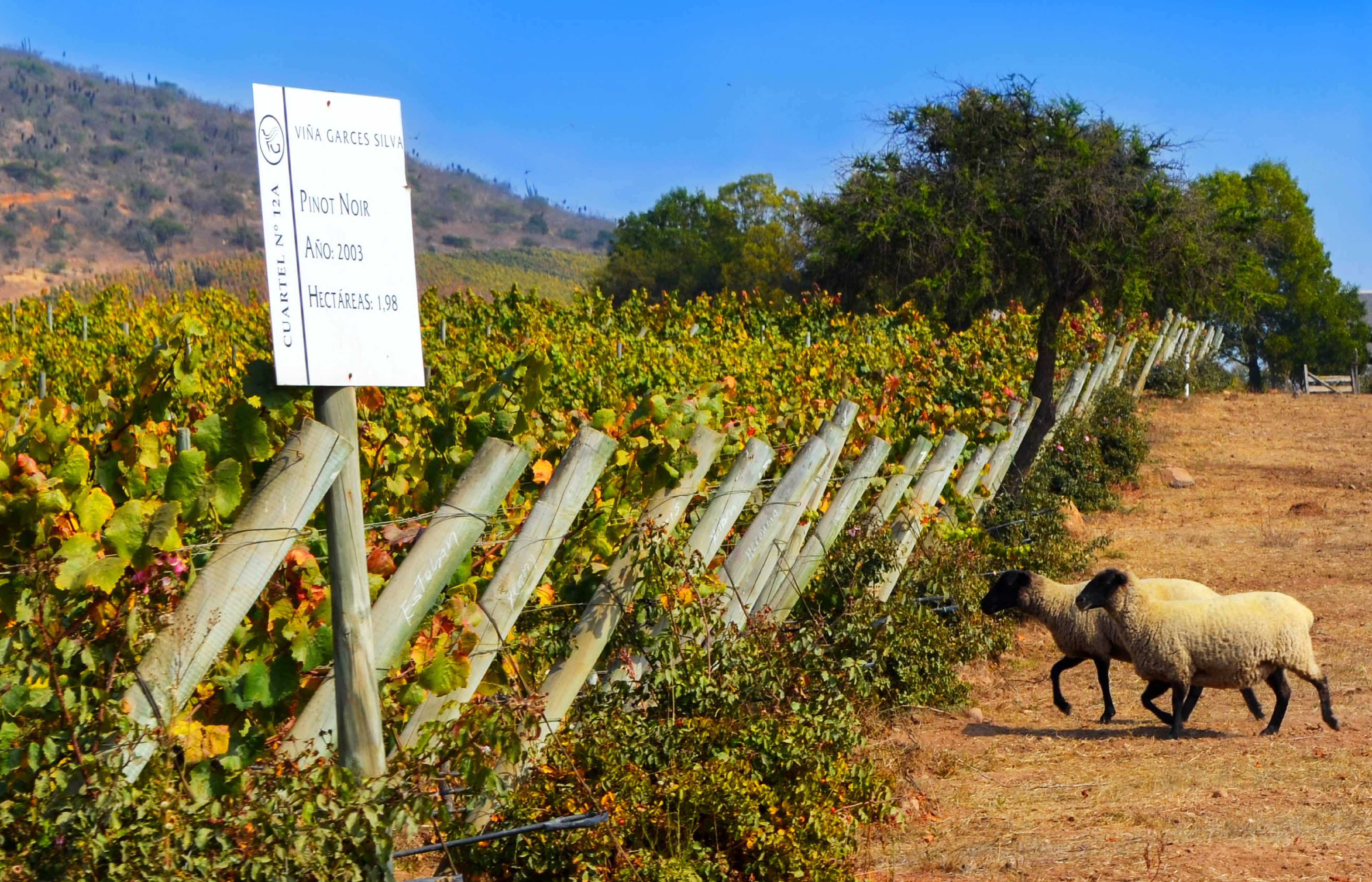
Tanino, which means Tannin in Spanish, has been specializing in importing the Chilean wines to Korea in order to spread the high-quality wines and diverse liquors experienced by the locals who lived in Chile for 40 years. We designed Tanino’s visual identity system by defining the corporate’s strength and core value and visualizing them into shape, color, and texture.
스페인어로 타닌(Tannin)을 뜻하는 타니노(Tanino)는 칠레에서 40년간 살아온 현지인이 오랜 시간 직접 경험한 칠레의 명품 와인과 다양한 주류를 한국에 알리기 위해 설립한 칠레 주류 전문 수입사입니다. 기업의 특장점과 핵심가치를 정의하고 이를 형태, 색감, 질감으로 시각화하는 과정을 통해 타니노만의 일관된 비주얼 아이덴티티 시스템을 구축하였습니다.
스페인어로 타닌(Tannin)을 뜻하는 타니노(Tanino)는 칠레에서 40년간 살아온 현지인이 오랜 시간 직접 경험한 칠레의 명품 와인과 다양한 주류를 한국에 알리기 위해 설립한 칠레 주류 전문 수입사입니다. 기업의 특장점과 핵심가치를 정의하고 이를 형태, 색감, 질감으로 시각화하는 과정을 통해 타니노만의 일관된 비주얼 아이덴티티 시스템을 구축하였습니다.
Design Strategy
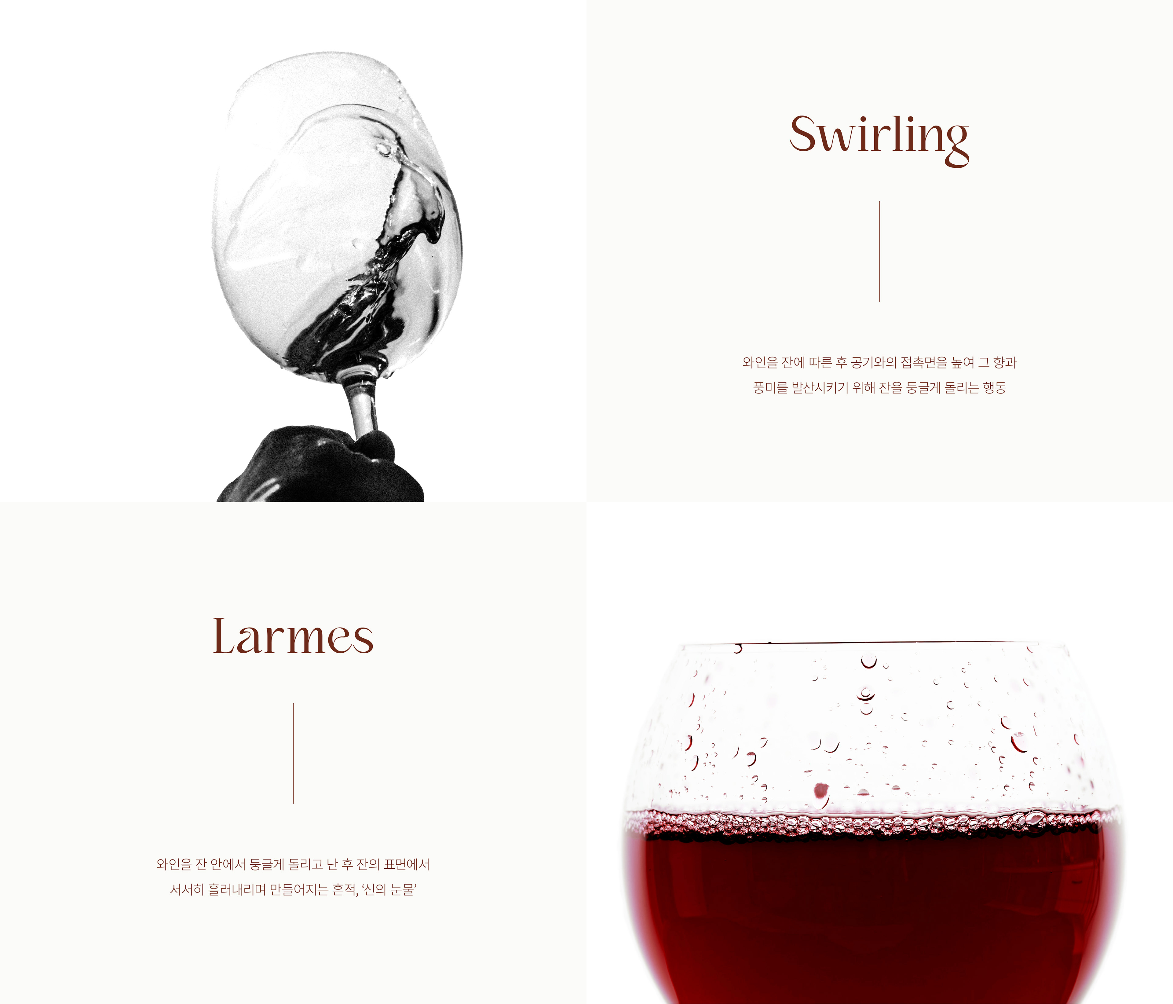
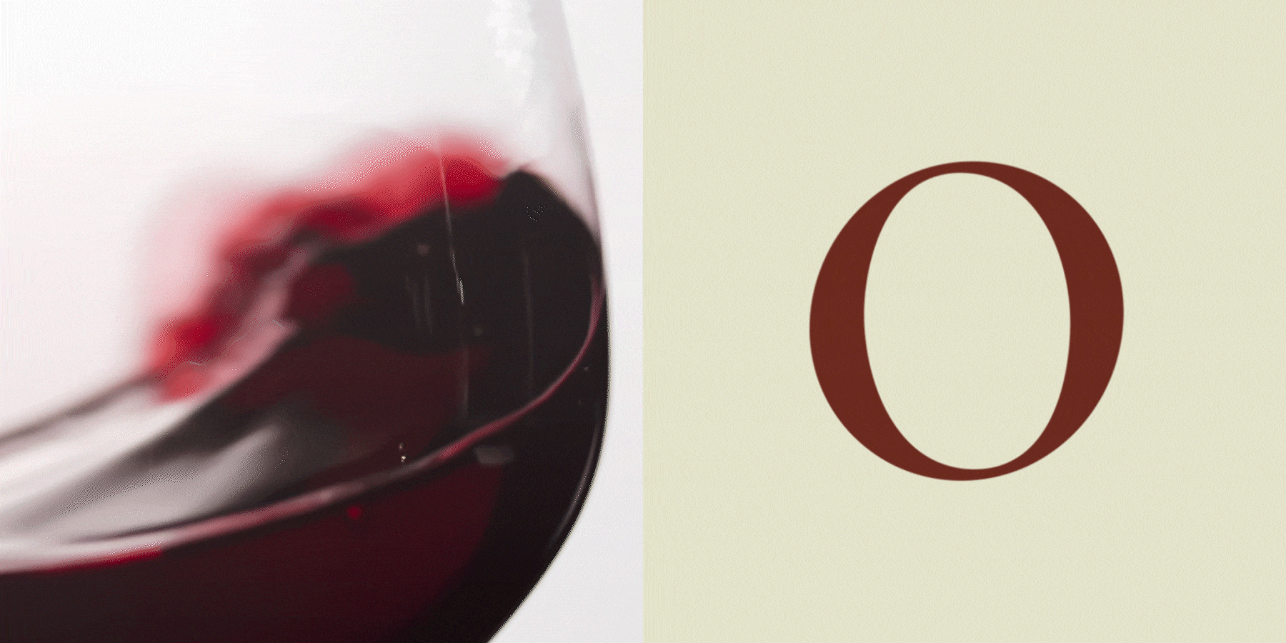
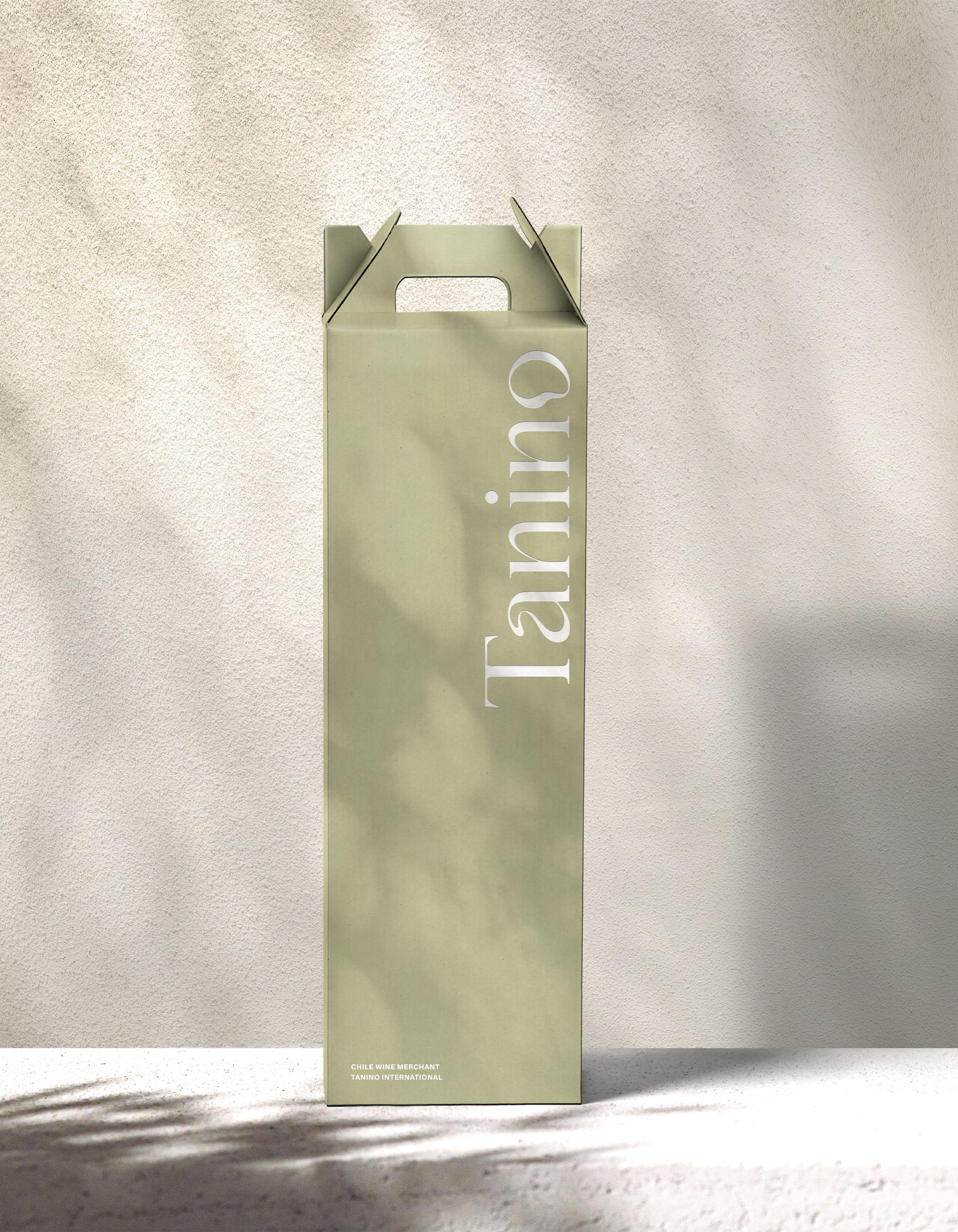
The excitement and movement of wine swaying in a glass are expressed with a serif font to show the constantly changing taste, aroma, and mood of the wine. The deep colors and rich texture also visualize TANINO’s values in thoroughly selecting and introducing the new Chilean wine leaving deep flavors from the terroirs and wonders of nature in Chile.
와인이 주는 설렘과 일렁이는 무브먼트를 세련된 세리프 서체에 담아 와인을 마실 때 시시각각으로 변하는 맛과 향, 그리고 분위기를 표현하였습니다. 더불어 천혜의 테루아가 선사하는 풍부한 풍미, 국내에 소개되지 않은 특별한 와인을 현지인이 직접 선별하여 소개하는 타니노의 가치를 깊은 감도의 색감과 풍성한 질감의 소재를 통해 시각화하였습니다.
와인이 주는 설렘과 일렁이는 무브먼트를 세련된 세리프 서체에 담아 와인을 마실 때 시시각각으로 변하는 맛과 향, 그리고 분위기를 표현하였습니다. 더불어 천혜의 테루아가 선사하는 풍부한 풍미, 국내에 소개되지 않은 특별한 와인을 현지인이 직접 선별하여 소개하는 타니노의 가치를 깊은 감도의 색감과 풍성한 질감의 소재를 통해 시각화하였습니다.

Color
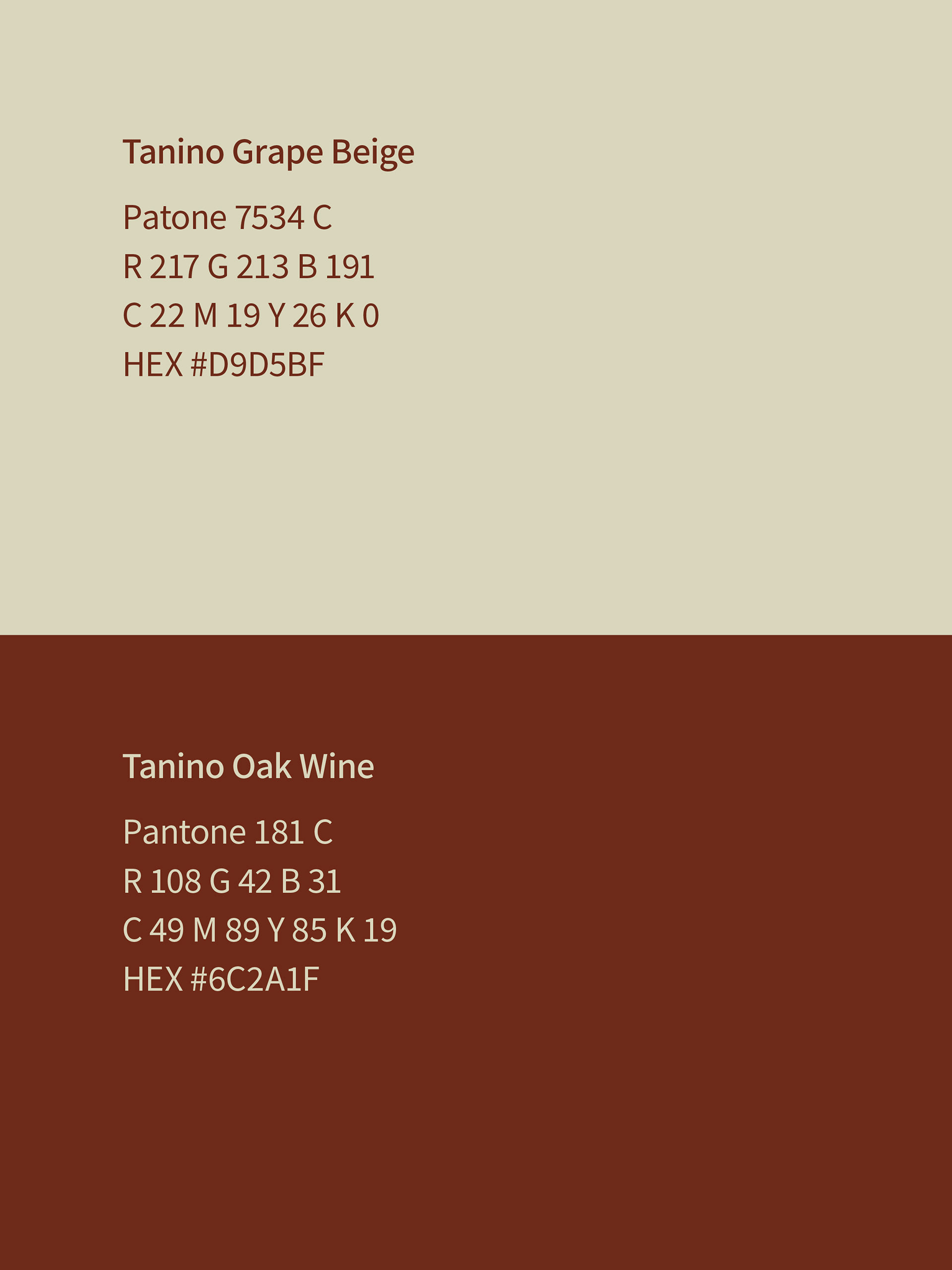
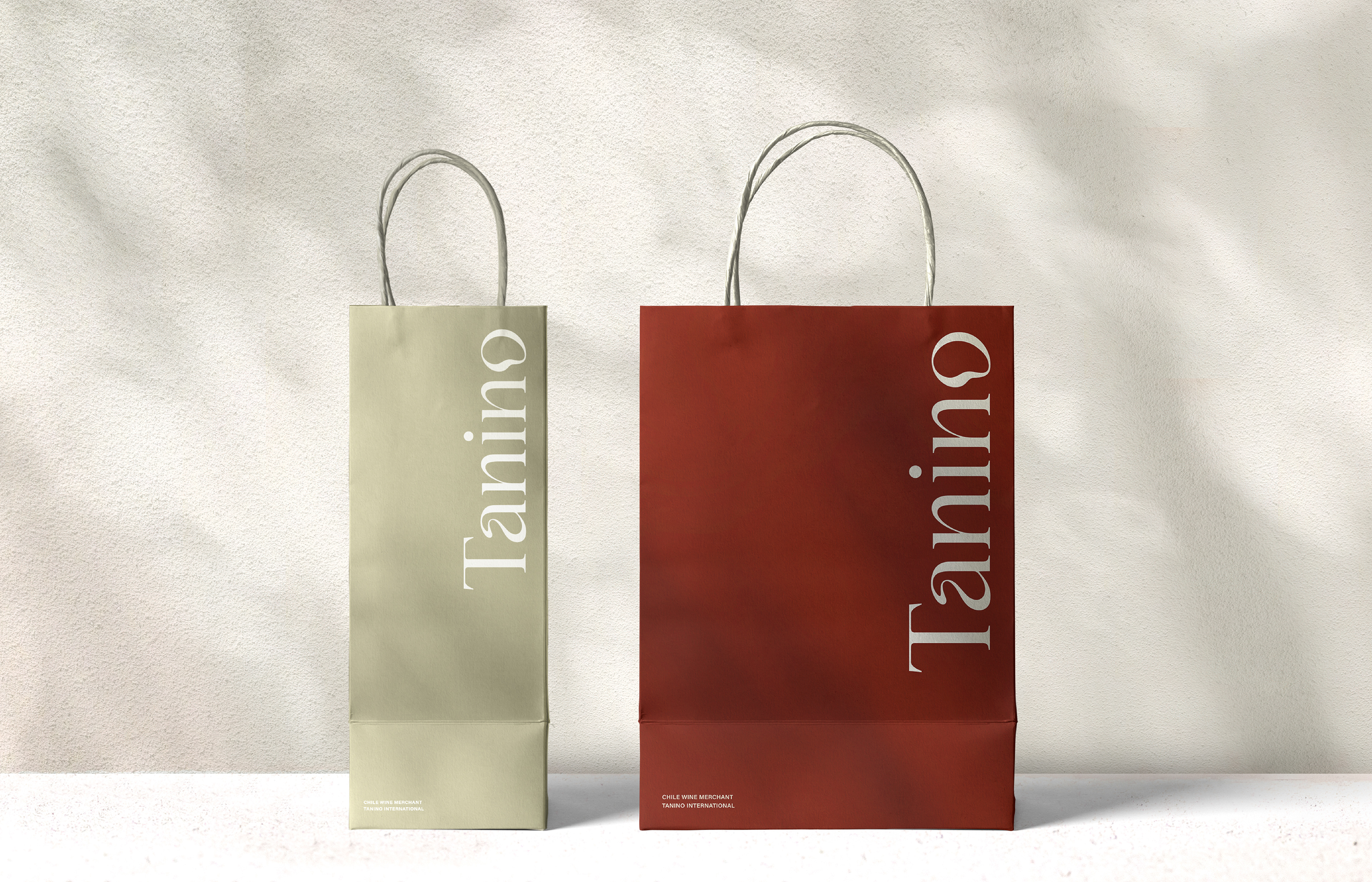
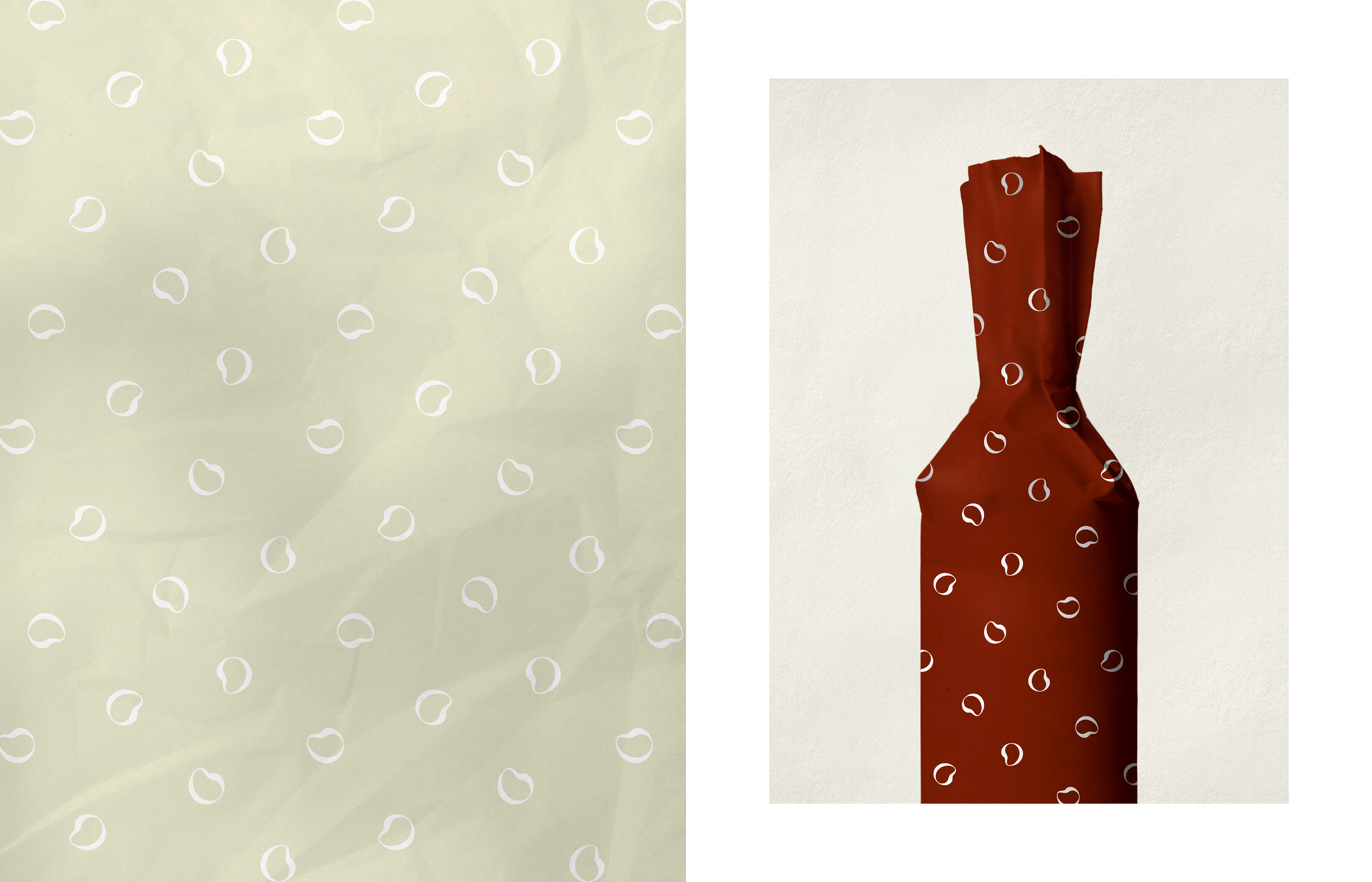
The color of wine comes from varieties of grapes. The color of Tanino Grape Beige started from an idea that the true grape color is the pulp color instead of the grape skin, which varies depending on varieties of grapes. The greenish ivory color of Tanino Grape Beige shows Tanino’s sincerity and originality. Tanino’s second color, Tanino Oak Wine, has a deep and rich color that brings up the image of oak barrels essential for wine aging. The reddish brown color symbolizes Chilean wine aged inside the oak barrels for richer and deeper aroma and flavor.
와인은 그 종류에 따라 다양한 포도 품종으로 만들어집니다. Tanino Grape Beige는 진정한 포도색은 품종에 따라 서로 다른 껍질의 색이 아니라 그 속에 든 포도알의 색이라는 생각에서 출발한 컬러입니다. 그린 빛이 가미된 차분한 아이보리톤의 Tanino Grape Beige는 타니노의 진정성과 오리지널리티를 소구합니다. 타니노의 두 번째 컬러, Tanino Oak Wine은 와인 숙성에 없어서는 안 될 오크통을 연상시키는 깊고 풍부한 감성을 담았습니다. 레드 빛이 감도는 브라운의 컬러로 오크통안에서 숙성되면서 그 향과 풍미가 더욱 깊고 그윽해진 칠레 와인을 상징합니다.
와인은 그 종류에 따라 다양한 포도 품종으로 만들어집니다. Tanino Grape Beige는 진정한 포도색은 품종에 따라 서로 다른 껍질의 색이 아니라 그 속에 든 포도알의 색이라는 생각에서 출발한 컬러입니다. 그린 빛이 가미된 차분한 아이보리톤의 Tanino Grape Beige는 타니노의 진정성과 오리지널리티를 소구합니다. 타니노의 두 번째 컬러, Tanino Oak Wine은 와인 숙성에 없어서는 안 될 오크통을 연상시키는 깊고 풍부한 감성을 담았습니다. 레드 빛이 감도는 브라운의 컬러로 오크통안에서 숙성되면서 그 향과 풍미가 더욱 깊고 그윽해진 칠레 와인을 상징합니다.
Client Tanino International
Discipline Corporate Identity / Copywrite / Packaging Design / Website Development
Director Jaeyong Jang
Design Yoona Kim, Yeohae Song, Hyeyoung Jung, Rihyeon Ju
Discipline Corporate Identity / Copywrite / Packaging Design / Website Development
Director Jaeyong Jang
Design Yoona Kim, Yeohae Song, Hyeyoung Jung, Rihyeon Ju